The art of writing in India has been admired over the ages. The invention of various languages resulted in artistic scripts on the paper. Gradually, the writings were enhanced with distinguished things used for writing over the period. With the introduction of typewriter and computer, the art of printing became popular.
Typing became one of the vital media of communication for major official work. While we talk about typing, typography has become one of the essential tools in a user interface. Beginners are not much aware of the term and think that it is all about choosing some fonts and tricking them. However, typography is much more.
In this series of two articles, the first part I am covering the basics of Typography in UI design and the second part will share some tips on the same based on my working and reading experience.
What is typography?

Typography is actually the art of technically arranging letters and characters in a layout. It is a technique to make the text readable and legible to the user when displayed.
Apart from its creativity in user interface, typography helps in portraying your business in a right way by making it appealing to the users.
In this article, we will find relevant basics about typography, its use in a User Interface and what beginners should keep in mind while practicing typography.
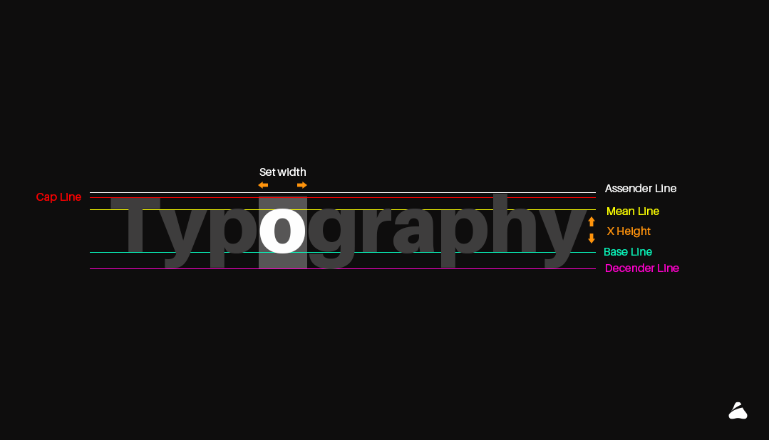
Typography has a lot of excessive impact on communicating process that includes designing a communicative User Interface. After the introduction of typography, we will learn about the term Typeface. Typeface means “FONT-FAMILY” that includes one or more fonts. Each font is composed of glyphs (meaning an elemental symbol with an agreed set of symbols) that share common design features. Each font of a typeface has a specific weight, style, and condensation.
Why is typography important?
Typography plays an important role in User Interface as it involves thoughtful and scrupulous selection of typeface, point size, line length, Kerning, Leading or any element that will leave an impact on User Interface.
70 % of User Interface depends on typography as it is the best source of communicating with anyone.
What are fonts?
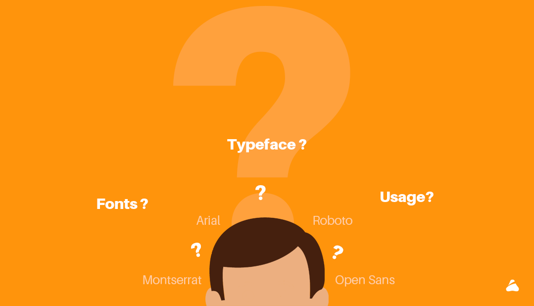
A font is a set of a presentable or printable text character in a specific style and size. It is a graphical representation of text that may include a different typeface, weight, size, point, color or design. Open Sans is an example of typeface family, Open Sans bold is a typeface and Open Sans bold 10 is a font.There are various types of fonts for user. Most of the typefaces can be classified into four basic group that includes Serifs, Sans- Serif, Decorative and Script.
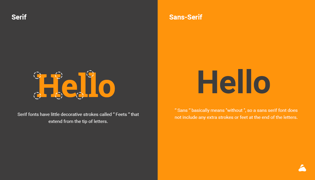
Serif
Serif typeface is the oldest form of type. Serif fonts have little decorative strokes called “Feets” that extend from the tip of letters. They appear on all letters, uppercase, and lowercase within a font family. Merriweather, Roboto Slab, Josefin Slab, Gentium Basic among others are serif fonts which are used for retro theme, posters or fashion site etc.
Sans-Serif
“Sans” means “without”, hence sans-serif font does not include any extra strokes or feet at the end of the letters. Being a modern form, this typeface makes it more legible and easier to read in small sizes on screen.
Roboto, Open sans, Poppins, Oswald etc are some of the sans-serif fonts. They are used for simple and classy websites, business websites, and also as a logo due to its good readability.
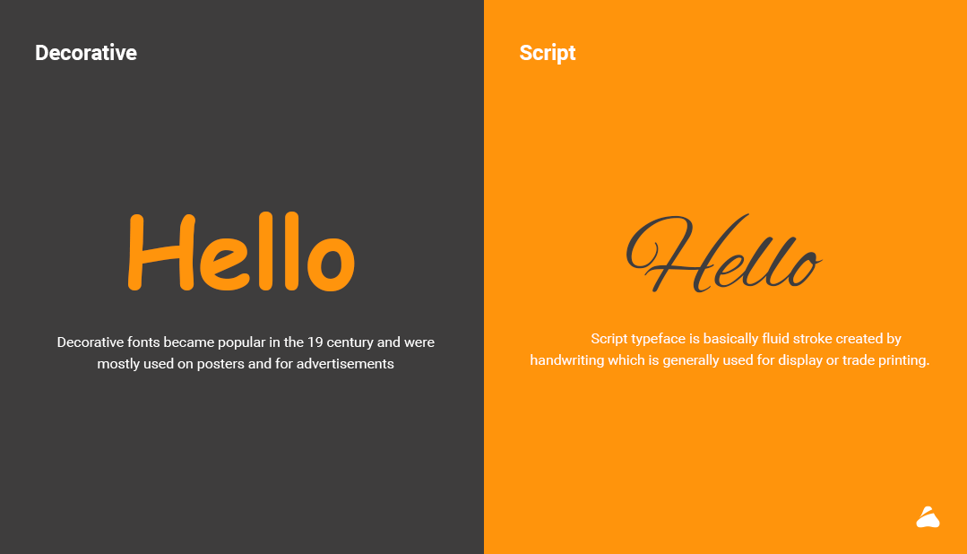
Decorative
Decorative fonts are also known as ornamental or display fonts. They became popular in the 19th century and were mostly used on posters or advertisements. The main aim of a decorative font is to serve decorative, elaborate and beautiful text. Decorative fonts quickly catch attention and makes text easier to perceive and fascinating. Debby, Arcadia, Bellico etc are decorative fonts which are basically used for posters and advertisements.
Script
Script typeface is basically fluid stroke created by handwriting which is generally used for display or trade printing. They are perfect for invitations, greeting cards or expressive texts. They are classified into two types; formal scripts and casual scripts.
1. Formal scripts
Formal Scripts connects to each other in fluid format. They look graceful so you will find them on greeting cards , invitation headers and similar . To find out more about scripts , refer this article
https://www.fonts.com/content/learning/fyti/typefaces/scripts
2. Casual scripts
Casual Scripts are mainly made to look friendly and engaging. Their strokes can be connected and their mood tends to be warm, personal and relaxed.
Technical terms in typography
Kerning:
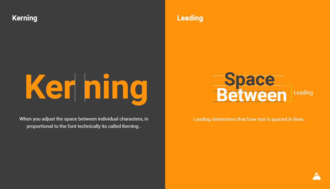
When you adjust the space between individual characters, in proportional to the font technically its called Kerning .
Leading:
Leading determines that how text is spaced in lines . I have created reference image below in order to visually understand the leading better . Content which has multiple lines to read there we need to take care of Leading.
Line length:
Line length is the width of a block of the text, usually measured in units of lengths like inches, points or in characters per line. A block of text or paragraph has a maximum line length that fits a determined design.
Tracking:
Tracking is generally used to fill a space that’s larger or smaller than the current one. It should suit the type’s parameters or to make a single word seeming airy and impressive. Changing the tracking can hamper the readability, and can be difficult for the user to read.
![]()
Though basic typography is interesting, you need to know the proper usage of the fonts and its shades to make it more appealing and enchanting to the reader or the user. You can learn advanced typography later so that you can strike a good deal for your business by impressing your clients through typography.
In my next article I will be covering some tips and tricks regarding usage of typography in UI . I would love to hear your thoughts and feedback on my article.
1 thought on “Typography basics and tips for User Interface (UI) design – Part 1”
Comments are closed.