Category Archives: All

Designing Experiences (UX/UI) for Enterprise Applications

If it’s not growing, it’s not a business!

Despite the size of the business, small or large enterprises, every business strives for growth & betterment. It could be in revenue, client satisfaction, market value, brand image, employee satisfaction or in any other area.

This blog post will focus on the power of strategic design and the need for designing complex systems those plays a pivotal role in speeding up business processes. Also, to make this article more focused towards enterprise applications specifically, we will for now, keep the consumer applications excluded.
This is not for those who want to learn UX/UI Design but interested to know how to use design expertise to make the business process more efficient and profitable.

What is an Enterprise Application?

Enterprise Application (or software), in simple words, are those applications, utilities or tools which are made for a specific set of users within the organization or for another organization/businesses to solve problems and complete the specified tasks in their operations. (business to business and or within the business)
For example, you can consider, back-end system for call centre staff, HR Management, Billing & Accounting software, Patient record tracking & management in hospitals (CRM), Trading software in financial technologies, LMS for corporates, email marketing systems, project management tool, ERP, Messaging & Collaboration system etc are all enterprise applications.

Need for design/redesigning the UX/UI for enterprise applications. A big why?

There is no more secret that high-performing companies from Fortune100 have put users & their experience on top in their priorities. There must be a good reason why these big brands came to this conclusion after investing a lot of time, money & efforts in research.
Just not to follow this conclusion blindly, we will look into the WHY there is need to design/redesign overall user experience through strategic thinking.

1. Feature/System Centric Vs User Centric platform

There was a time when tasks were performed by humans. Information technology and e-commerce boom excited businesses to automate all possible manual work through software systems.
In today’s world, for almost everything, there is an app or software system to accomplish. Automation, as a basic need, is already met. All the systems & software are coded and available either in the repository of codes, just to plug and play. So what’s the challenge now?
I believe its the experience – User/Customer experience. And there are we and market leaders are focusing. It’s a big shift of any software application from being feature rich or system centric to experience rich. Finally, everything is boiling down to user experience, how usable, effective, satisfactory, delightful & unique it is than other 10 similar options available in the market.

2. Efficiency matters

How businesses use their human resources efficiently? And how efficiently human resources use their time? In today’s competitive world, the efficiency of every employee, when he/she perform a particular task within the organization affects the whole business process. Design for efficiency is the technique can remarkably improve the efficiency of the user.

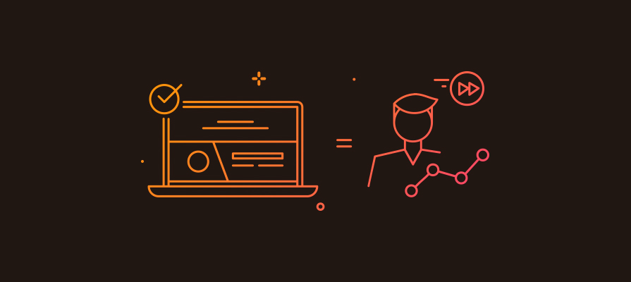
3. Productivity improvement
Productivity improvement UX

All businesses are investing in different programs, training sessions and methodologies to improve the productivity of employees. The tool that they use, (in the context of this article, a software application) can affect productivity ratio a lot. If its designed for maximum productivity (for e.g. minimum steps with more logical mapping to use cases to complete the task) more production or processing can happen in much lesser time. And that finally save the total number of resource engagement cost remarkably on a monthly or yearly basis.

In our observation, where we have consulted or redesigned the software applications, reported the improvement in productivity of users from 10% to 30%.

4. Sense of satisfaction

Satisfaction_UXUI

I get that when I swipe to the right on a task on my to-do list. Yes, its done when I wanted it! Studies have proven that satisfaction from small things leads to reduce the mental pressure and keep people away from depression. If an application designed in such way, to present the whole bunch of long task cue, broken into a small task that can be easily doable. Every completion will generate a sense of satisfaction in the team. More satisfied people with the work, more serenity in business place and culture – its a straight connection.

5. Employees are humans

If employees love what they do, they deserve to love the way they are doing it. Love is at the core of our existence and basic need of every human being. The more easy, simple, joyful and humanized systems are, more people will fall in love with that. Imagine if your teams like the way they perform their task and the way the application is communicating with them in between? Isn’t it just awesome?

6. Cost of iterations & revisions

It is often observed that when people start using software they have some feedback. One cannot build software, within the budget, that is just perfect for every use case. However, with the systematic user-centered analysis and design approach we can assess the requirement upfront, prioritize them and build something which will be much closer to user’s expectation & the way they are comfortable to use it. Thereby cost of possible iterations and revision in later phases can be reduced significantly. So your upfront investment in user-centered design can significantly save later recurring expenses in maintaining or refining it.

7. Cost of training & support

Providing detailed training for complicated software is a costly affair. The complicated software can also lead more customer queries that put the load on customer support team.
No one ever required detailed formal training for using Facebook, Whats app or YouTube (of course these are consumer app & not an enterprise app) These social platforms are best examples of intuitive, easy to use & highly engaging applications. Teenager to senior citizen performs many complex tasks with these social applications flawlessly just by using a couple of times.
The secret of the success of such applications is overall engaging user experience and importantly very simple & well-informed design.

8. Balancing is an Art!

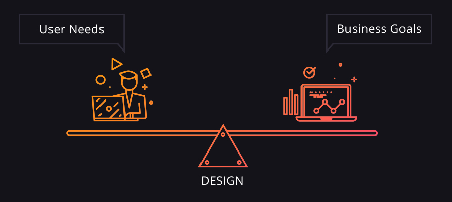
UX Balances User Goal & Business Goals

Feature rich or system centric platforms are often built by taking business needs into account. During the phase of development, its very rare that development team focus on real users, user research & their feedback’s. Everyone rushes to the functional testing, code optimization, and other development/technology centric decisions, On the other hand, design-centric process, focuses on User goals in line with Business goals and draw a solution by balancing them. Technology & Features comes in later stages if it has been identified in the research based on real usage by the user in the business process. One can really control the complexity & depth of the feature while taking user tasks, their priorities & other related factors.

The solution that only focuses on the business side and ignores the user’s concern, fails to achieve business goals due to friction in operations & production.

9. Design for error: avoiding high risk in critical actions

Design for errors

Good design & bad design is just not connected to more conversion, ease of use or customer delight but in some cases, it draws a line in between life and death. A very well known incident of B 17 Aircraft in World War Two. The landing gear and flaps control knows are identical and very close to each other. Here there was the high risk of accidentally operating wrong control.
In such cases, significant importance, time & effort should be put to consider all the possible errors and solutions to avoid or recover from these errors. If you observed your business and operations carefully, you can find very critical actions that invite huge risk in case of wrong selection by a user. A good design will be always backed up with necessary recovery options.

10. Profit by DESIGN

As reported by Design Council UK, according to research, design directly and significantly improve sales, profit, turnover, and growth.

“Every £100 a design alert business spends on design increases turnover by £225.”
~ Design Council UK

Design-led businesses who use and value design can have a competitive edge over the rest. So design is not just related to aesthetic uplift or cosmetic surgery anymore.

( Source: Page Number 4, The Value of Design Factfinder report © Design Council 2007 )

11. Benefit of multidisciplinary design
UX Multidisciplinary design

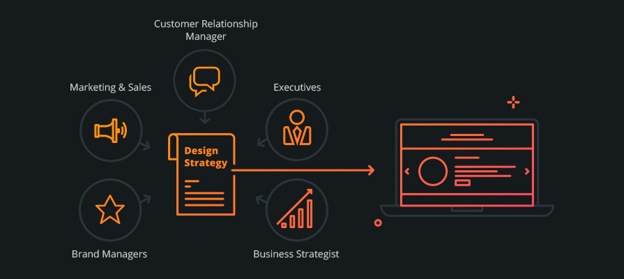
A strategic & user-centered design approach begins with taking inputs from various departments within the organization. It is a multidisciplinary design approach where Marketing & Sales, Business Development, Product Managers, Brand Managers, Executives, Customer Relationship Head, Business Strategist all these people contribute in defining the design strategy and critical success factors of the project. So the outcome ensures that it is not missing the 360-degree overview and consideration from every perspective before going live.

Great products come from great ideas, ideas are born out of the passion for solving the problems. And one can only identify a problem by looking at who is facing it (problem) i.e. the user. Design thinking is a proven way of solving user problems effectively.

I hope you enjoyed reading & find this article clarifying your doubts why one should rethink about designing an enterprise application. I have covered only a few important factors those are crucial from the business perspective. If you have any suggestions, those are welcome. Don’t forget to place your feedback.

In my next article, I will try to focus on the process (HOW) for designing an enterprise application. It will be a broader overview which will address steps, milestones and important factors that business should consider when they are undergoing design/redesign exercise.

If you have further question or need assistance from an expert, please Contact Us or get connected with me on my Twitter account
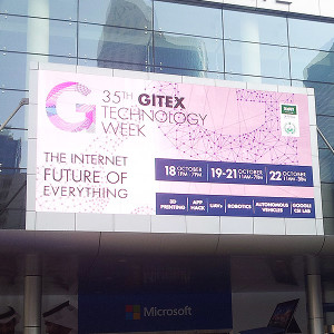
Meeting global visionaries from leading companies at GiTex 2015 (Dubai), to improve user experience of their product

Prismic Reflections® team is just returned back from their fantastic trip to Dubai.

We visited GiTex 2015 at world Trade Center Dubai, last week.


gitex_logo

Future of technology on display was at Gitex 2015, 35th?Technology week at Dubai. Its a gateway to the Middle East, Africa & South Asia’s ICT Industry. Innovative UAV, Robotics, 3D printing, business automation & autonomous vehicles. GiTex is the place where all business leaders, global visionaries from world’s leading companies come together. Its the place where you can explore business opportunities, ideas, your future business partners & customers. You can demonstrate your ideas & business to different people coming from all across the globe.

Me & My Partner Swarup visited GiTex last week to meet entrepreneurs, brands, businesses & leaders to explore the possibilities how Prismic Reflections® can contribute?to?improve their?digital product’s user experiences and take them to the next level.

During our 5 day trip to GiTex, we met lot of businesses leaders from different domains like software, IT, Banking & finance, Healthcare, Agriculture, Food, Education, Government and so on. It was quite exciting to see the value that these businesses are bringing together to contribute into the ecosystem of UAE and there by Global Economy. It was also inspiring to see businesses are openly collaborating with each other to explore the partnership opportunities to achieve high pace & sustainable growth.


sacle

?In my visit, I met few aspiring brands & business leaders like Saycle, Anazana, Devision, Firecart, 3D Printer, Xilopix, SOTI, and many more.?I was amazed by the revolutionary solutions these companies?are bringing to the society.
India’s contribution to the Software & technology domain was always been huge. No wonder I saw many of software & tech companies from India here in GiTex, which made me feel at home 🙂

However, I saw most of the companies brought inspiring & innovative ideas in form of products along with their services. Its fantastic that product mindset in evolved drastically in service based companies.

All the ideas, solutions & values brought by businesses & innovators surely seems to shift whole customer experience to the next level. Lot of different & complex challenges can be met with the use of technology based solutions where technology does the all the heavy lifting work and humans can enjoy?to the next level of experience by giving more comfort, ease and sophistication in day to day life.

Our meeting with business leaders & decision makers for transforming their software & platforms into better user experiences was great learning experience at both the end. Few of our meetings were turned successful and gone to the next level where Prismic Reflections® will be engaged in crafting UX for their digital products. We are quite excited to begin with these opportunities and hoping to create big difference in the digital space?with highly usable, engaging & customer user products.


Dubai Smart CityUI UX DesignOpening of GiTexView from Dubai World Trade Center

Overall it was great experience at GiTex to observe different business, ideas & importantly people coming together under one roof. Yes, its all about the people ? Humans. Technology can not rather should not replace Human interactions with each other. Instead, technology should compliment and bring more awareness, sophistication and improve the real life experiences. This is exactly what happened at GiTex where we met & interacted people face to face,?though it was a tech event- such a good experience.

One, who is in the technology space, should not miss the event. Like every year, GiTex was a great initiative from UAE’s government, held in Dubai, which will surely take UAE’s & Gobal Economy to the next level.

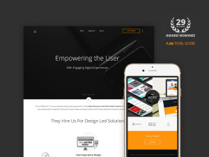
Prismic Reflections® Nomination for CSS Design Awards 2015!

I am quite excited to announce that our website – Prismic Reflections® – is nominated for “Site of the Day” from CSS Design Awards (CSSDA).

CSS Design Awards (CSSDA) is an international web design and development awards platform that honors and showcases curated & handpicked freelance designers, studios and agencies for work that pushes the boundaries of creativity, functionality and usability. Nominees & winners are selected by esteemed panel of experts & industry leaders, Sr. Designers, Sr. Developers,?Consultants & Creative peeps on the planet.

pr_cssda

Our whole 6 months (actually more than that) exercise turned well when we are done with final output what is there live on Prismic Reflections®. Of course the hard work, dedication & consistency when we were working on our own website,?without disturbing the client’s project, is?proved worth now.

If you ever wonder how we managed to create this, you can go through my this article?on medium which explains the entire process of crafting our own web presence.

Being nominated for awards is not new for Prismic Reflections®. However, getting nominated again and again is nevertheless great & inspiring for us to keep doing great work.

I would really appreciate if you can spare some time and vote for our website on?http://www.cssdesignawards.com/sites/prismic-reflections/27337

Thanks for reading & keep doing great work.

Prismic Reflections® attending 35th Gitex Technology Week at Dubai World Trade Centre

User Experience Experts of Prismic Reflections® will be meeting the delegates & decision makers of different countries & exploring the possibilities of get associated with their organizations as User Experience Design Partners. We are all set to transform your business plans into success stories & take responsibility of end-to-end customer experience design with strategies, user interfaces, effective communication design for Web, Mobile applications & Wearable?s.

From the past 13 years, WE – as a strategic design partner, helping startups & established businesses, making their customer communication much simplified, meaningful, engaging and of course more HUMAN.

Aiming to assist with technology based startup & established businesses – we look forward to take your ideas to the next level of measurable success.

Lets meet & collaborate to be a core part of Digital World. The Internet Future of Everything.

Developing Website for your real estate business? Here are our suggestions!

We have developed quiet a few successful Real Estate websites for our local and international clients within the span of last 9+ years. On the basis of that I would like to share some of our own aspects & experiences with all of you. I am sure, it will be helpful for those who are looking to develop or enhance their Real Estate Websites.

At Prismic Reflections® we have developed websites for Real Estate Builders & Developers, Individual Agents or Brokers & classified property listing portals. Following are few of the points which I think one must consider while he is planning for his own website for his real estate business.

Plan your website for your valuable audience

We all know about internet & power of its penetration. Considering same, I strongly suggest you to plan your website by keeping your audiences at center. Make sure your website communicates well regarding your products or services. If you are a part of real estate company, make sure your website has a proper space to communicate about your projects. which will contain all necessary information regarding your currently ongoing ?& upcoming projects. Talk less about your self and more about your projects, because as a customer we humans are always have more interest in products than the companies which build them.?Engage your customers through your website by asking them to register on your website, share the progress of the project which they have invested in or shows interest. You can also use the social media for sharing your project related updates, new projects to be launched in near future or if you launching any festive offers etc.

Many real estate developers also go for micro sites for each of their new projects. It could help you to do the focused digital branding of particular real estate project & help in your promotion extensively and thus ensuring good return on your investment.

Website for real estate agents/consultants?

Having your own website will always help you to grow your business, ?no matter if you are an individual real estate agent or a group of real estate consultants providing set of valuable services to your clients & dealing in bunch of properties. You can use your website to highlight your individual profile & the properties you have currently to buy, sell or rent. Go for a blog where you could share some free consultation or legal advises to your audiences which could offer you new business in future & help in your indirect marketing.

Building your real estate classified? listing portal

Narrow down & find your niche if you are planning for building any classified listing portal. One of our client have developed their classified listing website which deals only in “Stud Farms” and relative real estate properties. Similarly we have other client who have his website which allows you to search and browse “Water Front Properties“. As a result they get higher exposure & rankings in search result for their local searches.

Make sure you site offers flexible and user friendly system to list their properties. Engage & build some process which will make your site more trust worthy for your users such as verify the agents and registered users by setting up some smart user verification processes & moderation.

I believe, search & filter module plays a vital role in these classified listing real estate websites. Get your web design agency involved to make it more simplified for your users and make sure you get the upmarket tools & technologies from them. Get them involved in enhancing your overall project. Web agency can help you to make your project more sustainable for future. Don’t forget to demand for responsive & SEO friendly codes. It will help search engines to digest the content easily from your website.

You can even consider and plan to have a mobile app in order to gain more exposure and convenience for your users. It could be a part of your brand promotion strategy.

Points to be considered in eCommerce website building

Electronic Commerce, commonly known as e-commerce, eCommerce or e-comm, consists of the buying and selling of products or services over electronic systems such as the Internet and other computer networks. Other example is PayPal, which is an online payment processing site, and could also be integrated in your own websites as well.

It is more than just buying and selling products online. It also includes the entire online process of developing, marketing, selling, delivering, servicing and paying for products and services. The amount of trade conducted electronically has grown extraordinarily with widespread Internet usage.

Electronic commerce is generally considered to be the sales aspect of e-business. It also consists of the exchange of data to facilitate the financing and payment aspects of the business transactions.
Your eCommerce development plan should include such factors as are necessary to attract more buyers. In this Article I am listing most Important Points you should consider before starting making of E-commerce Website:


building ecommerce website

Familiarize yourself with the target audience:

Amazingly, most people completely ignore their target customer when writing product descriptions. However, the site visitor is the key to how the copy is shaped, the tone it takes and which angle is used to communicate the benefits.

Knowing your audience as a whole, and understanding each segment is imperative to creating eCommerce copy that hits the mark every time.

Limits of content management systems (CMS):

Content management systems (CMS) can be frustrating at times. Before you set out to write product copy that’s 150 words long with a catchy headline, you’ll want to verify what can and cannot be accomplished within your system. Some have limited room in the copy field. Others force the headline, pulling from information you enter into the product specifications. For example, the headline on each product page would be automatically fed from the title of the product. A few common areas to check include:

  • Maximum word or character count in the product copy field.
  • Forced information: headlines that are automatically inserted, product copy automatically fed to the category pages, etc.
  • Additional fields below the fold: if you run out of space in the product copy field, then you can add a link for “more information” that drops the reader to a space further down the page.

Incorporate search engine Key Phrases / Keywords:

Depending on your site design and your CMS, your product descriptions could conceivably be hundreds of words long. Generally speaking, however, you’re most likely looking at around 6080. That doesn’t leave much room to incorporate keywords.

While longer web pages benefit from the use of multiple search terms, I recommend sticking to one key phrase for short product descriptions. Start with the framework of your page including the title tag, description META tag, file name, page name in the navigational structure, breadcrumb trail, forced page headline and other elements. Then move on to the content. Use search phrases in the:
Headline include a key phrase into a headline, but – if for some reason it just doesn’t flow – leave it out.
Product image caption – too many eCommerce sites simply shove “Product #12345” below graphics. Instead, underneath the hero shot of your product, enter a short, keyword-rich sentence that briefly describes the item. This assists your visitors with learning about your product and gives a little nudge to your rankings.

Product copy – even within 6080 words, you should be able to comfortably work your search term in two or perhaps three times. Read the text out loud. If it sounds redundant, take out one instance of your key phrase.

Use good shopping cart function:

You should also make sure you include a good shopping cart function on your eCommerce website, as it is this that will alert you when an order is made. It will also take care of the necessary administration such as calculating tax on individual orders and sorting out order summaries. You should ideally go for a piece of software that updates regularly as this will help you ensure you stay on top of regulation while making ordering easy for your customers, which is very important on an eCommerce site.

Payment gateway option:

Another important thing to consider when building an eCommerce site is your payment gateway. As well as shopping cart software, you need a means of receiving and making payments. There is a lot of software that does this for you. For example, a lot of businesses use a package supplied by large website such as PayPal. If your company is larger, then you might want to talk to your web designer about integrating an alternative solution to meet your needs.
Make sure that the payment options included are not focused to a specific region. As you are on internet so there is no specific region for your customer to purchase from your shop. Try to include most of the payment options other than PayPal and Google Checkout.

At least include popular payment gateways of those regions from where you are getting maximum amount of visitors/conversions.

Safety security:

This point is very important in making of eCommerce website. Online transactions has provided the shoppers a great shopping comfort, but increasing cyber frauds and crimes has also made them skeptical about revealing their details, required while making online transactions. Always provide assurance to the customer with proper transaction securities such as Verfication etc.

If you keep all the above points in your mind while executing your eCommerce website development plan, you’ll surely get a lot of success and profit. If you have any other suggestions or any questions then drop me a comment let me know your thoughts.

Dear web design community, where have you gone?

As Web craftsmen, we are living in exciting times today. The frenetic pace of evolution in our industry has created remarkable opportunities for our work. Our established set of design and coding practices is more comprehensive than it has ever been before. Our designs are becoming more usable, our code more scalable, our layouts more responsive. In fact, just by comparing our design processes to those from a decade ago, it’s remarkable to observe how quickly we’ve developed and honed our craft over all these years.

3

However, the maturity of our industry is far from being complete. While producing a myriad of technological advancements, we have outpaced other developments along the way. These developments aren’t related to the lack of cross-browser standards support or technical downsides of the tools we are using. No, they have a different nature. They have emerged within our design community a community which is now so fertile and diverse that it is becoming increasingly difficult to ensure its professional maturity.

In fact, there are many issues that require a thorough, profound discussion within our industry, yet they are not properly discussed for one reason or the other. This article is based on my recent, often unrelated, observations of our community. It features my personal opinion on the problems we need to tackle and conversations we need to start to ensure its healthy evolution.

Where did the community spirit go?

I was very lucky to have experienced the development of the Web design community from its early days on. As a passionate newcomer to the industry, I was captivated by the sense of enthusiasm that seemed to be flourishing everywhere and spurring everyone. It was a strong and genuine feeling that was sparkled among dozens of sites and magazines and fueled by the motivation of experienced and non-experienced designers. The community was reasonably small and therefore very welcoming and supportive, so everybody was perfectly fine with asking lengthy questions and providing detailed answers.

I clearly remember in-depth discussions with hundreds of meaningful, engaged comments, in which designers would thoroughly analyze the techniques presented and suggest improvements or alternatives. I remember having experienced print and digital designers writing articles and teaching inexperienced designers the obscure details of and practical tips about the new craft. I remember vivid debates spreading from one site to another, connecting designers and building professional relationships in the community.

These discussions still take place today. There are many more designers and developers out there encouraging these discussions. The remarkable work of people like Paul Boag, Dan Mall, Jeffrey Zeldman, Francisco Inchauste, Chris Coyier, Simon Collison, Andy Clarke, Paul Irish, Chris Heilmann, Jeffrey Way, Trent Walton and many others is a vivid manifestation of the tremendous care and dedication of designers and developers to our industry. There are literally thousands of talented folks out there who are writing articles and releasing wonderful new tools and resources for all of us to use. That’s great. That’s great because all of these contributions bring our community much further.

However, every now and again I can’t help but realize that the number of active contributors with knowledge and experience hasn’t increased proportionally to the overall magnitude of our growing community. Way too often I find it extremely difficult to find meaningful debates spanning over the whole community debates that would create a strong echo and prompt us all to revise, extend or adjust our practices and hence become better professionals.

Way too often do I come to the conclusion that this remarkable, inspiring enthusiasm we once had is now gone. What remained are stranded cliques of passionate designers who lead design discussions privately and separately, often unnoticed by the vast majority of the community.

The tragic irony is that although we are probably one of the most connected professional communities out there, it seems that we are increasingly not connecting. It’s not that we’ve become just a bit too comfortable with the processes we’ve developed over the years nor that we don’t care about improving our design and coding skills. In dialogue with our readers and colleagues at conferences or even online, I’ve become confident that this development has entirely different roots.

Starting time to Contribute

Since there is so much going on the Web these days, it seems only reasonable that many of us might experience difficulties finding time to actively engage in professional discussions. Personally, I am just as guilty as the next guy, as I find it extremely difficult to read more than 5/7 design pieces a day not to mention commenting on any of them. I’m trying to challenge myself to be more responsive and engaging. Sometimes it works, sometimes it doesn’t, but I have firmly committed to this change and maybe just maybe so could you.

I believe that the lack of time is one of the reasons for our changed behavior online. Our emails have become shorter, and so are our blog posts and comments. Our interest has become much more difficult to enrapture, and so we’ve become more passive and less critical. We way too easily consume and accept ideas, designs, concepts out there, sometimes without even questioning their validity and correctness. Instead of debating, we agree; instead of criticizing, we accept or simply click away and ignore the discussion altogether. And this is the reason why many conversations in the community do not get a critical mass of interest.