This website uses analytic solutions, cookies and softwares which are essential and help us to improve the user experience. By using the website, you consent to the use of these analytic solutions. Read our Terms of Use and Privacy Policy to learn more.
The journey in the design industry is a huge roller coaster ride. From coming up with a concept through design thinking, amending the changes required, and making sure that the design enhances the user experience and resonates with the brand is a long journey. To a designer, a pat on the back and words of appreciation give the motivation to work throughout the journey and continue bringing meaning to the designs.
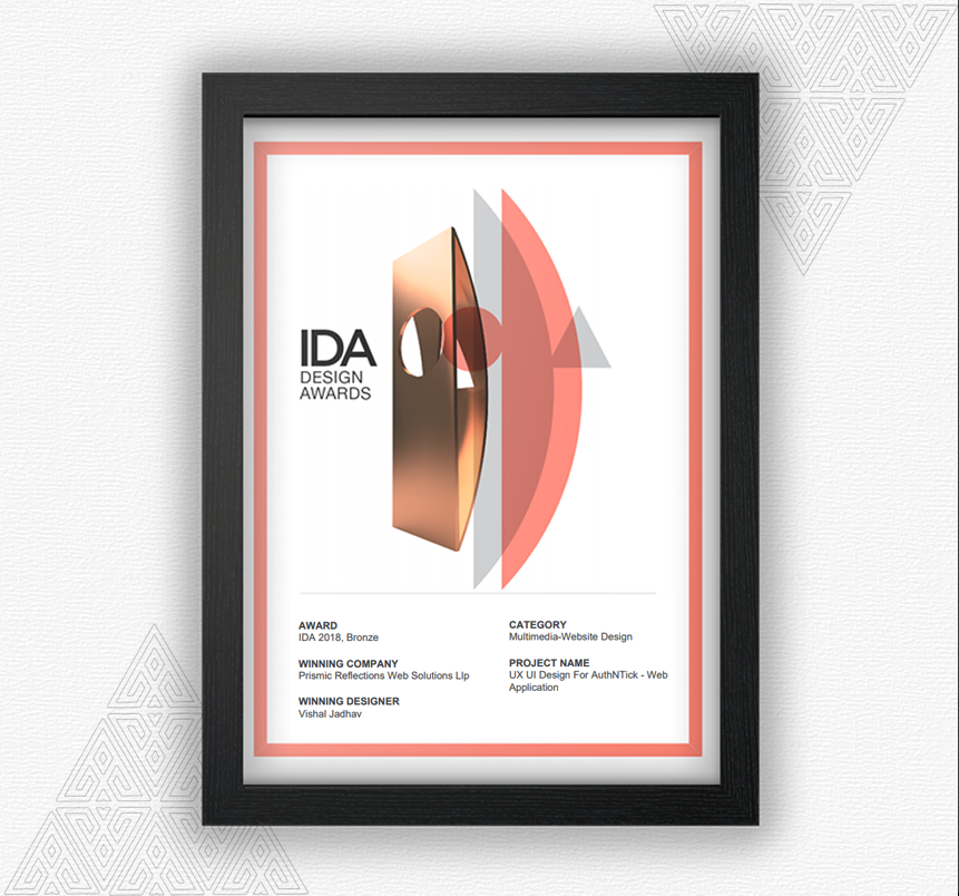
For us atPrismic Reflections®, client satisfaction is the highest. We work with passion at every task in hand and when we get recognition, we feel accomplished. It is a very ecstatic moment for us when we get recognition and appreciation for our work. We take pride to announce that we have recently been awarded bronze in the 12th International Design Award for one of our project, UX UI Design For AuthNTick – Web Application.
IDA award is one of the prestigious awards in the design industry which appreciates the designers and their work. The International Design Awards (IDA) recognizes, celebrates and promotes emerging talents in Architecture, Interior, Product, Graphic, and Fashion Design. At the IDA awards, we showcased our product designs and our UX/UI designs among the best designers in the world in the category ‘Multimedia-Website Design’.
Our hard work and design thinking strategy garnered eyeballs and got us love and appreciation from the jury of one of the most renowned body in the design industry, The International Design Awards. We were competing on a global platform among the best designs in the multimedia- website design category.
Our project ‘UX UI Design For AuthNTick‘ was one of the milestones in our journey. In this project, we were challenged to turn complex verification process into super simpler, faster & automated user experience for its end users. We began the project by understanding the needs of the owner and identifying the key stakeholders. A small team worked dedicate to come up with a design strategy to align the design strategy with the business goals of the client. The case study of our award-winning project is here.
Taking one step at a time, our designers worked closely with the client right from developing the concept of launching the product through several iterations and final testing. At every step, we focused on making the UI/User Interface Design unique and captivating.
We derive the highest satisfaction when all the time and the efforts together in bringing the design to life resonates with the brand and enhances the user experience. We, atPrismic Reflections®, are always ecstatic about the accolades that come our way. We take immense pride in showcasing our work and making a difference to the brands by delivering exceptional UX/User Experience designs for our clients. We extend our gratitude to the IDA awards for adding one more feather to our cap. Receiving such recognition validates our efforts and ideas and motivates us to work even better every day.
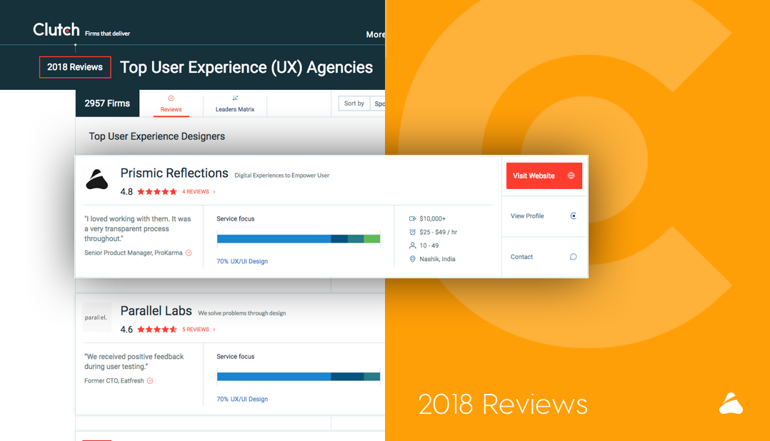
B2B Market Research Firm, Clutch Releases 2018 Report – Prismic Reflections Recognized as a Top UX/UI Agency in India
At Prismic Reflections®, we just don’t build products and websites – we design experiences. In order to develop the best user experiences for our customers, we begin with user first. Prismic Reflections® embraces human-centered design, a creative approach to problem-solving that starts with user and ends with solutions that tailor to their needs.
The UX/UI field is rapidly growing, and the number of agencies that are competing in the marketplace seems to increase by the day. Though we’re intent on letting our products, and the experiences we craft speak for themselves, we’re excited to partner with Clutch in order to display our work and demonstrate our skills to an even wider audience. In their report on the top agencies and developers in India, Prismic Reflections® has been named a leading firm in the UX/UI!
Clutch is a B2B market research firm that uses a proprietary research methodology to evaluate various companies in the technology space– from agencies to web developers and software companies. Their platform is a useful resource for a buyer, who overwhelmed with the number of choices, can identify a service provider that best suits their needs according to Clutch’s independent evaluation.
At the crux of their process are client reviews, and who better than our clients to speak to our business acumen and technical skill set. We’ve had a number of ambitious partners over the years, and their willingness to take the time to leave a review on Clutch is a testament to their dedication to our firm.
Feelings are very important in design, and Prismic Reflections® can combine professionalism with a personal touch.
I loved working with them. It was a very transparent process throughout.
Senior Product Manager, ProKarma
While the clients that we serve cover many different industries – from education to finance and IT, our mission is always the same– to achieve their business goals with elegant UI and UX solutions. From idealization to Iteration, you can trust that Prismic Reflections® will create an impactful and innovative user experience. You can also read more about our achievements on Clutch’s sister website, The Manifest. In all, we’re grateful to have Clutch reviews as well as this award to show our continued leadership in this field.
This achievement is significant for us. Especially for clients, it’s a reliable source for reviews on past projects & clients. Clutch’s independently takes and validates client feedback, making them more trustworthy to future clients.
In the previous part, we learned about typography and how it is useful for a UI designer. Now, in the concluding part, we will learn about typography principles and their useful tips.
Expected Readers:
Those who are interested in learning more about typography, aspiring designers, typography enthusiast, graphic and user interface designer. Continuing with the last part, we will learn some principles and their tips that you can use in your UI design practices. Learning and mastering them is not easy but you can go ahead gradually.
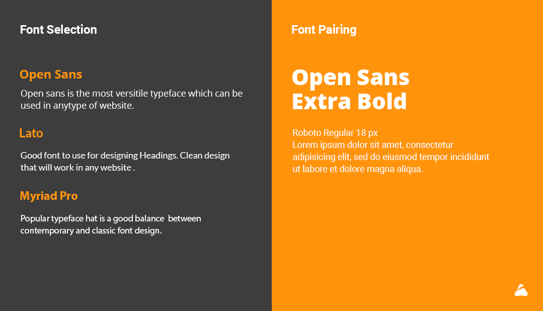
Font Selection
Making a right font selection is like choosing a right outfit as it speaks a lot about your taste and style. Font selection varies for different projects. Boldness, size, and spacing determine which areas will attract most of the attention.
Tips
Think about position and alignment of your font.
Check which font is suitable for your brand and style that way.
Play with different font sizes and make sure that the text is easy to read.
Font Pairing
Font pairing means usage of two different fonts and combining them into a typeface. There are basically three types in which font pairing can be included.
Concordance: Using a single typeface
Contrasting: Using two or more typeface that is different but goes well together.
Conflicting: Two typefaces which are similar to one another to work.
Tips
Try to establish a visual hierarchy
The mixture of serif and sans serif is always eye pleasing.
Avoid pairing too similar fonts.
Make content important while ensuring user’s
readability and simplicity of the content.
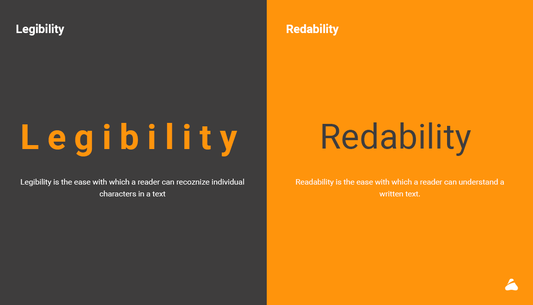
Legibility
Legibility is the pattern wherein a reader can recognize individual characters in a text. It is a measure to distinguish one letter from another in a particular typeface. Legibility is different than readability.
Tips
Fonts with taller X Height are easy to read. Fonts like Dejavu sans book, Libre Baskerwille Regular, Merriweather san s Light have a taller X Height.
Avoid using all caps and always be creative with your design.
Always remember to choose text with proper contrast.
Readability
Readability is the ease with which a reader can understand a written text. There are some important points that should be taken into consideration.
The minimum type size for readability should be 16 points.
The paragraphs should be no longer than 5-6 Lines.
Black type on a white background has the best readability.
Use serif fonts content and sans-serif for headlines.
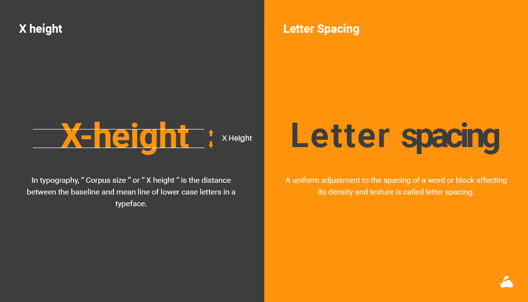
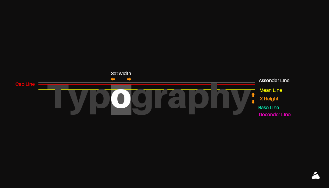
Height (X height)
Being equal to the height of the lower-case letter ‘x’, X height is the distance between the baseline and mid line in a typeface in typography. This height is a relative unit of measuring the proportion of lowercase letters.
Tips for X-Height
Always choose different line spacing for different typefaces.
Software’s like Photoshop, Illustrator, and InDesign are the best software to adjust leading or X-Height
Letter Spacing
A uniform adjustment to the spacing of a word or block affecting its density and texture is called letter spacing. In other words, adjustment applied to a block of text or paragraph to increase or decrease the average distance between line.
Tips for Letter Spacing
The most important thing for letter spacing is typeface as every typeface requires its own adjustments and spacing.
Also remember that Word Spacing is also important in typography to increase readability.
By choosing right corning your design will improve
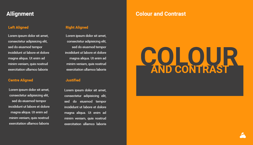
Alignment
Alignment means how text is placed on the screen in relation to margin. It’s also a process that allows the user to align text on a page or document.
For example: Left-aligned text aligns text to the left side.
Tips for Alignment
Always or mostly align your paragraphs from left to right as it is the standard way in which our eye’s read.
Avoid widow and orphans in the paragraph by using or adjusting type size, word or letter spacing etc.
Colours and Contrast
Colours and contrast also play an important role in typography. Colours can help to set the mood for your design and helps the text to stand out. The three integral components of the colour are:
Hue: The shade of colour.
Saturation: The intensity of colour in an image.
Value: Lightness and Darkness of colour.
Tips for colour and contrast
We need to remember that
” Sharp contrast is easy to read, pure contrast is hard to read”
Choose font colour and background properly to make your design standout.
For example, use white text on the red or black background to increase readability.
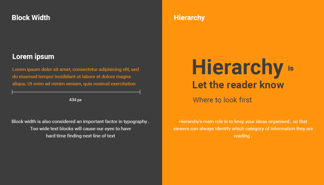
Block Width
One of the important factor in typography is Block Width . Due to wide text blocks it hard for the reader to find the next line . If lines are too narrow the eye will need to jump from line to line breaking the reading rhythm. Your text line should only have 50 to 75 characters.
Tips for Block Width
First, all of the paragraphs should be aligned left as its the standard practice to read.
Block width should be not extended more than 700px as the user is not fond of reading the whole sentence, the sentence needs to be broken.
Maximum 14 words should come under 1 line in a paragraph
Hierarchy
The main role of hierarchy to create a hierarchical division that can show users where to look for specific kinds of information. For this we can use size ,fonts and different pieces of text for creating hierarchy. Using them we can direct the users attention to that information which is important.
Tips for hierarchy
Always set rules for bold and italic in typography to maintain the visual hierarchy. For example, the heading should be bold and bigger as compared to paragraph to make it highlight.
For maintaining hierarchy, always create a Z pattern as it is the common reading pattern.
Font weight also helps in maintaining visual hierarchy in typography
4. Don’t use too many typefaces in a single design as the visual hierarchy gets disturbed.
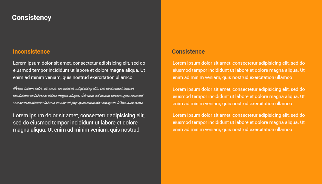
Consistency
Consistency refers to the constant use of visual design elements discussed such as colour, type, spatial layout etc. Using consistency in typography means using right font and font sizes for heading and body text style. There should be consistent use of typeface, kerning, leading and colour etc.
Consistency makes the work look beautiful and pleasing to the users’ eye. It helps in minimizing styling and reduces user memory. It also helps HTML developers to make the website optimized.
Tips for consistency
Do not use too many typefaces due to which the consistency will get hampered.
Use one or two typefaces which makes design consistent and minimal.
Accessibility related to font size
After understanding the principles of typography, you need to know about the varied age group of users. You will have to keep in mind the following points of principles and design.
There are mainly some limitations of human eyesight after a specific age that is 45-60 and further,
Loss of light
Human vision declines and pupil shrinks as the age advances, allowing less light to enter the eye. Due to this the human faces problem in the low light environment.
Loss of Focus
Loss of focus refers to the loss of elasticity of eye lenses making it less able to focus while reading. The amount of loss of focus differs from individual and can range from slight to severe.
Vision Field Loss
Eye diseases such as macular degeneration, which is the loss of vision in the center of the visual field. It can cause blurred vision and faded colour.
Here are the principles of Typography while designing for senior or aged people.
Typestyle
Use simple and easy to read font. You must avoid decorative or script fonts as it will be hard to read for aged people.
Type or Font Size
Use text size generously with extra leading to improve readability. For example, a minimum leading of 16 on 14 Pt text is a good rule of thumb. Your sizes can vary as per your typeface.
Text Length
The text length or block width should be divided into small parts as it will be easy for aged people to read and understand. Always use highlighter or bullet points to increase the readability.
White Space
Use lots of white space which will reduce eye strain.
Colour
Black text on white background or on a very light background is better for aged people as using other colour will be a trouble for them.
Guidelines of Bootstrap for Typography
Bootstrap global size font size is 16 px and line height of 1.5
Bootstrap 4 styles HTML headings with a bolder font and increased font size:
h1 Bootstrap Heading 36 pixels
h2 Bootstrap Heading 30 pixels
h3 Bootstrap Heading 24 pixels
h4 Bootstrap Heading 18 pixels
h5 Bootstrap Heading 14 pixels
h6 Bootstrap heading 12 pixels
The Default font family is “Helvetica neue”, Helvetica, Arial , Sans – Serif
Display headings are used to stand out more than normal headings with larger font size and font weight
Display 1 – Font Size 96
Font Weight 300
Display 2 – Font Size 88
Font Weight 300
Display 3 – Font Size 72
Font Weight 300
Display 4 – Font Size 56
Font Weight 300
Here are the resources you can use to update your knowledge
The art of writing in India has been admired over the ages. The invention of various languages resulted in artistic scripts on the paper. Gradually, the writings were enhanced with distinguished things used for writing over the period. With the introduction of typewriter and computer, the art of printing became popular.
Typing became one of the vital media of communication for major official work. While we talk about typing, typography has become one of the essential tools in a user interface. Beginners are not much aware of the term and think that it is all about choosing some fonts and tricking them. However, typography is much more.
In this series of two articles, the first part I am covering the basics of Typography in UI design and the second part will share some tips on the same based on my working and reading experience.
What is typography?
Typography is actually the art of technically arranging letters and characters in a layout. It is a technique to make the text readable and legible to the user when displayed.
Apart from its creativity in user interface, typography helps in portraying your business in a right way by making it appealing to the users.
In this article, we will find relevant basics about typography, its use in a User Interface and what beginners should keep in mind while practicing typography.
Typography has a lot of excessive impact on communicating process that includes designing a communicative User Interface. After the introduction of typography, we will learn about the term Typeface. Typeface means “FONT-FAMILY” that includes one or more fonts. Each font is composed of glyphs (meaning an elemental symbol with an agreed set of symbols) that share common design features. Each font of a typeface has a specific weight, style, and condensation.
Why is typography important?
Typography plays an important role in User Interface as it involves thoughtful and scrupulous selection of typeface, point size, line length, Kerning, Leading or any element that will leave an impact on User Interface.
70 % of User Interface depends on typography as it is the best source of communicating with anyone.
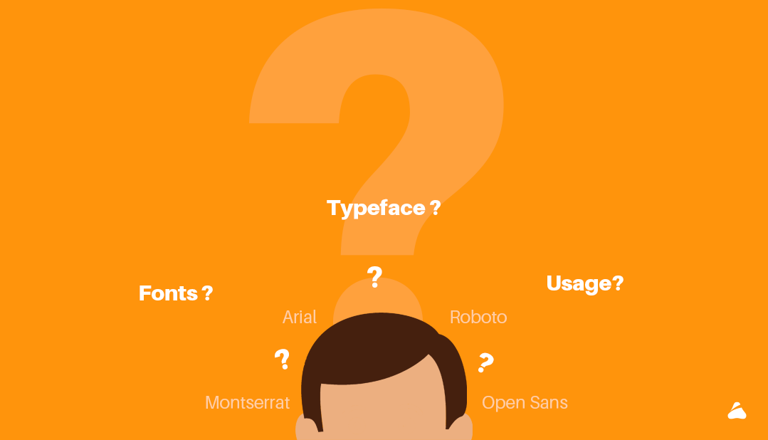
What are fonts?
A font is a set of a presentable or printable text character in a specific style and size. It is a graphical representation of text that may include a different typeface, weight, size, point, color or design. Open Sans is an example of typeface family, Open Sans bold is a typeface and Open Sans bold 10 is a font.There are various types of fonts for user. Most of the typefaces can be classified into four basic group that includes Serifs, Sans- Serif, Decorative and Script.
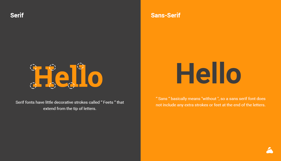
Serif
Serif typeface is the oldest form of type. Serif fonts have little decorative strokes called “Feets” that extend from the tip of letters. They appear on all letters, uppercase, and lowercase within a font family. Merriweather, Roboto Slab, Josefin Slab, Gentium Basic among others are serif fonts which are used for retro theme, posters or fashion site etc.
Sans-Serif
“Sans” means “without”, hence sans-serif font does not include any extra strokes or feet at the end of the letters. Being a modern form, this typeface makes it more legible and easier to read in small sizes on screen.
Roboto, Open sans, Poppins, Oswald etc are some of the sans-serif fonts. They are used for simple and classy websites, business websites, and also as a logo due to its good readability.
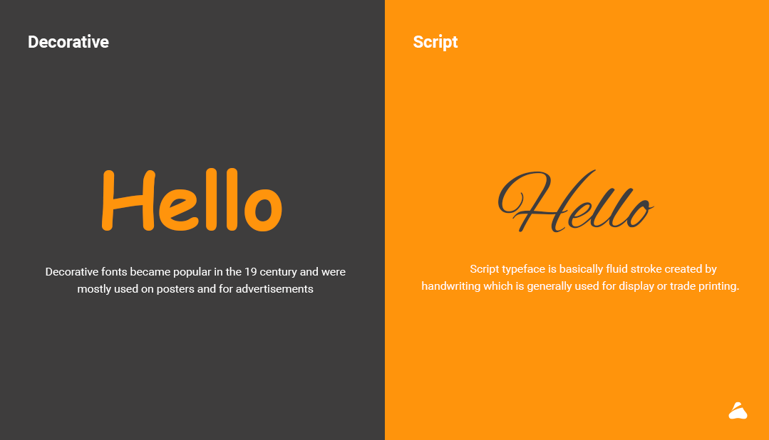
Decorative
Decorative fonts are also known as ornamental or display fonts. They became popular in the 19th century and were mostly used on posters or advertisements. The main aim of a decorative font is to serve decorative, elaborate and beautiful text. Decorative fonts quickly catch attention and makes text easier to perceive and fascinating. Debby, Arcadia, Bellico etc are decorative fonts which are basically used for posters and advertisements.
Script
Script typeface is basically fluid stroke created by handwriting which is generally used for display or trade printing. They are perfect for invitations, greeting cards or expressive texts. They are classified into two types; formal scripts and casual scripts.
1. Formal scripts
Formal Scripts connects to each other in fluid format. They look graceful so you will find them on greeting cards , invitation headers and similar . To find out more about scripts , refer this article https://www.fonts.com/content/learning/fyti/typefaces/scripts
2. Casual scripts
Casual Scripts are mainly made to look friendly and engaging. Their strokes can be connected and their mood tends to be warm, personal and relaxed.
Technical terms in typography
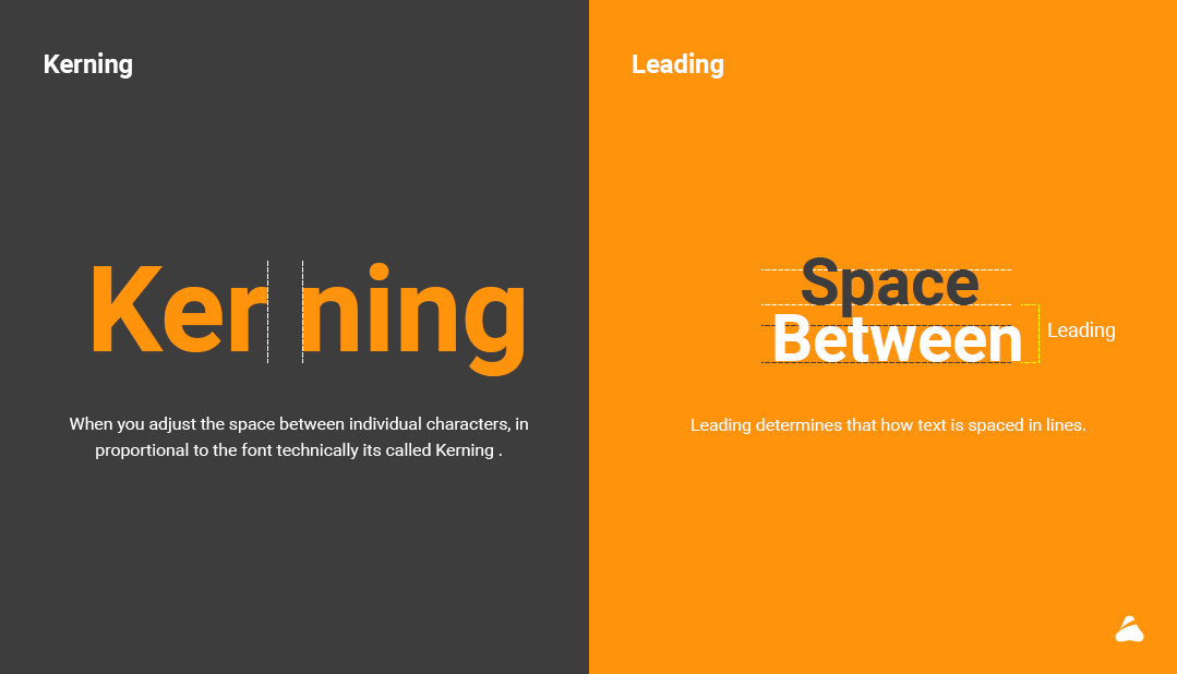
Kerning:
When you adjust the space between individual characters, in proportional to the font technically its called Kerning .
Leading:
Leading determines that how text is spaced in lines . I have created reference image below in order to visually understand the leading better . Content which has multiple lines to read there we need to take care of Leading.
Line length:
Line length is the width of a block of the text, usually measured in units of lengths like inches, points or in characters per line. A block of text or paragraph has a maximum line length that fits a determined design.
Tracking:
Tracking is generally used to fill a space that’s larger or smaller than the current one. It should suit the type’s parameters or to make a single word seeming airy and impressive. Changing the tracking can hamper the readability, and can be difficult for the user to read.
Though basic typography is interesting, you need to know the proper usage of the fonts and its shades to make it more appealing and enchanting to the reader or the user. You can learn advanced typography later so that you can strike a good deal for your business by impressing your clients through typography.
In my next article I will be covering some tips and tricks regarding usage of typography in UI . I would love to hear your thoughts and feedback on my article.
Still confused with UX? Where to start? What to refer? This article can guide you to know UX learning sources, will help in some basic UX Design concepts, and a quick guide to begin your journey with UX Design.
Of late, I have been observing that I spent a majority of my mentoring time to guide newcomers/freshers in UX. I tried my best to answer on social media, one on one communication and also when I was hiring UX Designer for my design studio.
Though there is lot information available about UX on the internet, it still lacks the clear, quick & focused guidance especially for newcomers. So, I decided to make a short article on this. This article can be useful for people who are looking to start or shift their career to UX.
Let’s start with some basic & typical questions.
What is UX design?
This term is discussed & explained several times. In recent years, this is one of the most searched keyword on the internet by businesses. For UX – there are various definitions available on the internet. Let me share what I think is easy to understand and also gives a clear idea about the term UX.
“User Experience” encompasses all aspects of the end-user’s interaction with the company, its services, and its products.
“User experience (UX) focuses on having a deep understanding of users, what they need, what they value, their abilities, and also their limitations. It also takes into account the business goals and objectives of the group managing the project. Best practices of UX promote improving the quality of the user’s interaction with and perceptions of your product and any related services”
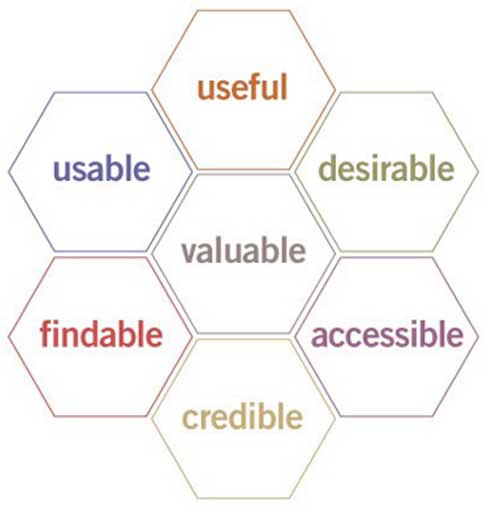
Peter Morville represents User Experience beautifully through honeycomb below
User Experience includes everything that contributes to physical & mental experiences of the user while using the product or service. It may include user’s journey, information flow, content text, videos, images, graphics, interfaces, colors, interactions with the products/services.
How can we create good User Experience?
Elements of Good User Experience Design
Building a good user experience is neither a linear nor a one time process. As a continuous activity, successful UX design requires the involvement of different departments in business with the design team. At some point in time, these different departments and people directly or indirectly come in contact with users through their product or services.
Following are the step by step practices that are involved while creating a good user experience.
Every step requires different expertise, but a most of the times, one person may cover several steps depending on the expertise & experience they have.
Collaboration and Information gathering
Analysis: Business, Product and Competition
User Research
Solution planning and Strategy
Sketches, Wire-frames and Prototyping
Early Testing
Iteration & Refinement
Visual Design
Code Development
Monitor and Evolve
Project Management
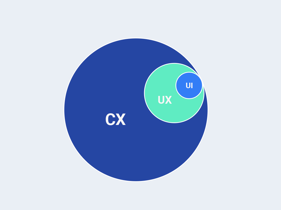
UX, UI & CX – What’s the difference?
Mostly people opt UX, because they love designing. We need to understand that UX starts with research followed by analysis and strategy. UX Designers invest their majority of time in finding solutions, documentation, dealing with wire-frames, decision making & more logical stuff.
CX, UX & UI — from bird’s eye view
UI design on the other hand focuses on visual design or skinning the wire-frames, where the creative designer plays with colors, shapes, layouts, typography and more.
Customer Experience (CX) includes almost everything : UX + Advertising + Branding + Sales process + business strategy + pricing + after sales service + support and other things as well. So scope of CX is much wider than UX, but both are interconnected to each other. Its becomes essential to have a seamless experience for users when they use the product, before they buy it or after they buy it.
Who can get into UX design?
Do you love to solve problems through research, analysis & design?
Are you passionate enough about your UX career?
If there is a positive response to the above, then YES, UX is for you!
Your enthusiasm could be the first step for you, but you need to understand that there is a bigger responsibility on your shoulders when you position yourself for UX.
I have seen a lot of people shifting and positioning themselves successfully in UX design, like Web designers, Graphic designers, Consultants, Architects, Interior designers, Industrial designers, User researcher etc.
For UX, moreover to skills, attitude and mindset is very important. There are certain qualities that UX designer must develop within. Maybe in future I will share more about the qualities of UX Designer.
What’s the career path in UX?
UX as a career has two tracks –
1) Technical
2) Managerial
Career path in UX Design
Managerial track is more about managing the people and getting the work done. Whereas technical track is more about handling nitty-gritty of the work. Both tracks are important and require equal potential.
Technical track would be the best choice to start with. As experience increases here, focus can be moved to the managerial track based on management skills.
What are the different roles in UX design?
There are some defined standard roles and responsibilities like UX Designers, User researcher, UX Strategists, Usability Professionals, UX Engineer, UI Designer, Interaction Designer, Visual Designer, Project Manager and so on. It varies depending on the organization structure.
How to start UX design?
The easiest & simplest way is to start as a UX Intern or Design intern, and then become Junior UX Designer. Or start as a graphic or visual designer. If I have make a choice, then more of practical experience will be my first option.
Apart from practical experience, you can please start reading knowledge resources, books, and articles. As a domain, understanding the depth of the UX domain is very much important. And what’s happening in the domain can keep you on track with market trends too.
If you can hire a working professional as a UX Designer (preferably senior), who can reserve some time to teach, nothing is better than that.
There are a lots of good resources you can refer to update your knowledge. Few of them below are as below for your convenience :
How to prepare UI/UX design portfolio as a fresher?
UX Portfolio: A journey from Problem to Opportunity and Solution
Demonstrative skills are very important for an employer when they hire UX professionals. As a beginner, you will face the problem of not having real work to showcase. As a solution, you can initiative redesigning the existing applications. Or you can start a project that addresses the particular real time issues.
It’s good, if your UX portfolio case studies cover the following sections :
Interface designs: Coloured UI with interaction explained
Conclusion & results: Outcome of testing that you conducted with real users.
Hope I have addressed most of the basic important questions you have, if you want to choose UX as a career. I encourage you to start and grow in this interesting field of UX. I wish all the best to beginners and hope that you enjoy this amazing journey of becoming a User Experience Designer.
Steps to conduct research at different level to make informed decisions
This article is continuation of series and first part of this article can be found here
In the first part of this article, we addressed the need of a requirement gathering, analysis in the discovery phase. This article will focus on different steps involved in discovery and how they impact on the UX projects.
As a part of Discovery Phase, a typical UX UI Project involves the following steps.
1. Talking with stakeholders & gathering information
Any design exercise (rather any project) should start with talking to the people who are responsible & involved in different areas of the product. Primary stakeholders are C level executives who are responsible for the business side, the product manager, marketing managers, support team lead/manager, developers, client servicing manager etc.
A quick introduction & project requirement brief is a good start for this step. In my practice, I always believe in knowing the stakeholders personally i.e. understanding from where they are coming in the context of project need. Your understanding of the business requirement, knowing the stakeholder little on a personal level & synergy with them, sets a comfortable environment. A typical set of primary questions helps us to understand the multifaceted structure of a requirement or problem. It’s a very important step and your first chance to understand the business side, their problems, expectations & goals from their perspective.
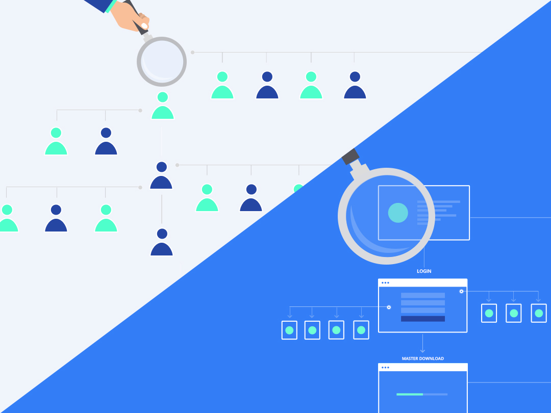
2. Understanding the organization structure
In every product, there is an involvement of employees in production & in servicing areas. Businesses have their own hierarchies, roles & responsibility assigned to each with the relevance of the product. Knowing the organization structure and how the tasks (in the context of product development or usage) are distributed in different roles, reveals the operational challenges, pain points & missing connecting dots.
Organization Structure Map
Form design perspective, the design team should know how a business is linked to the product or application. If design team is designing administrator side (like member management), they must understand the support department structure & challenges. Sometimes, in my experience, I noticed that businesses found some basic issues in their structure and how its linked to the products. Like few roles are missing, few roles combined irrespective of their context of use etc.
3. Business & competitive analysis
Business has some very critical challenges & limitations those needs consideration before planning for solution and strategy. Knowing the client’s business helps design team to get the business vision and empathize all the challenges with its limitation.
Competitors research and study gives design team fast forward approach. To know, understand what others (in the same line of business) are doing & how they are doing. It’s always good to learn from examples those are readily available. It also helps the team to identify and figure out what & how we can differentiate our experience from competitors. Depending on the need and time available, one can dive deeper in this analysis & research method as identified.
4. User research: identifying user types, personas & profile
“Empathy” you will hear this word frequently from designers or design school students. User Research is very important part of the discovery phase. It provides a right perspective designer with precise context.
The design team can only design better if they really know who is going to use it, how and when. Identifying the real users & their types, narrow down the focus of designing activity. The outcome of this step is we know the priority of users & their types. Also, we can easily allocate the functions & task between them.
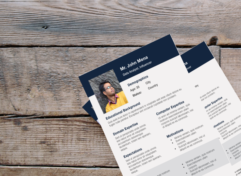
Persona Document (Sample) Created in User Research
Personas with the profile details add further clarity. Like understanding their Geography, Background, Culture, Profession, Goals, Environment, his/her typical daily routine activity etc. Once we identify different personas it helps us to draft user stories, document & use cases to bring more contextual clarity to the project.
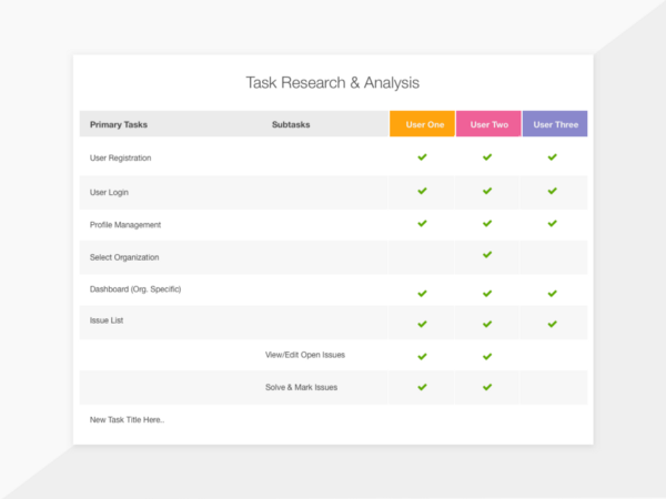
5. Task analysis
This step could be fairly time taking depending on the complexity & depth of usage of the product or application. Task analysis is a step where project team gets to know all the touch points where the user interacts with the product/application. It’s basically users needs & expectation which are converted into functions. Understanding the importance & priority of every function from a different user point of view is crucial. It acts a foundational activity in laying out the information architecture and navigation system.
Task analysis not only helps designing team but also the product owners to get the deep insight into the reality of usage of functional features & their importance. At the end of the task analysis, both design team and businesses can see somewhat blur picture of project scope, approximate volume of work and there by an approximate timeline. The assumptions in this phase what one can make are more accurate than one who does it without performing this. The drawback of avoiding this step can lead to spending more time on the less important part of the product or not paying enough attention to important things for its users.
The drawback of avoiding this step can lead to spending more time on the less important part of the product or not paying enough attention to important things for its users.
6. UX audit & heuristic evaluation: reviewing the existing application
In many cases, design team often perform this step much earlier, before analysis of business competition, user & tasks. However, based on my experience, without getting into real context and empathy, audit or heuristic evaluation can not be effective. In some general or common applications, it’s ok to do it earlier. However complex enterprise applications which have its own breadth &
In some general or common applications, it’s ok to do it earlier. However complex enterprise applications which have its own breadth & depth can be only audited precisely when an auditor has the fair knowledge of the domain, application, different users and use case scenarios. For e.g. Energy management, internal applications of banks, share market, medical research, Security & Defense (government) etc.
Complete UX Audit could be a lengthy process depending on how one needs to perform it. Heuristic evaluation is the step where an expert in user experience quickly evaluates the usability & other issues in the application. In the same step, UX expert may prepare a list of seen problems & possible solutions or enhancements.
Heuristic evaluation is a fast, quick and comparatively less expensive method as compared to the detailed discovery phase. (charges of UX experts are high as they are seniors in most cases)
Note: UX Audit or heuristic evaluation could be a part of detailed discovery process or can be performed as a stand alone activity. Again it’s a business call how to identify the need of the situation & selection of appropriate choice. UX expert can contribute in making decision making about
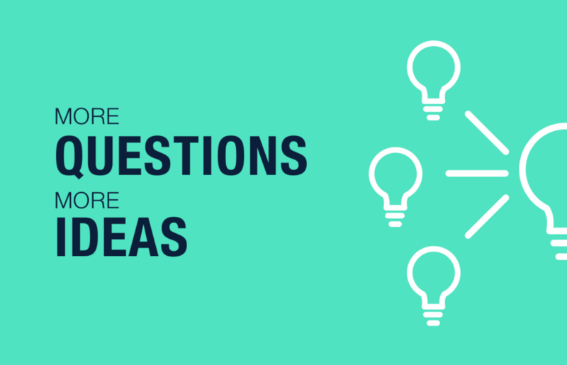
7. Brainstorming: UX team & different departments in the organization
Brainstorm for more questions & more ideas
Brainstorm should not be a noise, it’s an opportunity to think through the findings team got so far. It also helps entire team to absorb the important information to gain further clarity. Different issues & options are inspected by different people from a different angle. And then gather to figure common point before they move ahead. Finalizing the strategy and approach for the design project need solid inputs. How we are planning the activities, what we are prioritizing and why we are doing it — these are all which forms the Strategy document. Sometimes strategy prepared separately or can be part of other master documents. In some cases requirement analysis, strategy & solution documents are more time to consume & expensive than the project execution itself.
Sometimes strategy prepared separately or can be part of other master documents. In some cases requirement analysis, strategy & solution documents are more time to consume & expensive than the project execution itself.
8. Information architecture & navigation system
Organizing & structuring the content in an effective way, labeling to make them easily findable. Information architecture matters and its one of the primary strength (or could be a weakness) of any product or website.
Once the context is set with business information, priorities, users, profiles, tasks etc. Its the time to think about IA (Information Architecture)
Good information architecture not only enable user to find the appropriate information quickly but also make them feel empowered while performing a particular task in the application in a much smoother way.
9. Strategy
If you notice, by following the above steps, the big picture is already getting in shape. A product design team can now figure out the strategy if they understand the business goals, users persona’s & stories, technological constraint, critical success factors, competition, priorities etc.
A method or plan to achieve the desired result by performing a specific action at a particular time is what we can define as a strategy.
The strategy consists of all these points which are especially focused on “What” we are going to do and “How” should it be approached & measured.
Any meeting or exercise is complete if we do not have a solid action plan. And a solid action plan should not get into execution unless it is agreed by decision makers. Getting an agreement on what and how the further execution will be handled with a delivery schedule is important to avoid future conflicts. In this steps along with the project scope, strategy, solutions, timelines, deliverables, commercials & other terms to be documented and agreed in black and white. It is always best to face any type of conflicts or gaps earlier than the later stage.
Note: In depth research & analysis in discovery phase are the right fit for mid size, big & complex applications. Here the challenges are critical & expectations are very high. Expecting high & accurate results without in depth discovery is not a realistic expectation. The shallow approach in discovery has its pitfalls. However simpler and smaller products may adapt it depending on the time constraint.
In the above article, I have tried to mention all those points what I have experienced and remember in my design career. Of course, there is no specific step or method that is fit for every project. As we know it’s an iterative exercise.
More we DO, more we LEARN. More we are AWARE while doing, there we achieve the balance!
I would love to hear your experiences, feedback & comments. If you have any question or think we need a quick talk about your ideas, I am eager to get connected. You can contact me via Twitter or LinkedIn or through our company website Prismic Reflections®
Finding small details in the big picture: analysis & research in UX design projects
In the first part of this article, we will address the need of a requirement gathering, analysis, and discovery phase in UX projects. This article will more focus on different steps in the discovery and how they impact on the UX activities.
A couple of weeks before I went to a mobile shop with my friend for buying a new smart phone for him. Well, yes, we didn’t choose to do it online. My friend wanted to actually feel & experience the phone before he actually takes the decision.
To summarise this story, we tried two shops one after another. And the biggest difference between two different shops was the shopping experience. The 1st shop was having more varieties & staff to attend us, whereas 2nd shop was having very few people but with the right approach. One of them (from the 2nd shop) started with asking right questions to us. Which actually helped us to know our own requirement & expectations clearly. He also helped us to weigh appropriately in between (smart phone) features, configuration & prices. Finally, the quick talk with smart sales person led us to get the product which was much closer to our needs, expectations & demand.
No doubt, sales person in the 2nd shop was smart, however, a quick process he followed was important. He did a quick a Discovery before he actually starts offering or selling.
Life is too short to build that nobody wants!
We can easily map the above very common & simple experience to the world of User Experience (UX) Design. Lack of discovery there are greater chances of reaching the conclusion or point where project team realizes that they have built something that is either “Not Enough” or “Too Much” for the users.
“Achieving a perfect balance between what user needs what business intending to provide with their goals aligned, is an Art!”
This article will quickly address the need of Requirement Gathering & Analysis, which is typically part of our discovery phase. The next series of this article will be focusing on different steps involved in the discovery.
What is requirement analysis, research & why it’s needed?
Discovery phase includes requirement gathering, analysis & research.
As the term itself explains, RA (Requirement Analysis) includes various type of information collection, research, analysis and streamlining it by different methods.
Analysis means breaking down complex structure of information into smaller pieces those are easy to understand.
It becomes an essential part of UX project for the following reasons,
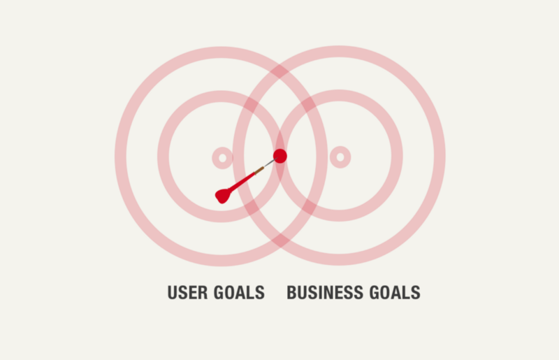
Goals
Identifying definite goal in UX project is really crucial and project without a definite goal can go into an infinite loop of iterations & revisions. Analysis & Research can be used to identify & define the definite goal of the project. Goals can be of two types i.e. User Goals and Business Goals. Defining some measurable metrics to both the goals can add great clarity to them.
Scope of work
Though user experience can be continuously evolving, one must draw the boundaries to the efforts, team involvement and finally timeline & commercials. Research helps to bring some important facts into the light so we can prioritize the goals to execute them as per the management agreement. It gives a clear idea about the efforts & timeline upfront before we begin the activity.
Strategy
This information not only helps us to identify & scope but also gives solid and logical reason to adopt a particular approach or strategy for the design process.
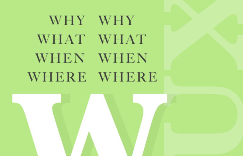
Information & Research data answers very basic and important questions to the UX team, like Why are we doing it? Whom are we doing for? What supposes to be done and at what point in time?
The success of any UX project depends on solid understanding & identification of the right “Wh” questions. We may find multiple questions under each category, picking up the most appropriate & important question is important here.
Documentation
All the documents & files produced in RA process helps entire team across the lifecycle of the project to stay aligned & focused with an ultimate goal of the project.
It really saves the time, cost and effort since team knows what are the findings from the user, business, and competitive research. Having a goal, work scope & strategy in place helps the team to work on the precise set of deliverables that is going to really matter in the project success.
As a part of Discovery Phase, a typical UX UI Project involves the number of steps. We will look into them in the next part (II) of this article which will be released soon.
I would love to hear your experiences, feedback & comments. If you have any question or think we need a quick talk about your ideas, I am eager to get connected. You can contact me via Twitter or LinkedIn or through our company website Prismic Reflections®
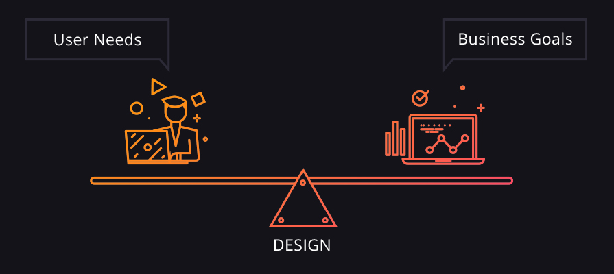
Despite the size of the business, small or large enterprises, every business strives for growth & betterment. It could be in revenue, client satisfaction, market value, brand image, employee satisfaction or in any other area.
This blog post will focus on the power of strategic design and the need for designing complex systems those plays a pivotal role in speeding up business processes. Also, to make this article more focused towards enterprise applications specifically, we will for now, keep the consumer applications excluded.
This is not for those who want to learn UX/UI Design but interested to know how to use design expertise to make the business process more efficient and profitable.
What is an Enterprise Application?
Enterprise Application (or software), in simple words, are those applications, utilities or tools which are made for a specific set of users within the organization or for another organization/businesses to solve problems and complete the specified tasks in their operations. (business to business and or within the business)
For example, you can consider, back-end system for call centre staff, HR Management, Billing & Accounting software, Patient record tracking & management in hospitals (CRM), Trading software in financial technologies, LMS for corporates, email marketing systems, project management tool, ERP, Messaging & Collaboration system etc are all enterprise applications.
Need for design/redesigning the UX/UI for enterprise applications. A big why?
There is no more secret that high-performing companies from Fortune100 have put users & their experience on top in their priorities. There must be a good reason why these big brands came to this conclusion after investing a lot of time, money & efforts in research.
Just not to follow this conclusion blindly, we will look into the WHY there is need to design/redesign overall user experience through strategic thinking.
1. Feature/System Centric Vs User Centric platform
There was a time when tasks were performed by humans. Information technology and e-commerce boom excited businesses to automate all possible manual work through software systems.
In today’s world, for almost everything, there is an app or software system to accomplish. Automation, as a basic need, is already met. All the systems & software are coded and available either in the repository of codes, just to plug and play. So what’s the challenge now?
I believe its the experience – User/Customer experience. And there are we and market leaders are focusing. It’s a big shift of any software application from being feature rich or system centric to experience rich. Finally, everything is boiling down to user experience, how usable, effective, satisfactory, delightful & unique it is than other 10 similar options available in the market.
2. Efficiency matters
How businesses use their human resources efficiently? And how efficiently human resources use their time? In today’s competitive world, the efficiency of every employee, when he/she perform a particular task within the organization affects the whole business process. Design for efficiency is the technique can remarkably improve the efficiency of the user.
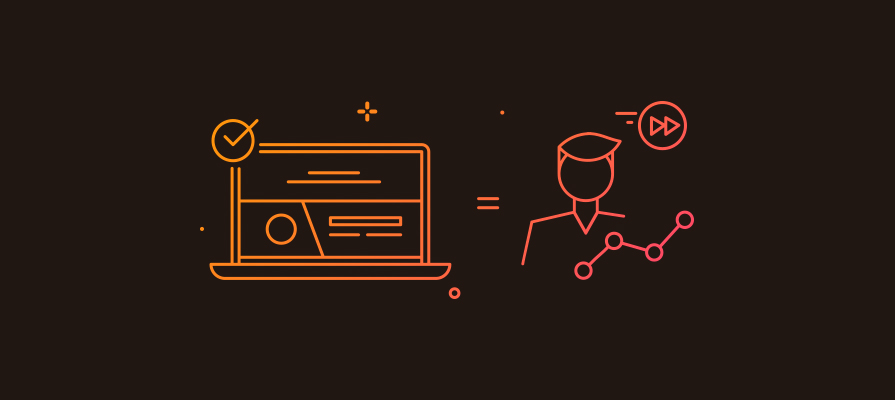
3. Productivity improvement
All businesses are investing in different programs, training sessions and methodologies to improve the productivity of employees. The tool that they use, (in the context of this article, a software application) can affect productivity ratio a lot. If its designed for maximum productivity (for e.g. minimum steps with more logical mapping to use cases to complete the task) more production or processing can happen in much lesser time. And that finally save the total number of resource engagement cost remarkably on a monthly or yearly basis.
In our observation, where we have consulted or redesigned the software applications, reported the improvement in productivity of users from 10% to 30%.
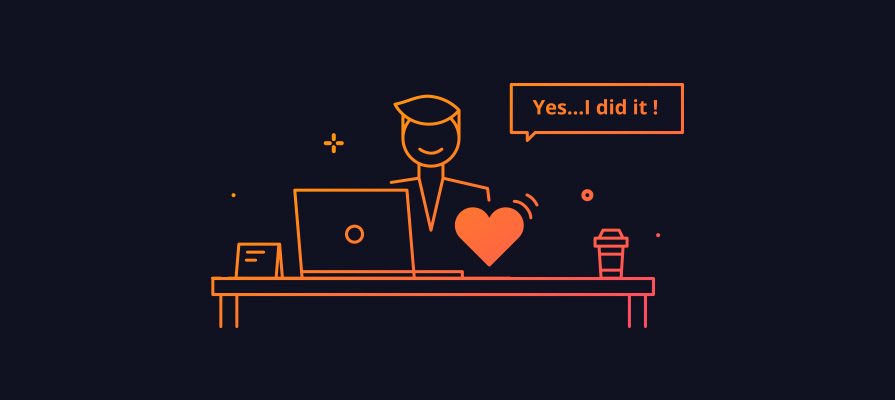
4. Sense of satisfaction
I get that when I swipe to the right on a task on my to-do list. Yes, its done when I wanted it! Studies have proven that satisfaction from small things leads to reduce the mental pressure and keep people away from depression. If an application designed in such way, to present the whole bunch of long task cue, broken into a small task that can be easily doable. Every completion will generate a sense of satisfaction in the team. More satisfied people with the work, more serenity in business place and culture – its a straight connection.
5. Employees are humans
If employees love what they do, they deserve to love the way they are doing it. Love is at the core of our existence and basic need of every human being. The more easy, simple, joyful and humanized systems are, more people will fall in love with that. Imagine if your teams like the way they perform their task and the way the application is communicating with them in between? Isn’t it just awesome?
6. Cost of iterations & revisions
It is often observed that when people start using software they have some feedback. One cannot build software, within the budget, that is just perfect for every use case. However, with the systematic user-centered analysis and design approach we can assess the requirement upfront, prioritize them and build something which will be much closer to user’s expectation & the way they are comfortable to use it. Thereby cost of possible iterations and revision in later phases can be reduced significantly. So your upfront investment in user-centered design can significantly save later recurring expenses in maintaining or refining it.
7. Cost of training & support
Providing detailed training for complicated software is a costly affair. The complicated software can also lead more customer queries that put the load on customer support team.
No one ever required detailed formal training for using Facebook, Whats app or YouTube (of course these are consumer app & not an enterprise app) These social platforms are best examples of intuitive, easy to use & highly engaging applications. Teenager to senior citizen performs many complex tasks with these social applications flawlessly just by using a couple of times.
The secret of the success of such applications is overall engaging user experience and importantly very simple & well-informed design.
8. Balancing is an Art!
Feature rich or system centric platforms are often built by taking business needs into account. During the phase of development, its very rare that development team focus on real users, user research & their feedback’s. Everyone rushes to the functional testing, code optimization, and other development/technology centric decisions, On the other hand, design-centric process, focuses on User goals in line with Business goals and draw a solution by balancing them. Technology & Features comes in later stages if it has been identified in the research based on real usage by the user in the business process. One can really control the complexity & depth of the feature while taking user tasks, their priorities & other related factors.
The solution that only focuses on the business side and ignores the user’s concern, fails to achieve business goals due to friction in operations & production.
9. Design for error: avoiding high risk in critical actions
Good design & bad design is just not connected to more conversion, ease of use or customer delight but in some cases, it draws a line in between life and death. A very well known incident of B 17 Aircraft in World War Two. The landing gear and flaps control knows are identical and very close to each other. Here there was the high risk of accidentally operating wrong control.
In such cases, significant importance, time & effort should be put to consider all the possible errors and solutions to avoid or recover from these errors. If you observed your business and operations carefully, you can find very critical actions that invite huge risk in case of wrong selection by a user. A good design will be always backed up with necessary recovery options.
10. Profit by DESIGN
As reported by Design Council UK, according to research, design directly and significantly improve sales, profit, turnover, and growth.
“Every £100 a design alert business spends on design increases turnover by £225.”
~ Design Council UK
Design-led businesses who use and value design can have a competitive edge over the rest. So design is not just related to aesthetic uplift or cosmetic surgery anymore.
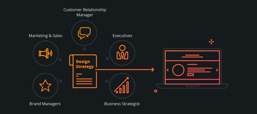
A strategic & user-centered design approach begins with taking inputs from various departments within the organization. It is a multidisciplinary design approach where Marketing & Sales, Business Development, Product Managers, Brand Managers, Executives, Customer Relationship Head, Business Strategist all these people contribute in defining the design strategy and critical success factors of the project. So the outcome ensures that it is not missing the 360-degree overview and consideration from every perspective before going live.
Great products come from great ideas, ideas are born out of the passion for solving the problems. And one can only identify a problem by looking at who is facing it (problem) i.e. the user. Design thinking is a proven way of solving user problems effectively.
I hope you enjoyed reading & find this article clarifying your doubts why one should rethink about designing an enterprise application. I have covered only a few important factors those are crucial from the business perspective. If you have any suggestions, those are welcome. Don’t forget to place your feedback.
In my next article, I will try to focus on the process (HOW) for designing an enterprise application. It will be a broader overview which will address steps, milestones and important factors that business should consider when they are undergoing design/redesign exercise.
If you have further question or need assistance from an expert, please Contact Us or get connected with me on my Twitter account
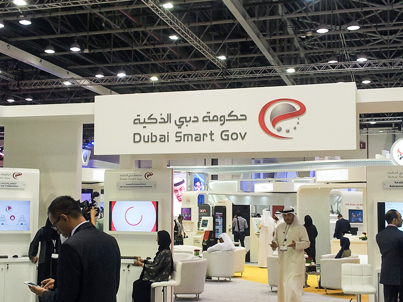
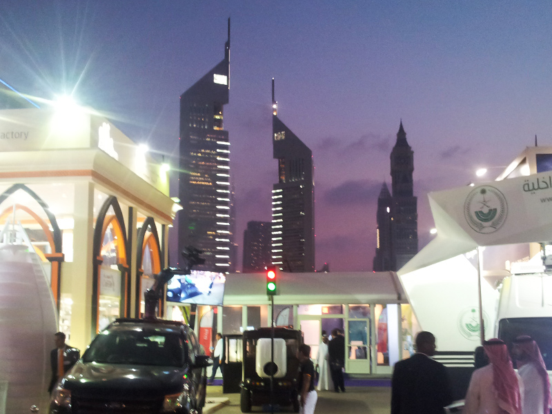
Prismic Reflections® team is just returned back from their fantastic trip to Dubai.
We visited GiTex 2015 at world Trade Center Dubai, last week.
Future of technology on display was at Gitex 2015, 35th?Technology week at Dubai. Its a gateway to the Middle East, Africa & South Asia’s ICT Industry. Innovative UAV, Robotics, 3D printing, business automation & autonomous vehicles. GiTex is the place where all business leaders, global visionaries from world’s leading companies come together. Its the place where you can explore business opportunities, ideas, your future business partners & customers. You can demonstrate your ideas & business to different people coming from all across the globe.
Me & My Partner Swarup visited GiTex last week to meet entrepreneurs, brands, businesses & leaders to explore the possibilities how Prismic Reflections® can contribute?to?improve their?digital product’s user experiences and take them to the next level.
During our 5 day trip to GiTex, we met lot of businesses leaders from different domains like software, IT, Banking & finance, Healthcare, Agriculture, Food, Education, Government and so on. It was quite exciting to see the value that these businesses are bringing together to contribute into the ecosystem of UAE and there by Global Economy. It was also inspiring to see businesses are openly collaborating with each other to explore the partnership opportunities to achieve high pace & sustainable growth.
?In my visit, I met few aspiring brands & business leaders like Saycle, Anazana, Devision, Firecart, 3D Printer, Xilopix, SOTI, and many more.?I was amazed by the revolutionary solutions these companies?are bringing to the society.
India’s contribution to the Software & technology domain was always been huge. No wonder I saw many of software & tech companies from India here in GiTex, which made me feel at home 🙂
However, I saw most of the companies brought inspiring & innovative ideas in form of products along with their services. Its fantastic that product mindset in evolved drastically in service based companies.
All the ideas, solutions & values brought by businesses & innovators surely seems to shift whole customer experience to the next level. Lot of different & complex challenges can be met with the use of technology based solutions where technology does the all the heavy lifting work and humans can enjoy?to the next level of experience by giving more comfort, ease and sophistication in day to day life.
Our meeting with business leaders & decision makers for transforming their software & platforms into better user experiences was great learning experience at both the end. Few of our meetings were turned successful and gone to the next level where Prismic Reflections® will be engaged in crafting UX for their digital products. We are quite excited to begin with these opportunities and hoping to create big difference in the digital space?with highly usable, engaging & customer user products.
Overall it was great experience at GiTex to observe different business, ideas & importantly people coming together under one roof. Yes, its all about the people ? Humans. Technology can not rather should not replace Human interactions with each other. Instead, technology should compliment and bring more awareness, sophistication and improve the real life experiences. This is exactly what happened at GiTex where we met & interacted people face to face,?though it was a tech event- such a good experience.
One, who is in the technology space, should not miss the event. Like every year, GiTex was a great initiative from UAE’s government, held in Dubai, which will surely take UAE’s & Gobal Economy to the next level.
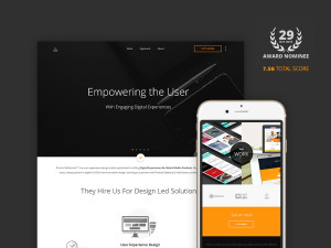
CSS Design Awards (CSSDA) is an international web design and development awards platform that honors and showcases curated & handpicked freelance designers, studios and agencies for work that pushes the boundaries of creativity, functionality and usability. Nominees & winners are selected by esteemed panel of experts & industry leaders, Sr. Designers, Sr. Developers,?Consultants & Creative peeps on the planet.
Our whole 6 months (actually more than that) exercise turned well when we are done with final output what is there live on Prismic Reflections®. Of course the hard work, dedication & consistency when we were working on our own website,?without disturbing the client’s project, is?proved worth now.
If you ever wonder how we managed to create this, you can go through my this article?on medium which explains the entire process of crafting our own web presence.
Being nominated for awards is not new for Prismic Reflections®. However, getting nominated again and again is nevertheless great & inspiring for us to keep doing great work.
I would really appreciate if you can spare some time and vote for our website on?http://www.cssdesignawards.com/sites/prismic-reflections/27337