All posts by Swarup Bagul

About Swarup Bagul

Co-Founder of Prismic Reflections® India - a design studio that focuses on User Experience & Brand Communication Design. Head of Experience Design, Strategy & Co-Founder with over 17+ Years of experience in creating Digital Experiences to help people, businesses, products & brands to effectively communicate to their audience.

Landing Page Design to Drive Conversions – UX Tips for Marketing

In the digital marketing landscape, landing pages play a pivotal role in converting visitors into leads or customers. A well-designed landing page can significantly boost your conversion rates. Following are the essential elements and best practices for designing landing pages that convert effectively. .


Understanding the Purpose of a Landing Page

A landing page is a standalone web page created specifically for a marketing campaign. It is where a visitor “lands” after clicking on a link in an email, ad, or other digital location. Unlike other web pages, a landing page is designed with a single focused objective – a call to action (CTA).
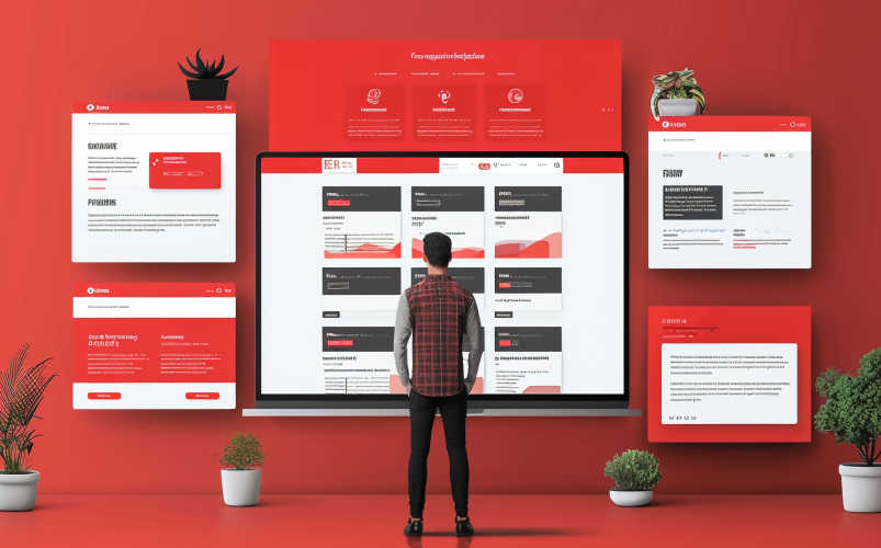
 

Photo by freepik.com

Key Objectives of a Landing Page:

  • Lead Generation: If the training data includes biased information (e.g., past hiring data that favoured certain demographics), the AI might learn and perpetuate these biases, leading to unfair hiring practices.
  • Sales: Encouraging visitors to make a purchase.
  • Event Registration: Signing up visitors for webinars, events, or trials.
  • Promotion: Highlighting a special offer or product.
 

Essential Elements of a High-Converting Landing Page

 Engaging Content Architecture

– Start with a compelling headline and subheadline.

– Provide clear, sequential information that builds on the visitor’s interest.

– Use logical sections to break up the content.


Meaningful Yet Hooking Copywriting

Your copy should be both meaningful and engaging, hooking the reader’s attention while delivering valuable information. It should highlight the benefits of your offer and motivate users to take action.

– Use clear, concise language that speaks directly to your audience.
– Use action-oriented language.

– Highlight key benefits and solutions to common pain points.
– Keep it short and to the point.

– Include a strong call to action that encourages immediate response.


Contextual Visual Design

Visual elements should enhance your message and create a compelling visual story that resonates with your audience. Use images, videos, and graphics that convey the nuances of your offer and help visitors relate to your message.

– Use high-quality, relevant images and videos.

– Ensure visuals are directly related to the content and support the message.


Avoid Distraction

To keep users focused on your CTA, eliminate unnecessary distractions. Remove any elements that don’t contribute to the main goal of the landing page.

– Remove navigation menus and extraneous links.

– Keep the design clean and uncluttered.

– Use white space strategically to direct attention to key areas.


Simple and Intuitive Form

If your goal is lead generation, a form is essential. It should be simple, intuitive, and only ask for necessary information.

– Limit the number of fields to reduce friction.

– Use a clear and concise form title.

– Provide context or instructions if needed.


Trust Signals

Trust signals such as security badges, guarantees, and testimonials can alleviate any concerns visitors might have and build credibility.

– Display security badges near the form.

– Include customer testimonials or logos of well-known clients.

– Highlight any money-back guarantees or satisfaction policies.


Best Practices for Designing High-Converting Landing Pages

Photo by freepik.com


 Keep It Focused

A landing page should have a single, clear objective. Avoid distractions by removing navigation menus and links that could lead visitors away from the page.


Optimise for Mobile

With a significant number of users accessing the internet via mobile devices, it’s crucial to ensure your landing page is mobile-friendly. Use responsive design to adapt to different screen sizes. Ensure fast loading times by optimising images and reducing unnecessary elements and make buttons and forms easy to use on small screens.


A/B Testing

A/B testing involves creating two versions of your landing page with slight variations to see which one performs better.

You can test one element at a time (e.g., headline, CTA, image). Use tools like Unbounce or Optimizely to run tests and analyze results to implement changes based on data.


Use Analytics

Tracking and analysing the performance of your landing page is essential for ongoing optimization. Set up conversion tracking using tools like Google Analytics to help you monitor metrics such as bounce rate, time on page, and conversion rate. Use insights to identify areas for improvement.

Take away!

Designing a successful landing page requires a clear understanding of your audience and objectives. By focusing on essential elements like engaging content architecture, meaningful yet hooking copywriting, contextual visual design, and minimising distractions, you can create landing pages that not only attract visitors but also convert them into valuable leads or customers. Make sure to test and optimise your landing pages to ensure they deliver the best possible results.

By following these best practices, you can enhance the effectiveness of your landing pages and achieve your marketing goals more efficiently. 

Looking for an agency to help you design your landing pages? Let’s connect!
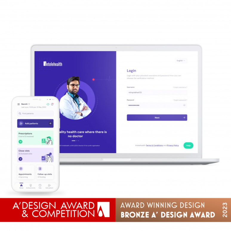
Prismic Reflections® Wins the PrestigiousA’ Design Award

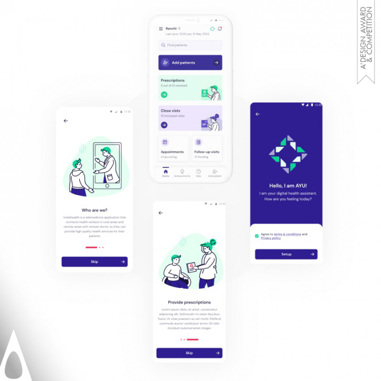
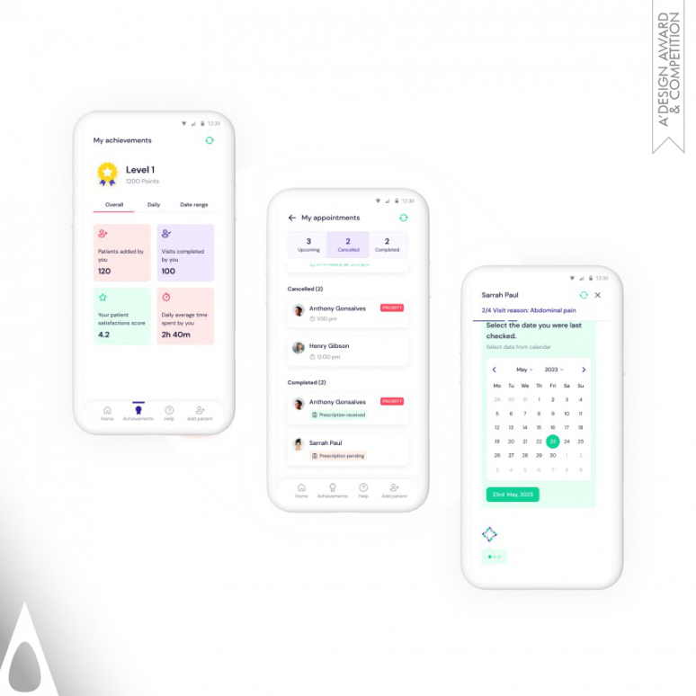
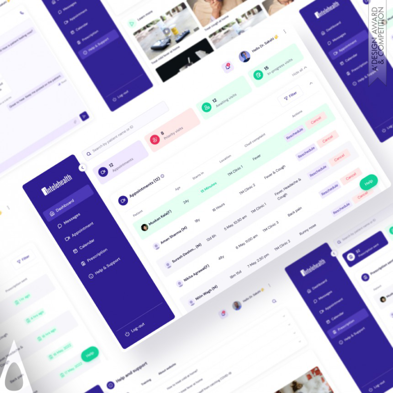
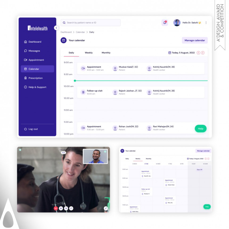
We are thrilled to share that the Intelehealth Mobile & Web Application, designed by Prismic Reflections, has received the Bronze A’ Design Award in the category of Interface, Interaction and User Experience Design.

The esteemed Grand Jury panel of the A’ Design Award & Competition, consisting of distinguished press members, renowned designers, esteemed academics, and notable entrepreneurs from around the globe, has acknowledged our outstanding skills, innovation, and commitment.

Link our our winning entry, Intelehealth Mobile & Web App Design Award https://competition.adesignaward.com/design.php?ID=148944

A’ Design Award and Competition is one of the World’s largest, most prestigious and influential design accolades, one of the highest achievements in design. A’ Design Award Winner Logo, symbolizes exceptional design excellence in your products, projects and services. A’ Design Award, recognizing the excellent and original design work from across the globe, is one of the highest achievements in design, a source of inspiration for award-winning designers, artists, architects, brands and design agencies.


Intelehealth is a not-for-profit tech organization that has developed a comprehensive technology platform that Governments, NGOs, and Hospitals can use to deliver telemedicine-based care to their beneficiaries.

Prismic Reflections was engaged to redesign and make Mobile and Web Application to improve upon user engagement, usability & overall user experience.

To view full case study of redesign of Intelehealth Mobile & Web App, Click Here

Future of Augmented Reality – A Designer’s Perspective.

Augmented reality (AR) and virtual reality (VR) are quickly becoming huge areas of technology, with giants like Apple, Microsoft and Google competing to provide the next big AR or VR experiences. Statista predicts that the worldwide virtual reality user base for AR MR VR will reach 443 million by 2025, meaning that it is becoming increasingly important for (UX) designers to know how to create amazing VR and AR & Mixed Reality experiences.


Features of augmented reality

Designing for 3D experiences will require completely new ways of thinking about UX design—and the question is, are you well equipped to tackle this new field of design? (Don’t take that additional 3rd dimension for granted). You must know the difference between ar and vr.

The rapid growth of this space has led to unforeseen innovation through the creation of immersive experiences, NFT’s, crypto and entirely new gateways to Web 4.0 that enhance the world around us—or sometimes take us to a different (virtual) world entirely. That said, these strides have not come without challenges, specifically when it comes to the way in which VR and AR experiences are designed and produced.


Where can augmented reality be used?

Overview:AR and VR need to be easy to use in order to provide users with realistic experiences that wow. Avoiding common usability mistakes and applying the principles of storytelling will help you carefully craft 3D experiences that delight, intrigue, amuse, and most of all evoke the response you intended. You’ll need to engage users in first-person narratives by making use of spatially dynamic UI’s, including gaze, gesture, movement, speech, and sound—often used in combination.


What does augmented reality look like?

AR experiences add a layer onto the existing world, whereas VR experiences transport the user to a different world entirely. Moreover, selecting the right platform (meaning, the devices through which these experiences occur) is hugely important since it’s difficult to optimize across devices and formats. 


Augmented reality in real life

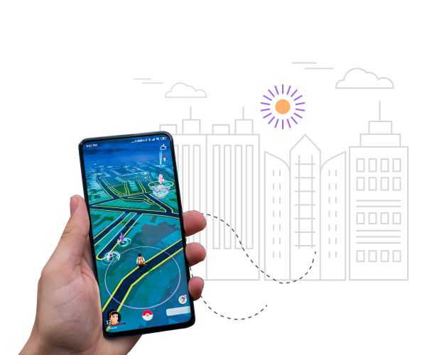
Augmented Reality (AR) acts as a virtual layer on top of the world in front of you and is in a new age of discovery and innovation. While early AR applications depended on a smartphone or tablet, they will soon expand into wearable devices like smart glasses requiring a different kind of UX and design process—thinking outside the confines of a smaller screen.

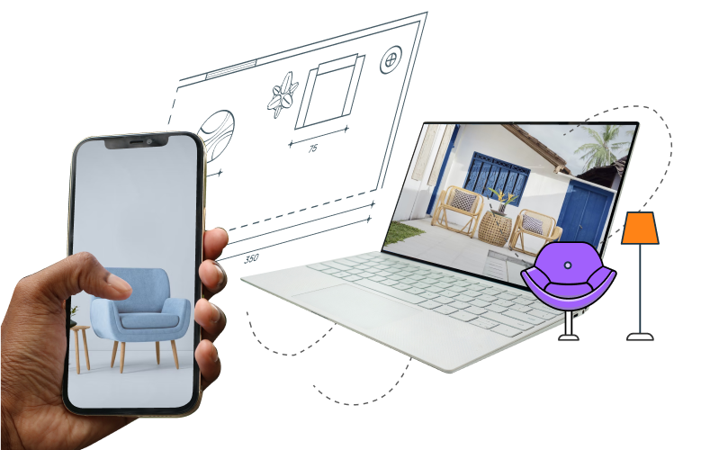
Augmented reality can also be used for knowledge transfer, such as training in industrial environments. Instead of explaining, imagine showing a worker how to do a specific task via in-context video. This opens doors for designers in the e-learning space to create next-generation AR interfaces.


Where is virtual reality used?

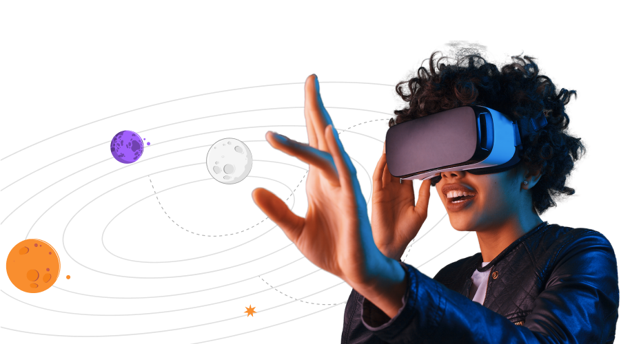
Understand the difference between Virtual Reality, Augmented Reality, Mixed Reality. Virtual Reality Today completely immerses you in a virtual world, and mixed reality (MR), sometimes referred to as hybrid reality, is the merging of real and virtual worlds.

Virtual Reality Examples – VR can be used for virtual offices, products, events like the 2017 Teen Choice Awards, and more. With VR, designers and their clients will be able to preview designs scaled to real, life-size environments and depth, before even entering the production phase.


Can virtual reality substitute for an actual reality?

In early 2017, Forbes observed that “the hype around virtual reality is fading.” Noticeable limitations VR faces are a high price for the headsets, discomfort over extensive use, poor visual quality, and much more. As a result, there is a slow mass-market adoption of VR technology in comparison to AR that is “likely to fare better in the short term.”


Virtual reality in real life

Though VR and AR design come with its own unique set of challenges, such as designing for first-person environments and capturing and/or securing 360-degree footage, producers should use narrative as their North Star when it comes to bringing content to life.


 How is virtual reality used?

Few tips on designing for AR/VR.

  • Remind the user regularly where they are in an experience
  • Increase immersion by including other human senses
  • Minimize user movement
  • Use intuitive gestures
  • When AR is limited, think of VR


Main Author:
Vishakha Agrawal
UX-UI Designer at Prismic Reflections®

Article Contributors
Swarup Bagul
Co-Founder of Prismic Reflections®

Collaborative design for the collective success

A remarkable customer experience is critical to the sustained growth of any business. A positive customer experience promotes loyalty and helps you retain customers.
Customers instinctively compare each new experience, positive or otherwise, with their previous ones and judge it accordingly.

As a new-comer to the family of Prismic Reflections, I got to learn a lot from my experience on the product that I was working on. The task was to re-imagine the platform for personalised property management services for the Homeowner Association (HOA) based out of the United States. I worked on User Research, Strategy, Idealization & Prototyping for web and mobile applications .

During the process, I observed and learned how collaborative design is important and what value it can add in the overall design process and ultimately to the business.


Involving client and his team in the design process

The client usually has knowledge that can contribute to the project a lot – since they are the masters of their game. The briefs themselves or even regular meetings, will not allow us to explore the subject deep enough to have the same knowledge as people with years of experience in a given field.
Encouraging the client to be actively engaged in the design or research process has many invaluable benefits.
The client-base can be further classified in 4 ways-

Top Level Management/C Suit-
Top management have the visibility and clarity of the big picture of the business. Their views and inputs to align the design objectives with business strategic objectives at an early stage is critical for the success of any design project.

Product Owners, Managers & Marketing team-
These people own the product internally. They develop a very deep understanding about the product, its vision, core functions, workflows, technology etc. They define. Decide & control the feature rollout time, testing, backlogs etc along with empathy they have developed for users. Product managers are responsible for different success metrics of the product, internally in the client’s team.

Dev Ops-
Addressing the concerns, constraints on the technical ground in the early stage becomes important for designers if they want to reduce the time in the development process. Technical feasibility of design solutions is something we can expect from the Development team.

End Users / Product Users-
Involving actual users during the design process, may not be at every point but at completion of critical workflows like on-boarding, payment etc definitely saves time at an early stage if designers validate them before it goes to production. Having real users for early stage testing (with wireframes or prototypes), at least for every critical roll-out adds significant value to the outcome.

Working together with the client’s team & real users (or set of people that matches the persona of real users) enables the design team to deepen their empathy around critical success factors (CSF) & validate the product at various stages early on.

Photo by freepik
 

Pros & Cons of Collaborative Design

Pros of Collaborative Design-

  • It helps building solid business empathy & its critical impact areas
  • It brings business team and design team on same page to agree upon one common vision
  • Saves cost by early addressing different constraints to avoid future back and forth.
  • Design is iterative process, however iteration cycles become much fast in collaborative design
  • It brings diversity & sense on inclusion in the team while working together
  • Involving users early in the stage, helps in building deep empathy & early validation of design ideas & solutions
  • It helps in bringing personalisation in experience design at a very early stage.

Synthesizing abstract ideas into concrete design implications is not an easy task. In collaborative design one must be open to receiving feedback and constructive criticism.

Reducing effort is a huge component of improving UI/UX design. People don’t want to have to hunt for information or click on buttons that lead to dead links. They will also choose interfaces that enable them to accomplish tasks in the shortest possible time, and abandon brands that don’t meet these efficiency and ease-of-use standards. It all comes down to these straight points as mentioned below.

There are some factors that may impact on the overall process due to collaboration, as mentioned below.

Cons of Collaborative Design-

  • There are chances teams may often lose the track as different people are involved with different perspectives
  • It becomes a little time consuming exercise as compared to a non collaborative approach.
  • It might surface if there is any mis-management in the inter department which may result in conflict.
  • Some clients/designers assume they have a leadership role.
  • Collaborative design requires very experienced & professional in charge to handle and drive the project in a seamless manner. Such resources come with their own high fees.
 

Conclusion

Photo by Unsplash

Involving the client, their team & users in the design and research process is always valuable. The client has much more knowledge about his business, customers and product, so it is worth using this knowledge as much as we can. Consistent feedback from users & stakeholders can play a pivotal role. Client’s engagement also allows us to make sure that we understand business needs and constraints well, and that we deliver real value for him.

In the end, however we conceptualize it, a customer that is engaged in a project is less likely to be critical of decisions made about direction and design and more likely to feel some ownership in the outcome. A customer who is part of the process is less likely to criticize than one who remains distant as an observer. In my experience, projects with high customer involvement always end smoothly with a sense of mutual accomplishment and that is exactly the process I have tried to follow.

I would love to hear about your experiences & thoughts about collaborative design. If you have any project ideas or would like to understand our process in detail, you can reach out to us here.


Main Author:
Vishakha Agrawal
UX-UI Designer at Prismic Reflections®

Article Contributors
Swarup K. Bagul
Co-Founder of Prismic Reflections®

Article Contributors
Vishal Jadhav
Co-Founder of Prismic Reflections®

UX Strategy and Approach

User Centric Designs are changing the game in every business domain. No matter whether you are a founder of a new startup or a CXO of billion dollar enterprise, UX is in demand almost everywhere!

Well, there could be some who do not agree with me but trust me sooner or later they will be joining the party.

Strategy & Approach — The Key Ingredients of every UX Recipe

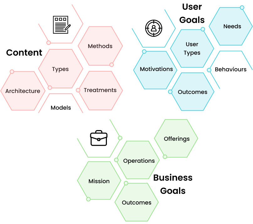
While working on several exciting products for startups, corporates and enterprises, I learnt that it is the “Strategy” which acts as a backbone of every design project. While practicing UX at our design studio we firmly believe that defining the right strategy and executing the same will help you to meet the necessary success.

It starts with a business need or user challenges when every business starts looking for a right team of designers or agencies. The one who have right experience, capabilities and yet can fit in their budget.

Designers should learn and understand these core problems, analyse its core reasons and its repercussions affecting the businesses and their user or customers. Feel free to use necessary UX research methods during initial analysis based upon the success metrics one is aiming to achieve. The core purpose of this analysis is to look for crucial insights which helps us to define our core strategy which needs to be implemented through prototyping or visual experience designing part later in the process. This strategy backed up with real time insights gathered from data collected from various UX research methods is equally essential for internal and external stake holders of project.

responsive design

Clear strategy document ensures clients and decision makers (such as CXO’s) about desired output or results, while same acts like a catalyst for design teams to be innovative and creative to find out answers for “How might we…?” questions. Don’t forget to add the right quantity of empathy at a right time.

Being a team of passionate designers, we synthesise and use the gathered research data to define our UX Solutions and Creative Direction to uplift the overall experience of new age digital products. Take a deep dive of our work over here.

responsive design

Looking at the same data from different chairs and angles has the immense potential to unlock the solutions for diverse problems in product lifecycles. And the best part is it gets better and better as you practice it every time. I think that’s the real fuel to ignite designer’s passion.