Category Archives: UX Based Design

Collaborative design for the collective success

A remarkable customer experience is critical to the sustained growth of any business. A positive customer experience promotes loyalty and helps you retain customers.
Customers instinctively compare each new experience, positive or otherwise, with their previous ones and judge it accordingly.

As a new-comer to the family of Prismic Reflections, I got to learn a lot from my experience on the product that I was working on. The task was to re-imagine the platform for personalised property management services for the Homeowner Association (HOA) based out of the United States. I worked on User Research, Strategy, Idealization & Prototyping for web and mobile applications .

During the process, I observed and learned how collaborative design is important and what value it can add in the overall design process and ultimately to the business.


Involving client and his team in the design process

The client usually has knowledge that can contribute to the project a lot – since they are the masters of their game. The briefs themselves or even regular meetings, will not allow us to explore the subject deep enough to have the same knowledge as people with years of experience in a given field.
Encouraging the client to be actively engaged in the design or research process has many invaluable benefits.
The client-base can be further classified in 4 ways-

Top Level Management/C Suit-
Top management have the visibility and clarity of the big picture of the business. Their views and inputs to align the design objectives with business strategic objectives at an early stage is critical for the success of any design project.

Product Owners, Managers & Marketing team-
These people own the product internally. They develop a very deep understanding about the product, its vision, core functions, workflows, technology etc. They define. Decide & control the feature rollout time, testing, backlogs etc along with empathy they have developed for users. Product managers are responsible for different success metrics of the product, internally in the client’s team.

Dev Ops-
Addressing the concerns, constraints on the technical ground in the early stage becomes important for designers if they want to reduce the time in the development process. Technical feasibility of design solutions is something we can expect from the Development team.

End Users / Product Users-
Involving actual users during the design process, may not be at every point but at completion of critical workflows like on-boarding, payment etc definitely saves time at an early stage if designers validate them before it goes to production. Having real users for early stage testing (with wireframes or prototypes), at least for every critical roll-out adds significant value to the outcome.

Working together with the client’s team & real users (or set of people that matches the persona of real users) enables the design team to deepen their empathy around critical success factors (CSF) & validate the product at various stages early on.

Photo by freepik
 

Pros & Cons of Collaborative Design

Pros of Collaborative Design-

  • It helps building solid business empathy & its critical impact areas
  • It brings business team and design team on same page to agree upon one common vision
  • Saves cost by early addressing different constraints to avoid future back and forth.
  • Design is iterative process, however iteration cycles become much fast in collaborative design
  • It brings diversity & sense on inclusion in the team while working together
  • Involving users early in the stage, helps in building deep empathy & early validation of design ideas & solutions
  • It helps in bringing personalisation in experience design at a very early stage.

Synthesizing abstract ideas into concrete design implications is not an easy task. In collaborative design one must be open to receiving feedback and constructive criticism.

Reducing effort is a huge component of improving UI/UX design. People don’t want to have to hunt for information or click on buttons that lead to dead links. They will also choose interfaces that enable them to accomplish tasks in the shortest possible time, and abandon brands that don’t meet these efficiency and ease-of-use standards. It all comes down to these straight points as mentioned below.

There are some factors that may impact on the overall process due to collaboration, as mentioned below.

Cons of Collaborative Design-

  • There are chances teams may often lose the track as different people are involved with different perspectives
  • It becomes a little time consuming exercise as compared to a non collaborative approach.
  • It might surface if there is any mis-management in the inter department which may result in conflict.
  • Some clients/designers assume they have a leadership role.
  • Collaborative design requires very experienced & professional in charge to handle and drive the project in a seamless manner. Such resources come with their own high fees.
 

Conclusion

Photo by Unsplash

Involving the client, their team & users in the design and research process is always valuable. The client has much more knowledge about his business, customers and product, so it is worth using this knowledge as much as we can. Consistent feedback from users & stakeholders can play a pivotal role. Client’s engagement also allows us to make sure that we understand business needs and constraints well, and that we deliver real value for him.

In the end, however we conceptualize it, a customer that is engaged in a project is less likely to be critical of decisions made about direction and design and more likely to feel some ownership in the outcome. A customer who is part of the process is less likely to criticize than one who remains distant as an observer. In my experience, projects with high customer involvement always end smoothly with a sense of mutual accomplishment and that is exactly the process I have tried to follow.

I would love to hear about your experiences & thoughts about collaborative design. If you have any project ideas or would like to understand our process in detail, you can reach out to us here.


Main Author:
Vishakha Agrawal
UX-UI Designer at Prismic Reflections®

Article Contributors
Swarup K. Bagul
Co-Founder of Prismic Reflections®

Article Contributors
Vishal Jadhav
Co-Founder of Prismic Reflections®

Driven by purpose of empowering users & businesses,
Prismic Reflections® harness the power of strategic UX design: GoodFirms

By creating a strategic & human-centric experience, Prismic Reflections® is on the journey of empowering brands with their designs. It has become one of the trusted and reliable user experience firms delivering intuitive & user-friendly designs. Navigate through the profile of Prismic Reflections® below to gain a fresh perspective on what this business is all about:

Prismic Reflections®: A brief introduction

Founded in 2003, Prismic Reflections® is an award-winning UX UI Design Studio located in Nashik, Maharashtra, India. With their in-depth knowledge and experience in design space, they craft experiences that help companies make an impact in the competitive market space. The business comprises a talented team of thinkers and doers working together to solve the business challenges and simplify their customer’s life by design.

The firm consists of creative professionals who are from diverse backgrounds like Art, Creativity, Product Design, Management & Strategy etc. Prismic Reflections®, by pushing the boundaries in the design arena, have completed 1000+ projects till now. The company stands true to its vision to design experiences that transform businesses in a progressive way. They have won 10+ honors & awards in the last 17 years of their business. By focusing on the right process, technology and market opportunities, Prismic Reflections® follows its mission to become the best global design studio creating a highly impactful design.

GoodFirms research process

GoodFirms is a renowned B2B firm headquartered in Washington, D.C, where different companies are ranked. All the companies on the website are evaluated strictly on three parameters of Quality, Reliability, Ability before finally getting ranked on the website. GoodFirms evaluated Prismic Reflections® on the same parameters as mentioned earlier, and it came to notice that they have constantly been delivering great user experience to various industries.

User Experience Design for innovation, growth & success!

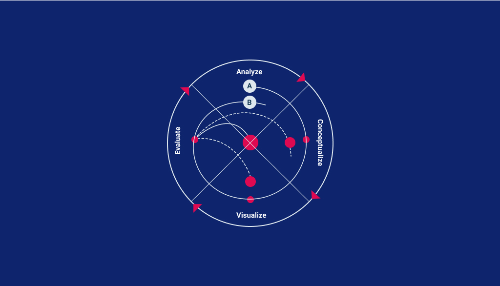
Great products always grab customer attention, and Prismic Reflections® work towards connecting with users by creating empathetic designs. Being a founder-led firm, what differentiates Prismic Reflections® is its ability to empathize with the Businesses and their Users at the same time. The Design process starts with the Discovery phase, with in-depth Analysis of – Business, Brand, Users, Product & the competition. Interviews with the Users and Business stakeholders from various departments (Marketing, Customer Support, Technology, Sales, etc) plays a critical part in gaining a 360 degree view. By defining strategy, architecture and creating an innovative design, the firm has designed digital products for many renowned firms. By creating a user-friendly design, the expert designers’ team empowers brands & helps to meet desired business goals.

Branding is another service offering they are extremely passionate about. Backed by indepth research and analysis, it lays the foundation and clarity in defining the Brand – Purpose, Vision, Mission, Personality, Voice, Positioning and Goals. Prismic Reflections® has worked in the space of digital product design – consumer applications, enterprise & SAAS applications, conversational UX and strategic corporate & marketing websites. Catering services to various industry niches, the firm puts all its efforts together to solve business problems & deliver best in class user experience using design as a strategic tool. GoodFirms spotlights Prismic Reflections® as one of the top user experience (UX) design companies.

Engaging & interactive application designing

Prismic Reflections® forte is to craft engaging experiences backed by indepth research & solid strategy. In a journey of 17+ years, they have collaborated with start-ups as well as established enterprises in tackling challenges like MVP launch, improving user engagement, adoption, conversions, retention & user satisfaction through strategic design.

The team of expert designers focuses on critical thinking, research, strategy & delivering high-quality interface designs. By working closely with business, the firm follows its own process with creativity, art, and science. Additionally, working strategically to create a brand identity for clients, Prismic Reflections® leaves no stone unturned when it comes to helping businesses to connect and communicate with their existing & potential customers. Due to the expertise and User-centric design approach, Prismic Reflections® is on GoodFirms radar as one of the top mobile app design companies in India.

Strategic yet human-centric brand

Working closely with clients, Prismic Reflections® prioritizes aligning brand’s positioning internally (& and then external) with stakeholders by performing various research methods.

Validating the facts with customer research, crafting solid experience strategy for business gives a clear roadmap to follow for desired success scenario. All the efforts backed by research and solid strategy translated into corporate & product websites, encourages the right set of customers to connect with brands and their products in a delightful manner.

So, for transforming businesses with strategic designs and guiding them to surge progressively, Prismic Reflections® is to shine on GoodFirms as one of the top web design companies.

About the author

Anna Stark is a staff writer with GoodFirms – a Washington D.C.-based B2B Research Company that bridges the gap between service seekers and service providers. Anna’s current role includes gauging companies’ performances and their key attributes and putting them into words. She firmly believes in the magic of words and is always on the lookout for new strategies and ideas that companies have gladly embraced, and then helps them shine a light on those to make their identities shine brighter.

Anna Stark

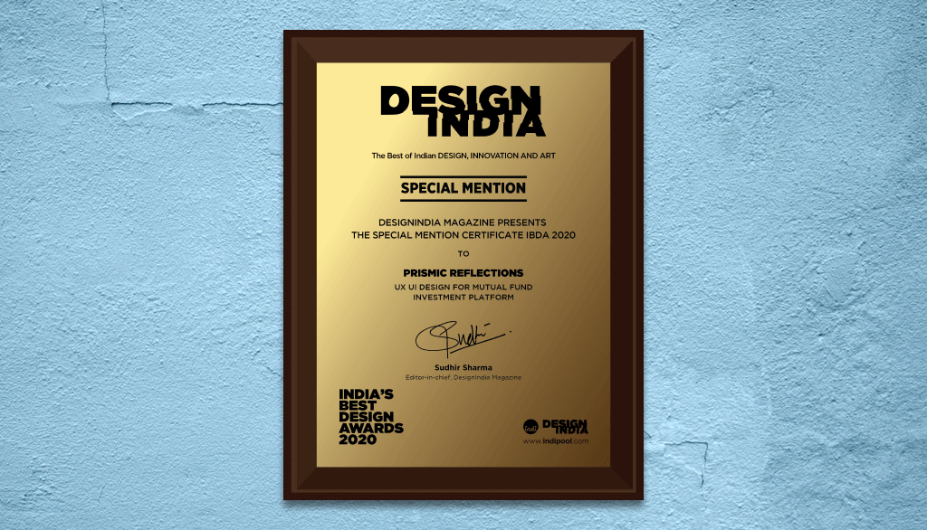
Prismic Reflections® gets special mention from India’s Best Design Awards

Designing experiences for products and platforms is a rewarding experience. It feels good when months of hard work turns into a product that benefits people and businesses. It feels even great when these efforts are recognized by respected people and committees around us.

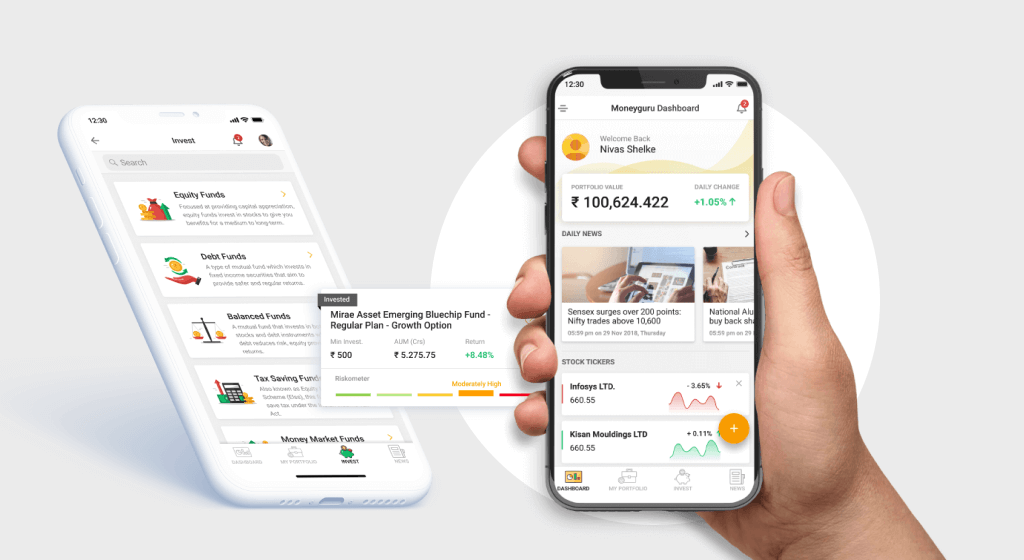
We at Prismic Reflections® are honored to receive special mention from India’s Best Design Awards for designing the experience of MoneyGuru – a Mutual Fund Investment Platform.

India’s Best Design Studio Awards is the first and most respected recognition for Design Studios and Projects for their professional work, business practices and transparency, initiated by POOL Magazine.

MoneyGuru was indeed a very special project for us. With a number of mutual fund investment platforms already in the market, the challenge was to design a unique, intuitive and seamless experience that empowers smart savers with market insights & simplifies overall mutual fund investment experience. How the mobile application is crafted to tackle different challenges, how solutions are ideated, can be viewed here in the case study.

We would like to thank the team at Moneyguru for giving us the opportunity to contribute our expertise in Strategy, UX & UI designing for Android, iOS mobile applications as well as their product website.

It was a true collaboration, where our designers worked closely with the client, right from developing the concept to launching the product through several iterations and final testing. Here’s what Harsh, Managing Director MoneyGuru has to say about us:

“We couldn’t be happier with their services. Their responsiveness and attention to detail when it comes to my feedback was amazing. Instead of blindly executing what I told them, they suggested good improvements to my initial thinking.”

We extend our gratitude to POOL Magazine for recognizing our efforts. This will definitely inspire our designers at Prismic Reflections® to set new creative benchmarks in the coming future.

Design & tech terms every UX UI designer needs to know part II

In the previous article, we talked about the commonly used design terms in “Research and Ideation” category. You can check the first article of this series here if you have missed out.

Here are the next set of design terms, those you will find useful to keep handy when you study foundation as well as deeper in this area.

User-Centered Design

user-centred-design

This iterative design process aims at understanding the user perspective (their thoughts, beliefs, motivations, etc.) for creating highly accessible and usable products for them. Wide variety of design and research techniques are used in this procedure. Also, it involves a mix and match of generative ideas (rigorous brainstorming sessions) and investigative tools ( surveys and interviews ) for a deep understanding of the needs of the users.

Human-Computer Interaction

Human-computer interaction is a systematic study which aims at improvising the overall experience for smooth communication between humans and computers.

Interaction between human and computer should be as friendly as conversations between two humans. Specialized design process, emotional design, and human psychology are its three major integral parts.
Ultimate goals of Human Computer-Interaction are :

  • Understanding the ways of improving user experience
  • Understanding user behavior in order to determine as to how people can use technology

UX Design

ux design

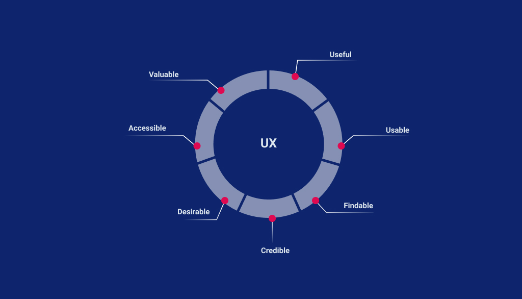
User Experience includes everything that contributes to physical & mental experiences of the user while using the product or service. It may include the user’s journey, information flow, content text, videos, images, graphics, interfaces, colors, interactions with the products/services. It is a step-by-step process which aims at creating meaningful & engaging products & platforms for the end users. User experience design follows a multidisciplinary approach that covers the entire process from branding, analysis, research, design, interaction, accessibility, usability, functional development & frequent upgradation.
We have discussed more in detail about UX Design, elements of UX design & different career options in our article which you can read here.

Lean UX

lean ux

As an Agile development in software development, Lean UX is about creating the design in rapid way, mostly depending on assumptions, to get maximum feedback as early as possible. Unlike traditional or comprehensive UX Design process, Lean UX eliminates in depth activities to arrive at something tangible quick

Some of the major benefits of using this technique are :

  • Cost Effectiveness: Don’t waste your resources in working on a product which isn’t needed in the market. You can easily test your hypothesis by validating every decision.
  • Save your precious time: Due to its collaborative nature, getting rapid and quick solutions becomes easier.
  • User-centric: Focus is on the user and their requirements at every stage of the designing process.

Responsive Design

responsive design

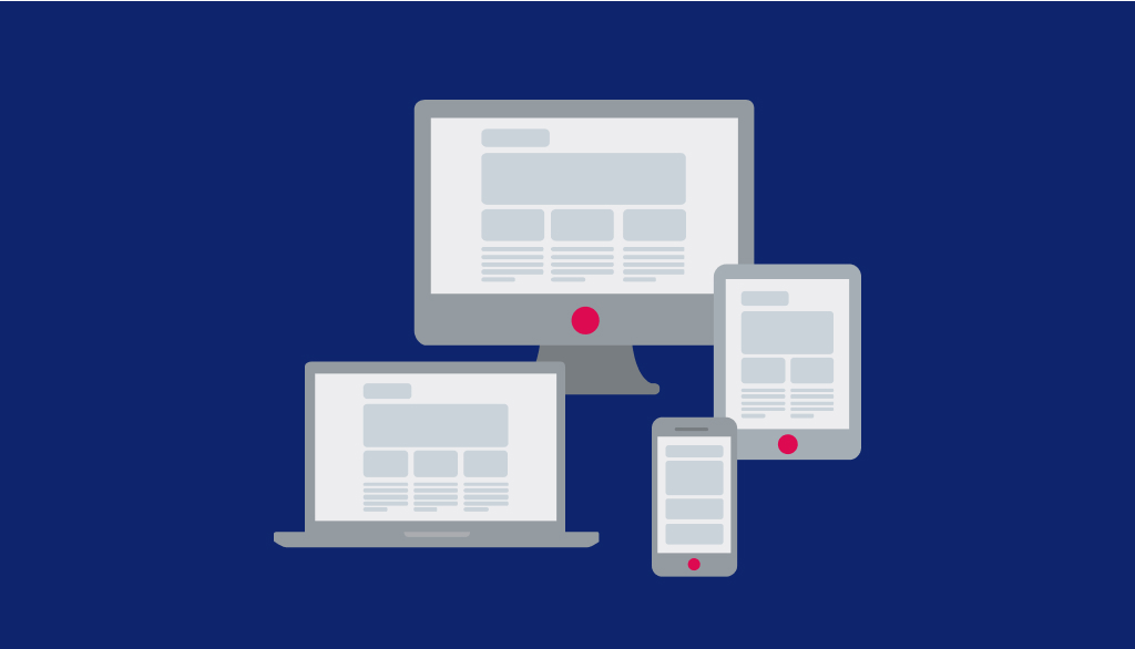
It is a holistic approach which makes use of cascading style sheets, flexible layouts, and images to enhance user experience across all devices. Its ultimate purpose is to refine the appearance of the website according to the orientation and the screen size of the device which the user is using.
This technology is adept at adapting automatically according to user preferences and needs. This helps to get rid of a different design for every new gadget in the market.

Interaction Design

The process of interaction design takes into account like how users will interact and use the product or particular interface or even a particular piece of content. Five major dimensions in interaction design include words, visual representations, time, physical objects and behavior.

Wireframe

Wireframe

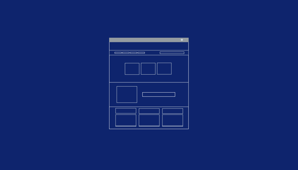
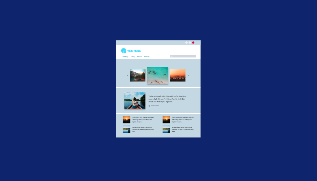
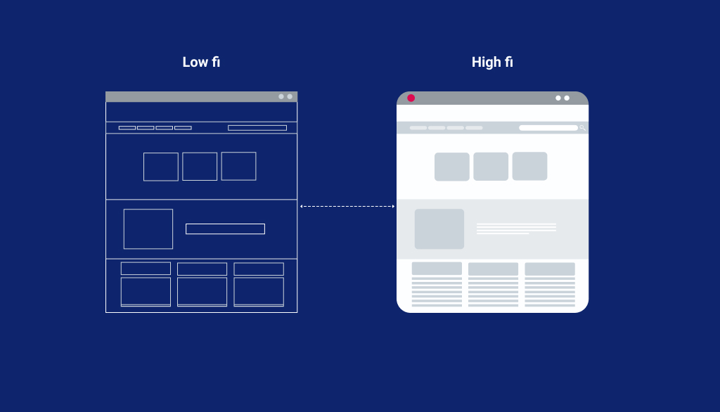
Wireframe refers to designing a website at a very nascent stage. A wireframe is used for laying out content and functionality on a page which takes into account the preferences and requirements of the users. Wireframes are used in the initial design process to set the basic structure of a page before visual design can be added. There are two phases in wireframing activity Low Fidelity & High Fidelity Wireframing.

Low Fidelity Wireframes

low fedility wireframes

Low Fidelity Wireframes are an easy and quick way to translate high-level design concepts into testable artifacts. The aspects of visual designing for the final product include basic visual hierarchy, shapes of elements and more. Typically they are in black white (or any two contrast colors)

High Fidelity Wireframes

high fedility

High Fidelity Wireframes are more effective than low fidelity wireframes as they reveal what content & functions will go where and how, using guidelines of layout as well. Apart from that, high fidelity wireframes are refined and consist of various elements like images, graphics, color scheme, logo and more. They are created using digital tools and hence the process is more time consuming.

Prototype

A prototype is basically a primitive version of something that is iterated upon until it is a final product. It is a simple & easy version of the product or website. It helps to understand the simple workings of a product and its interaction with the user on creation of the final product. Prototype can have static interface (series) or in the form of clickable simulations of interfaces

UI (User Interface) Design

UI Design

UI Design is a process of creating an interface between human (user), software and machine/hardware. This interface is actually a virtual (sometimes physical) layer where interaction between user, software and hardware takes place.

UI Design is a phase when designer converts the wireframe into final visual design with appropriate fonts, colors, graphics and, icons by focusing more on visual design aesthetics. UI design must follow some guidelines for usability like font sizes, usage of color shades, content hierarchy, consistency, accessibility guideline, etc.

Use Cases

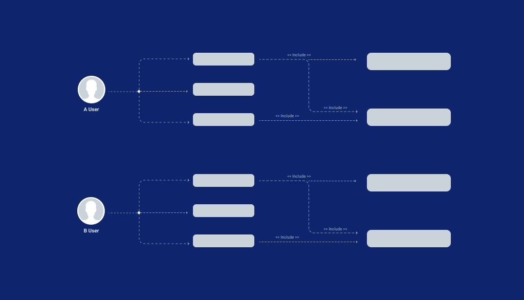
Use Case is a brief of how the system will respond to the user against the action the user is performing. Use cases take into account all the possibilities where different options or tasks with a combination of other possible options or tasks in the application/website. Use Cases are to be considered and recorded while planning & designing an application. Apart from that, use cases also provides a list of comprehensive goals as to how the system should behave in certain processes.

Affordance

affordance

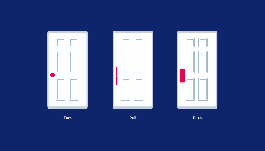
Affordances are nothing but visual clues in a design. They help the users to understand your UI efficiently and effectively. Improving the clarity of interface is vital to getting more visibility from the users.
For e.g. a door handle can indicate whether it can afford to push or pull.

Service Blueprints

Service blueprints are simple and clear diagrammatic representation of the services of a business as a whole. Their end goal is to understand the pain points of the customers and discover the internal shortcomings in their workings so as to improvise their working process. It aims at visualizing the organizational processes to optimize how a business can aim at delivering a great user experience.

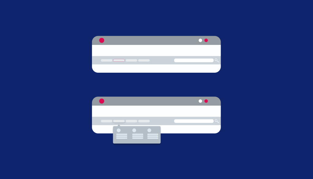
Navigation Design

navigation-design

Navigation design is a discipline to design the ways for helping users to navigate through the platform (website or app or product or even physical space)
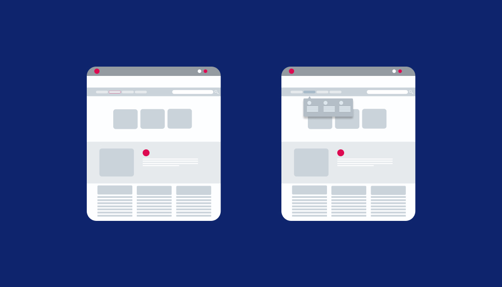
Navigation design plays an important role in creating a full-proof system that allows the users to interact and use the products in the most effective way. It is how your user can get from point A to point B or point C in an easy and hassle-free way.

Some of the advantages of a good navigation design are enhanced credibility and visibility of product, increased conversions due to more traffic, enhanced user experience and more.

MVP

mvp-final

Minimum Viable Product is the process of developing or designing a product with the least but its core features so that it can be quickly deployed for testing the market viability and acceptance amongst product’s potential customers.

Several benefits of carrying out MVP Process are understanding your customer preferences and needs, getting insights into whether the product is needed by users or not and checking the viability in the market by launching the product with minimal features.

I hope you enjoyed reading. Please feel free to share your comments and thought or any other terms if you wish to include in this list. Soon we will come up with the next part of this article with a few more interesting terms.

Design & tech terms every UX UI designer needs to know – part I

Glossary of the must-know common words in UX/UI

Half the battle is already won if you don’t have to juggle through your dictionary to search for the meanings of technical jargons. Isn’t it? If you are new to the world of user experience, understanding the terminology in a super-easy way can make things a cakewalk for you.

You no longer have to scratch your head to get everything you might be looking for. All you need to do is start using these terms frequently so that you can understand their meaning in a better way.

We will keep it simple so that it becomes easy for you to understand and comprehend. If you have been struggling to interpret the technical terms correctly, then you are at the right place.

Why Do You Need To Know the UX/UI Terminology?

You might be familiarized with hearing a lot of new terms and acronyms in UX/UI design space. But, have you ever wondered as to why you need to be thorough with your list of most commonly used words?

Well, the reason is simple. You are bound to feel disconnected while discussing the project with the client if half the terms during the discussion are greek to you. The twisted terms can make you grow crazy if you will fail to understand its proper usability. Treading into a new industry without knowing its basics can turn out to be a nightmare. Don’t worry; you will sail through if you are willing to invest your energy in understanding these important UX/UI words.

This compiled easy-to-understand list will extensively cover all that falls under

“Research & Idealization”.
Gear up before you decide to choose this promising career path!!!!

Research + Ideate: User Groups, User Research, User Scenarios, User Stories, Task Analysis, Card Sorting, Stakeholders, UX Strategy, KWHL Chart, User Journey Mapping, Problem Statement, Empathy Map, User Persona, Pain-Points, User Flows, KPI, ROI, Site Map, Information Architecture, Metaphor.

User Group
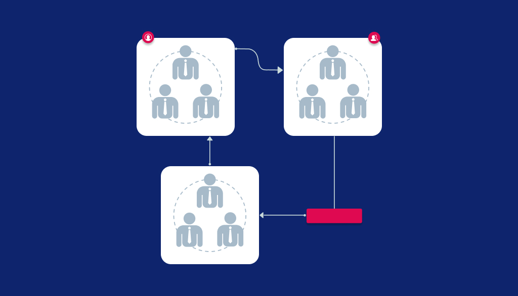
User Group

User Group is defined as a group of individuals who possess similar psychological traits. To understand the nuances in your industry, you need to closely study the behavior, tastes, motivations and pain points of a set of people who would be keen to use your product. Hence, innovative designing solutions are crafted keeping this user group in mind. It plays a crucial role in helping the company understanding its target audience’s psyche.

Supposedly, you wish to outweigh your competitors in terms of selling a product. But, you cannot be successful unless you know your target audience well. Therefore, to stay ahead in the competition, you need to be willing to do your research part well. This would include monitoring the preferences and interests of your target audience.

User Research / UX Research
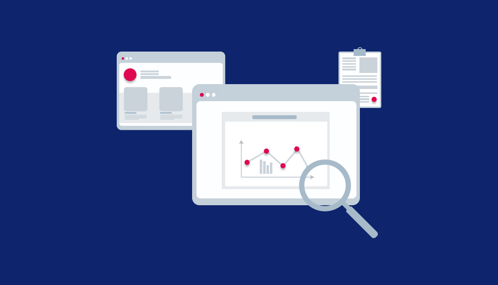
User Research

UX research involves carrying out a systematic investigation in order to understand the users perspective for the design process. Gathering valuable information from users can be done using various qualitative and quantitative methods by employing varied techniques, methodologies, tools and more.

Interpreting collected data can become easy with this organized study which would involve using various methods like Focus Group Interview, Personal Interview, Persona, Task Analysis, Ethnographic research and more.

Card sorting
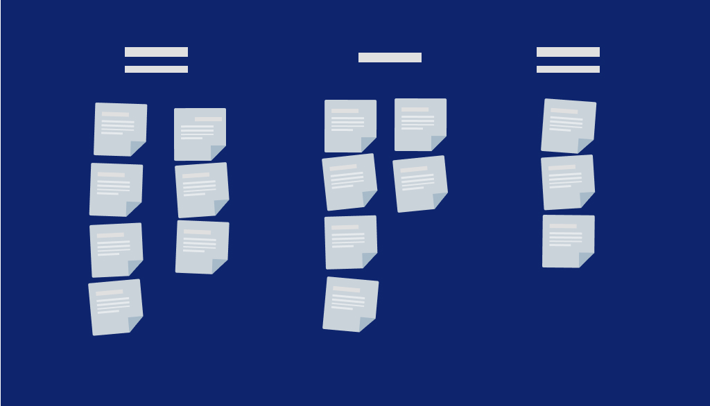
Cards Sorting

Card Sorting is a unique and inexpensive method which helps you to design website navigation paths, menu structure, workflow and information architecture in an organized manner. In order to ensure a user-friendly experience, this tool is used to predict emerging trends of customer preferences and interests.Supposedly, you decide to create a website to sell your products and services. But, it won’t work out until you are familiar with what your users might be looking for. You cannot shoot an arrow into the air without knowing your users. Isn’t it? In such a scenario, the

card sorting technique can come to your rescue. Its simple approach revolves around conducting a thorough research through pieces of cards or online tools to understand as to how your users structure the content on the website. This can give you a peep into your users’ expectations. Some other benefits include quick and easy execution without much investment of time.

User Persona

User Persona

Personas are fictional characters which are created based upon the user research to represent different user types to target a particular product, service or site. They are well analyzed and well-defined archetypes which are replicas of users.

They play an instrumental role in helping you make informed decisions based on user preferences. Building effective personas can ensure an interactive user experience. Adding a human touch to these model characters will thus allow you to market the products or services.

Now, let us take a simple example to understand this concept. You desire to launch a new product in the market. But, you are not sure about strategies which you can adopt to reach your target audience. In such a scenario, you can create a persona which can be used as a communication tool to pitch your product or service in an effective way. In this way, you can use the persona to leverage your business.

User Scenario
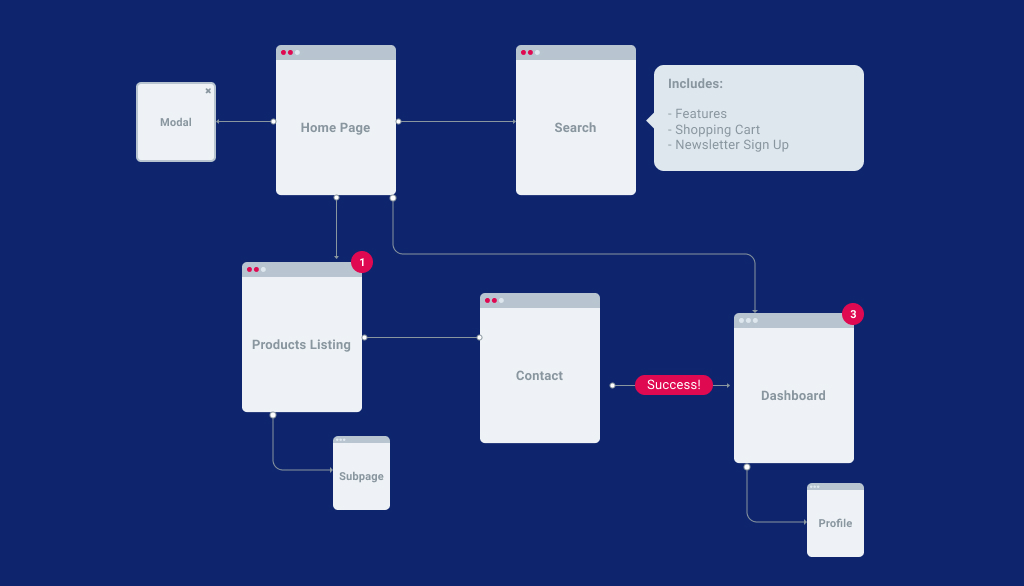
User Scenario Analysis

User scenarios can give a peep into the minds of the users by predicting the patterns of how they will interact with your mobile application or website. Ensuring excellent user experience should be the priority and it can only be achieved if you are willing to walk an extra mile to understand the end goal of your target audience.

User scenarios can help the designers understand the psyche of users interacting with a design on the website. Various scenarios can help you find the best solution for the user’s problems. Chart out various scenario possibilities to ensure a hassle-free experience for the users.

Stakeholders
stakeholders

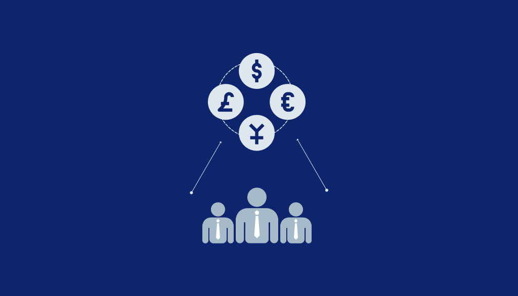
Stakeholders play an instrumental role in planning when it comes to UX design.

Stakeholders are a set of individuals who have a vested interest in a certain product. They are also the key decision-makers and help in the proper implementation of ideas. They can be divided into three main categories :

  1. Business: This category includes upper management, product managers, salespeople, etc.
  2. Engineer: This category includes developers, technical support and quality assurance people.
  3. UX People: This category includes researchers, designers and technical writers.

Ux strategy
UX strategy

UX strategy is an approach or plan of action to achieve the end goal for the product. It aims at solving the problems of the end-user efficiently and accurately. Several effective approaches include planning, validating ideas, testing and researching.

With the change in user behavior and preferences, the adoption of new features and tools is essential to keep pace with changing technological trends. Hence, a rigorous and full proof UX strategy can help you stay ahead of your competitors by predicting your user’s needs.

KWHL Chart
kwhl chart

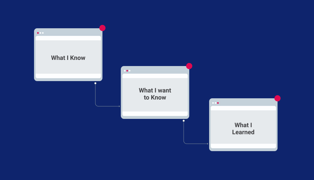
It is one of the initial steps which involves organizing the research data in four major categories. Extensive research is important to understand what your users might be looking for.

K – stands for what you already KNOW about the product.

It includes as to what prior knowledge you have regarding the product.

W – stands for what you WANT to learn.

It includes what is the intention and goal of the user while interacting with a product.

H – stands for figuring out HOW you can learn more about the product.

L – stands for figuring out HOW you can learn more about the product.

User Journey Mapping
user journey mapping

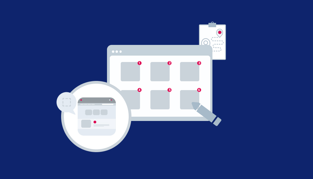
User Journey Mapping captures the experience of a user’s interaction with a product.

It also gives an insight into the emotions of the users based on their end goals and motivations. Following a user-centric approach is important to ensure excellent customer experience. Hence,

user journey map bridges the gap between a brand and individual across different channels.

The main steps involved in user journey mapping are :

  1. Choosing a scope
  2. Creating an interactive user persona
  3. Defining user expectations and scenario
  4. Creating an elaborate list of touch-points
  5. Paying attention to user intention
    – Motivation
    – Channels
    – Actions
    – Pain Points
  6. Sketching the journey
  7. Evaluating the user’s emotional state during the interaction process
  8. Validating user journey

Problem Statement
problem statement

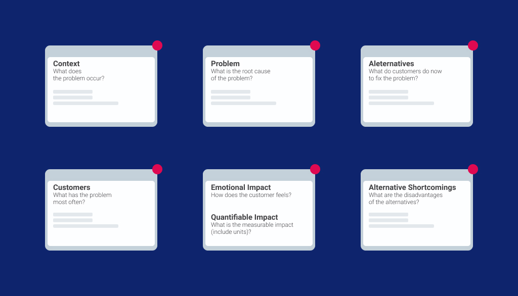
Problem statement is an integral part of UX Design.

Problem statement makes room for brainstorming ideas and channeling them in a single direction. It aims at giving a precise description of the problem and guides the team to focus on the key areas.

Problem statement requires you to synthesize your user observation from the very beginning. It also gives the idealization process a head start in the right direction. It is a combination of certain processes including empathizing, analyzing, synthesizing, prototyping and testing. Creating a

problem statement is thus a non-linear process.

Empathy Maps
empathy mapping

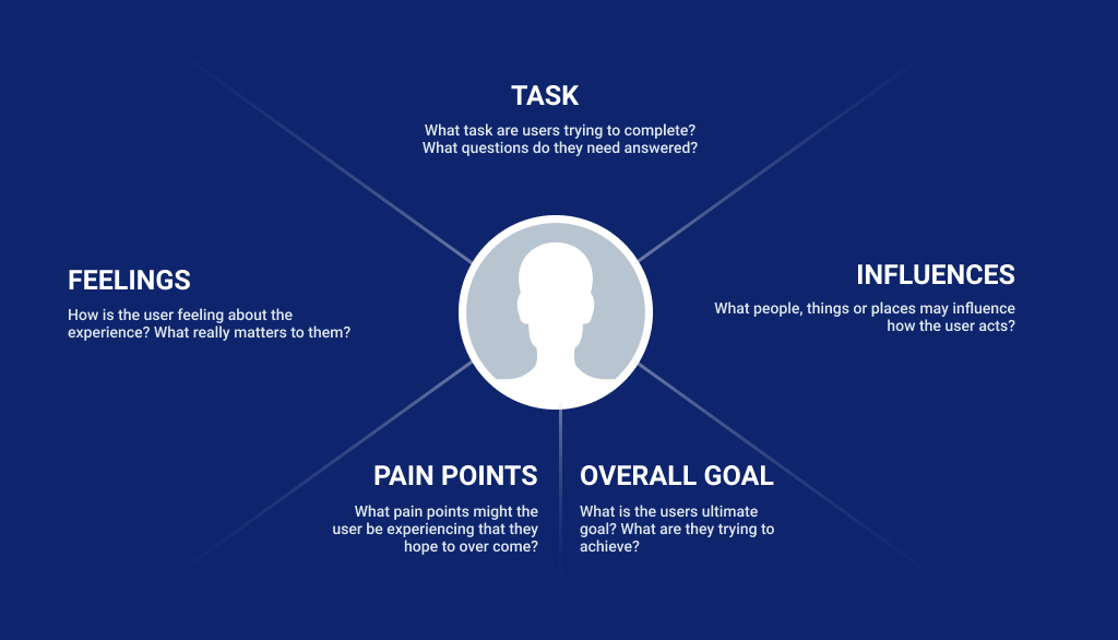
Empathy map is a collaborative tool which is used to gain deeper insights about the customers. It involves using various techniques to evaluate the attitude and behavior of the target user. It bridges the gap between what customers really want and what you think they want. Hence, crafting specific user experiences becomes easy for designers. It revolves around four basic key traits which include what the user says, does, thinks and feels.

It is one of the initial steps of the designing process which relies on “customer first” philosophy. It will allow you to understand the following about the user:

  • Feelings: How is the overall experience of the user?
  • Tasks: What type of tasks is the user trying to accomplish?
  • Influences: What are the things or people governing the decisions of the user?
  • Pain Points: What are the pain points which user wishes to overcome? What are their hidden fears and anxieties?
  • Goals: What is the ultimate goal of the user and what is he trying to achieve?

User flows
userflow

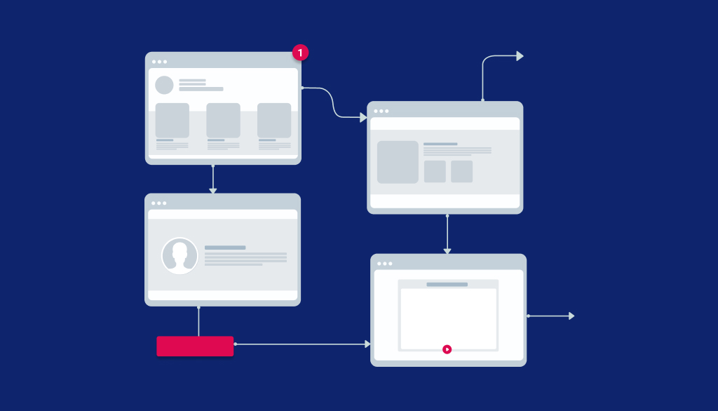
User flow refers to a series of steps which are performed by a user to complete a task efficiently on a website or app. Simplifying the overall process for the users can give an edge to your business. Delivering what the user wants most effectively is what can help websites get the best results.

Now, let us understand this with an example. Supposedly, the end goal of the user is to buy a product on a website. Now, this can be done using various methods. The simplest of the ways would be adding the item on the cart and complete the purchase from the checkout screen. There could be other permutations and combinations to buy a product on the website. Hence, user flow aims at improvising the navigational flow for hassle-free user experience.

KPI
kpi

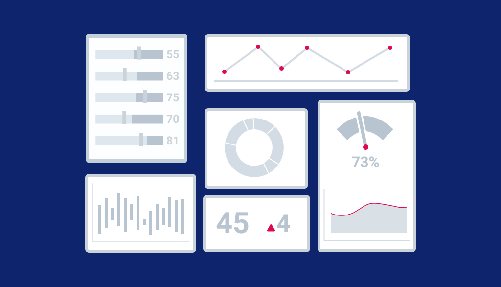
KPI is a key indicator which can be used for tracking the progress towards user experience related goals. Measuring human behavior related metrics can be a tough task as it involves checking the overall satisfaction levels of the users. Some of these important quantitative and qualitative metrics include :

Quantitative:

  • Task success rate: Percentage of tasks completed by the target user accurately
  • Time on task: Amount of time taken to complete the task
  • Use of search vs. navigation: Tracking the number of users who accomplished the task using search vs the number of users who completed the task using the navigation
  • User error rate : Errors can be essentially useful for scrutinizing user performance
  • System Usability Scale (SUS): It assesses the usability of an app or product by the user

Qualitative :

  • These factors take into account overall satisfaction and reported expectation and performance of the product

ROI

Return On Investment is an essential metric for product owners at the time of design and development of a product. It helps an investor to calculate profit on the investment made on product designing. Some of the great UX indicators include higher sales, customer engagements and better customer loyalty. ROI for user experience has certain main elements that must be taken into account. They can be categorized into two categories:

  1. Hard Elements: These elements include lead generations, conversion or acquisition, viral referrals, channel migration, retention, targeted traffic, cost savings and employee productivity.
  2. Soft Elements: Customer engagement, satisfaction, engagement, awareness, ethics, loyalty to brand, utilization and product adoption are considered while calculating ROI for UX Design.

Sitemap

Sitemap acts as a guiding document for users and helps them to navigate through the website easily. It basically depicts how various sections on the website will be linked together. It shows how different pages, subsections and sections will be represented on the website.

Having an initial sitemap is important to ease out the navigation process for the users. There are innumerable ways of creating sitemaps though the approach can vary according to your preferences and requirements.

Let us understand this with the help of an example. Supposedly, you wish to build an e-commerce website. Its ultimate aim will be to sell products. In this scenario, your sitemap should be displaying pages and product indices on the top of the hierarchy. This would ensure easy navigation for visitors and they will be able to see where they need to go immediately without any hassles.
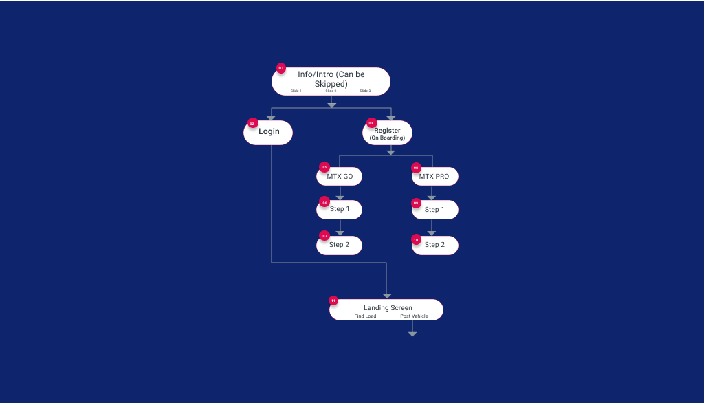
Sitemap

Information Architecture

Information Architecture is the science used by the experts for structuring content on the website. A user must be able to find out the required information with minimum interventions and clicks.

It is essential to arrange the parts on the website or application properly to ensure a great user experience. Several important aspects of information architecture include functionality, interaction, visual elements, navigation and more.

Metaphor
Metaphor

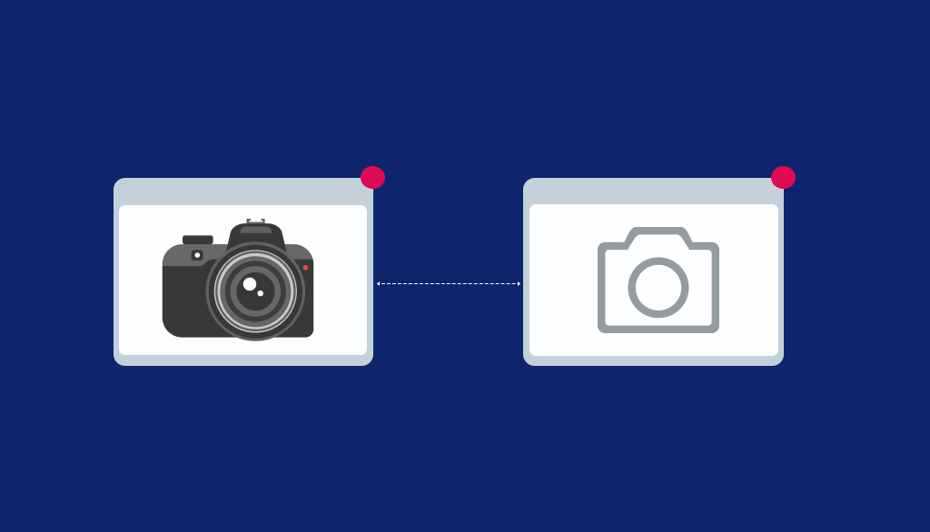
Metaphors in UX design are used for solving certain issues creatively by using real-world terms. It goes beyond the literal meaning of the word to communicate certain actions.

Let us understand this with the help of an example. Trash Can image is delegated to “delete” option and is named as “recycle bin” in windows. Such metaphors make technological designs more relatable and easy to use.

User Stories

user stories

User Stories are used in design processes to enable a designer to understand the psyche of the user. It involves conducting qualitative research to get information about what users might be looking for. Creating engaging stories is thus an important part of the research process.

Interesting stories can play an instrumental role in creating effective solutions according to the user’s daily activities. They can also be integrated with personas. They can be represented in the form of visualized storyboards, short stories, written stories and more.

Stay tuned for the next article which would give you a peep into another set of curated acronyms. Feel free to reach out to us for any doubts and queries. We will be happy to help!!!

Thanks to Ashay, Amar, Laksha and Prismic Team for contributing their efforts & Special thanks to Vigisha for enhancing the reading experience of this article.
Prismic Reflection gets global recognition at the 12TH ANNUAL INT’L DESIGNER OF THE YEAR AWARDS

Prismic Reflections® is honored with The International Design Awards at the 12th ANNUAL INT’L DESIGNER OF THE YEAR AWARDS”

The journey in the design industry is a huge roller coaster ride. From coming up with a concept through design thinking, amending the changes required, and making sure that the design enhances the user experience and resonates with the brand is a long journey. To a designer, a pat on the back and words of appreciation give the motivation to work throughout the journey and continue bringing meaning to the designs.

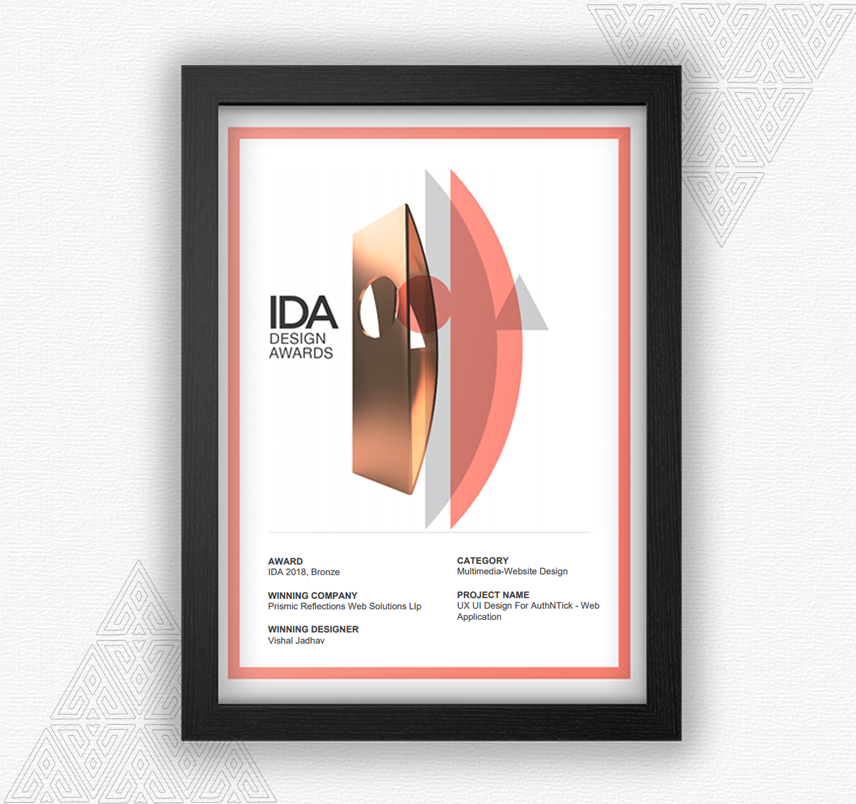
For us at Prismic Reflections®, client satisfaction is the highest. We work with passion at every task in hand and when we get recognition, we feel accomplished. It is a very ecstatic moment for us when we get recognition and appreciation for our work. We take pride to announce that we have recently been awarded bronze in the 12th International Design Award for one of our project, UX UI Design For AuthNTick – Web Application.

IDA Award

IDA award is one of the prestigious awards in the design industry which appreciates the designers and their work. The International Design Awards (IDA) recognizes, celebrates and promotes emerging talents in Architecture, Interior, Product, Graphic, and Fashion Design. At the IDA awards, we showcased our product designs and our UX/UI designs among the best designers in the world in the category ‘Multimedia-Website Design’.

Our hard work and design thinking strategy garnered eyeballs and got us love and appreciation from the jury of one of the most renowned body in the design industry, The International Design Awards. We were competing on a global platform among the best designs in the multimedia- website design category.

Our project ‘UX UI Design For AuthNTick‘ was one of the milestones in our journey. In this project, we were challenged to turn complex verification process into super simpler, faster & automated user experience for its end users. We began the project by understanding the needs of the owner and identifying the key stakeholders. A small team worked dedicate to come up with a design strategy to align the design strategy with the business goals of the client. The case study of our award winning project is here.

Taking one step at a time, our designers worked closely with the client right from developing the concept of launching the product through several iterations and final testing. At every step, we focused on making the UI/User Interface Design unique and captivating.

We derive the highest satisfaction when all the time and the efforts together in bringing the design to life resonates with the brand and enhances the user experience. We, at Prismic Reflections®, are always ecstatic about the accolades that come our way. We take immense pride in showcasing our work and making a difference to the brands by delivering exceptional UX/User Experience designs for our clients. We extend our gratitude to the IDA awards for adding one more feather to our cap. Receiving such recognition validates our efforts and ideas and motivates us to work even better every day.

Meeting global visionaries from leading companies at GiTex 2015 (Dubai), to improve user experience of their product

Prismic Reflections® team is just returned back from their fantastic trip to Dubai.

We visited GiTex 2015 at world Trade Center Dubai, last week.


gitex_logo

Future of technology on display was at Gitex 2015, 35th?Technology week at Dubai. Its a gateway to the Middle East, Africa & South Asia’s ICT Industry. Innovative UAV, Robotics, 3D printing, business automation & autonomous vehicles. GiTex is the place where all business leaders, global visionaries from world’s leading companies come together. Its the place where you can explore business opportunities, ideas, your future business partners & customers. You can demonstrate your ideas & business to different people coming from all across the globe.

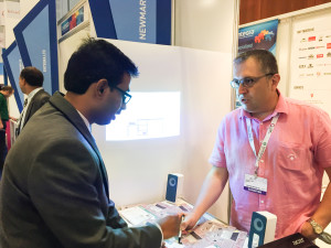
Me & My Partner Swarup visited GiTex last week to meet entrepreneurs, brands, businesses & leaders to explore the possibilities how Prismic Reflections® can contribute?to?improve their?digital product’s user experiences and take them to the next level.

During our 5 day trip to GiTex, we met lot of businesses leaders from different domains like software, IT, Banking & finance, Healthcare, Agriculture, Food, Education, Government and so on. It was quite exciting to see the value that these businesses are bringing together to contribute into the ecosystem of UAE and there by Global Economy. It was also inspiring to see businesses are openly collaborating with each other to explore the partnership opportunities to achieve high pace & sustainable growth.


sacle

?In my visit, I met few aspiring brands & business leaders like Saycle, Anazana, Devision, Firecart, 3D Printer, Xilopix, SOTI, and many more.?I was amazed by the revolutionary solutions these companies?are bringing to the society.
India’s contribution to the Software & technology domain was always been huge. No wonder I saw many of software & tech companies from India here in GiTex, which made me feel at home 🙂

However, I saw most of the companies brought inspiring & innovative ideas in form of products along with their services. Its fantastic that product mindset in evolved drastically in service based companies.

All the ideas, solutions & values brought by businesses & innovators surely seems to shift whole customer experience to the next level. Lot of different & complex challenges can be met with the use of technology based solutions where technology does the all the heavy lifting work and humans can enjoy?to the next level of experience by giving more comfort, ease and sophistication in day to day life.

Our meeting with business leaders & decision makers for transforming their software & platforms into better user experiences was great learning experience at both the end. Few of our meetings were turned successful and gone to the next level where Prismic Reflections® will be engaged in crafting UX for their digital products. We are quite excited to begin with these opportunities and hoping to create big difference in the digital space?with highly usable, engaging & customer user products.


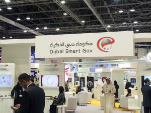
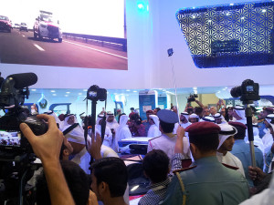
Dubai Smart CityUI UX DesignOpening of GiTexView from Dubai World Trade Center

Overall it was great experience at GiTex to observe different business, ideas & importantly people coming together under one roof. Yes, its all about the people ? Humans. Technology can not rather should not replace Human interactions with each other. Instead, technology should compliment and bring more awareness, sophistication and improve the real life experiences. This is exactly what happened at GiTex where we met & interacted people face to face,?though it was a tech event- such a good experience.

One, who is in the technology space, should not miss the event. Like every year, GiTex was a great initiative from UAE’s government, held in Dubai, which will surely take UAE’s & Gobal Economy to the next level.