Tag Archives: User Experience

User Experience Design for AI-Powered Products: A Beginner’s Guide for Founders, Product Designers, Developers & Managers

AI has become an integral part of our daily life. Almost of the digital touchpoints, devices & apps we use these days, AI is working in the background in more or less manner.
For businesses & customers AI offers endless possibilities. Still for many, the idea of incorporating AI into their product design process can feel overwhelming or unclear. This guide aims to demystify AI and provide a roadmap for integrating it into your product design process, ensuring a seamless user experience (UX) that delights and engages users. This quick beginner guide is for Startup Founders, Product Managers, Product Designers, UX UI Designers and product teams who are just starting with AI integration into their products/platforms.


Fundamentals of AI in Product Design & Technology Landscape

Understanding the basics of AI is the first step. AI encompasses various technologies, including machine learning, natural language processing, and computer vision. These technologies enable systems to learn from data, recognize patterns, and make decisions with minimal human intervention. Familiarize yourself with these technologies and how they can be applied to your product. This fundamental step is really important to build your AI empathy. 


Photo by freepik.com
 

Identifying Real Problems and Real Human Needs

Let’s integrate AI into our product” is not the right approach to start with. Rather starting with users, identify the real problems your users face and the human needs your product aims to fulfill. AI should enhance the user experience by solving genuine problems and adding real value. Conduct a user research, use various research methods to uncover real problems, pain points and opportunities for AI integration.


Photo by freepik.com
 

AI Capabilities & Use Cases: Opportunities to Integrate AI

Automation vs. Augmentation

AI can either automate tasks or augment human capabilities. Automation involves AI performing tasks without human intervention, while augmentation enhances human abilities. Google’s Project PAIR (People + AI Research) talks more about how AI can augment human decision-making rather than replace it. Identify opportunities in your product where AI can either automate repetitive tasks or provide valuable insights to users.


Photo by freepik.com
 

Avoid AI Anywhere or Everywhere: Where AI Should Not Be Used

AI is powerful, but it’s not a silver bullet. Avoid using AI for tasks that don’t require it or where it could complicate the user experience. Evaluate whether AI genuinely adds value or if a simpler solution would be more effective. Once you understand appropriate user and business needs, set your goal/expectations, define success metrics, identify the right type of AI solutions, consider the possible outcome and impact mentrics of the same to ensure that its really worth taking the AI path.


Where should AI not be used or better to avoid use?

In general sense it’s better to avoid using AI in areas like Privacy intensive applications, high stake decision making, emotionally sensitive applications, ethically complex decision making etc.


Data Collection and Preparation: Gather and Prepare Your Data

AI is not magic, it’s based on math. Data is everything for creating & designing effective user experience for AI powered products. Collecting and preparing high-quality data is really crucial for training AI models. Ensure your data is accurate, relevant, and diverse to build robust AI systems. Data collection & preparation involves steps like cleaning, normalization, and ensuring ethical data collection practices.


Photo by freepik.com
 

Ethical Considerations

AI introduces ethical challenges when building digital products and platforms. Ensure your AI systems are fair, transparent, and accountable. Address biases in your data and algorithms to prevent discrimination. Establish guidelines for ethical AI usage to build trust with your users. 
Some quick examples

  1. AI system used for hiring employees. If the training data includes biased information (e.g., past hiring data that favored certain demographics), the AI might learn and perpetuate these biases, leading to unfair hiring practices.
  2. A social media platform uses AI to recommend content to users. If the AI only promotes sensationalist or polarizing content to increase engagement, it can negatively impact societal well-being.
 

Design for Transparency and Explainability

Users need to understand how AI makes decisions. Design your AI systems or applications to be transparent and explainable. Provide clear explanations of AI-driven actions and decisions to help users trust and effectively use your product.
For example
A loan approval AI system decides whether individuals qualify for a loan. If the system’s decision-making process is opaque, applicants won’t understand why they were approved or denied. 


Calibrated Trust

Calibrated trust involves balancing user trust in AI with appropriate levels of skepticism. Ensure users understand the limitations of your AI system, neither they underestimate (poor/no trust) or even overestimate (blind trust) the AI capabilities your platform is offering them. Provide mechanisms for users to correct or override AI decisions if necessary.


Human-Centric / User-Centric Design: Not to Replace Humans but to Empower Humans

Focus on designing AI powered products that enhance human capabilities, give them superpowers and provide meaningful assistance in their tasks. User-centric design principles in AI should guide and serve to improve the overall experience of the platform.


Ensure Data Privacy and Security

Protecting your users’ data is crucial. Put strong privacy and security measures in place to keep their information secure. Stay on top of data protection laws and be transparent with users about how you handle their data. Clear communication builds trust and reassures users that their privacy is a top priority, fostering a safer and more reliable user experience.


Design for Inclusivity

AI should be for everyone, so it’s important to make your systems inclusive and accessible. Tailor AI user experiences  to meet the needs and abilities of all users. To ensure this, test designs with a diverse group of users. This will help you spot and fix any accessibility issues, making AI more user-friendly for everyone. The more inclusive your design, the better the experience for all users.


Collaborating with Cross-Functional Teams

AI product design requires collaboration between various teams, including designers, developers, data scientists, and product managers. Foster a collaborative environment where cross-functional teams can share insights, align goals, and work together effectively.


Photo by freepik.com

Prototyping and Iterating

AI product design requires collaboration between various teams, including designers, developers, data scientists, and product managers. Foster a collaborative environment where cross-functional teams can share insights, align goals, and work together effectively.


Conclusion

Designing experiences for AI-powered products is a challenging yet incredibly rewarding journey. By grasping the fundamentals of AI, pinpointing genuine user needs, and adhering to best practices for ethical and user-centric design, you can create AI products that surpass user expectations. Embrace AI’s potential to revolutionize your product development strategies and deliver outstanding user experiences. 

We hope that with this guide, you are a little more aware to navigate the unknown areas of AI-powered product design. The goal of any product design/redesign & development exercise isn’t just to incorporate AI, but to do so in a way that genuinely enhances the user experience. Keep experimenting, stay curious, and put the user at the center of your design process to turn this journey into something genuinely rewarding. 

If you are building something awesome in the space of AI, we would love to hear and explore how our team of experts can help you. Contact us to start the discussion! 
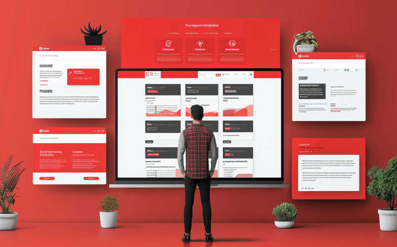
Landing Page Design to Drive Conversions – UX Tips for Marketing

In the digital marketing landscape, landing pages play a pivotal role in converting visitors into leads or customers. A well-designed landing page can significantly boost your conversion rates. Following are the essential elements and best practices for designing landing pages that convert effectively. .


Understanding the Purpose of a Landing Page

A landing page is a standalone web page created specifically for a marketing campaign. It is where a visitor “lands” after clicking on a link in an email, ad, or other digital location. Unlike other web pages, a landing page is designed with a single focused objective – a call to action (CTA).


Photo by freepik.com

Key Objectives of a Landing Page:

  • Lead Generation: If the training data includes biased information (e.g., past hiring data that favoured certain demographics), the AI might learn and perpetuate these biases, leading to unfair hiring practices.
  • Sales: Encouraging visitors to make a purchase.
  • Event Registration: Signing up visitors for webinars, events, or trials.
  • Promotion: Highlighting a special offer or product.
 

Essential Elements of a High-Converting Landing Page

 Engaging Content Architecture

– Start with a compelling headline and subheadline.

– Provide clear, sequential information that builds on the visitor’s interest.

– Use logical sections to break up the content.


Meaningful Yet Hooking Copywriting

Your copy should be both meaningful and engaging, hooking the reader’s attention while delivering valuable information. It should highlight the benefits of your offer and motivate users to take action.

– Use clear, concise language that speaks directly to your audience.
– Use action-oriented language.

– Highlight key benefits and solutions to common pain points.
– Keep it short and to the point.

– Include a strong call to action that encourages immediate response.


Contextual Visual Design

Visual elements should enhance your message and create a compelling visual story that resonates with your audience. Use images, videos, and graphics that convey the nuances of your offer and help visitors relate to your message.

– Use high-quality, relevant images and videos.

– Ensure visuals are directly related to the content and support the message.


Avoid Distraction

To keep users focused on your CTA, eliminate unnecessary distractions. Remove any elements that don’t contribute to the main goal of the landing page.

– Remove navigation menus and extraneous links.

– Keep the design clean and uncluttered.

– Use white space strategically to direct attention to key areas.


Simple and Intuitive Form

If your goal is lead generation, a form is essential. It should be simple, intuitive, and only ask for necessary information.

– Limit the number of fields to reduce friction.

– Use a clear and concise form title.

– Provide context or instructions if needed.


Trust Signals

Trust signals such as security badges, guarantees, and testimonials can alleviate any concerns visitors might have and build credibility.

– Display security badges near the form.

– Include customer testimonials or logos of well-known clients.

– Highlight any money-back guarantees or satisfaction policies.


Best Practices for Designing High-Converting Landing Pages

Photo by freepik.com


 Keep It Focused

A landing page should have a single, clear objective. Avoid distractions by removing navigation menus and links that could lead visitors away from the page.


Optimise for Mobile

With a significant number of users accessing the internet via mobile devices, it’s crucial to ensure your landing page is mobile-friendly. Use responsive design to adapt to different screen sizes. Ensure fast loading times by optimising images and reducing unnecessary elements and make buttons and forms easy to use on small screens.


A/B Testing

A/B testing involves creating two versions of your landing page with slight variations to see which one performs better.

You can test one element at a time (e.g., headline, CTA, image). Use tools like Unbounce or Optimizely to run tests and analyze results to implement changes based on data.


Use Analytics

Tracking and analysing the performance of your landing page is essential for ongoing optimization. Set up conversion tracking using tools like Google Analytics to help you monitor metrics such as bounce rate, time on page, and conversion rate. Use insights to identify areas for improvement.

Take away!

Designing a successful landing page requires a clear understanding of your audience and objectives. By focusing on essential elements like engaging content architecture, meaningful yet hooking copywriting, contextual visual design, and minimising distractions, you can create landing pages that not only attract visitors but also convert them into valuable leads or customers. Make sure to test and optimise your landing pages to ensure they deliver the best possible results.

By following these best practices, you can enhance the effectiveness of your landing pages and achieve your marketing goals more efficiently. 

Looking for an agency to help you design your landing pages? Let’s connect!

The Symphony of Collaboration at Prismic Reflections®

Once upon a time in the bustling design studio of Prismic reflections, I embarked on a remarkable journey as a UX UI designer, but this journey wasn’t an overnight transformation. Today as I continue my work in this thriving creative hub, I am eager to share the ongoing story of collaboration – A story that unfolds with each passing day, enriching our designs and propelling us to new heights.


A journey of discovery
Finding true passion in the design world

After exploring various career paths in IT, teaching and banking, I realized that I was yearning for a profession that would bring me true fulfillment. From a young age, I was captivated by art and design, finding joy in expressing my creativity through drawing, painting, and various creative projects. During my maternity break, I made the decision to pursue a career that aligned with my passion and creative mindset. That’s when I discovered the captivating realm of UX UI design, which encompassed everything I had been searching for – Problem solving, user centricity, and a seamless blend of aesthetics and functionality. Through intensive bootcamps & workshops, I cultivated my skills and proudly emerged as a UX UI designer.

Now as a valued member of the Prismic reflections team, I am fortunate to contribute to a range of projects across diverse industries like fintech, BFSI and marketing. This journey with its ups and downs, has ultimately led me to a place of immense joy and satisfaction, where I can fully express my passion and create meaningful user experiences.


Harnessing collective brilliance : Fusing individual talents through teamwork

In this studio, collaboration is not just a concept, It is a living, breathing force that permeates every aspect of our work. As designers, we embrace a mindset that celebrates the brilliance of our teammates and recognizes the value of diverse perspectives. We understand that collaboration is about learning from others, knowing that each person brings their own unique strengths and expertise to the table.

Every point we embark upon is an opportunity for collaborative magic. Like a collaborative symphony, we as a team of designers & developers, coordinate our efforts, ensuring that every instrument in our ensemble plays its part harmoniously. Together we dive deep into the intricate details of user experience and visual aesthetics, crafting captivating & delightful designs.


Building strong connections : Collaborating with clients for exceptional solutions

Collaboration extends far beyond our individual roles. It flourishes at the very core of our relationship, within the studio and with our valued clients. We cultivate an environment where trust and open communication flourish, fostering a strong bond that allows us to tackle challenges with confidence and creativity.

When we collaborate with our clients, we understand that they are partners in our design journey. Their visions and aspirations become intertwined with our own, creating a shared purpose. By truly listening to their needs and aspirations, we are able to co-create exceptional solutions that surpass expectations.


Crafting experiences together : The collaborative design process

As we navigate the ever-evolving landscape of design, collaboration becomes the driving force behind our growth and innovation. We approach each project with an open mind, ready to learn from one another and push the boundaries of what is possible. Together we embrace the challenges that come our way, knowing that they are catalysts for personal and professional development.

And when success graces us, we celebrate as a united team. We take pride in our collective achievements, recognizing that they are the result of our collaborative efforts. Each design accolade, each satisfied client and each milestone reached are testaments to the power of collaboration in our studio.


Embracing the symphony : Gratitude for the journey of collaboration

As I continue my journey in Prismic reflections, I am grateful for the ongoing story of collaboration that unfolds each day. It is a story that inspires us, challenges us, and reminds us of the transformative potential that lies within our collective brilliance.And so dear reader, as I recount this tale of collaboration, I extend an open invitation to those with a passion for design and the vision to create exceptional experiences.

Whether you are seeking to experience the magic of collaboration firsthand or looking for exceptional design solutions, I welcome you to explore more about us on our About Us page “https://prismicreflections.com/about”. If you are inspired by the story and wish to be part of our team, I encourage you to visit our Career page “https://prismicreflections.com/career” to learn more about exciting opportunities. Together, we will keep crafting exceptional designs, united by the magic of collaboration and driven by our shared passion for creating remarkable user experiences.


Main Author :
Padmini Paithane

UX UI Designer at Prismic Reflections®


Unlocking the Potential of Artificial Intelligence – Useful AI Tools for UX UI Designers

As a UI UX designer, it’s no secret that keeping up with the latest trends and technologies can be a daunting task. The design process is complex and multifaceted, and it can be difficult to know where to turn for help. Luckily, there are many AI-powered tools available that can make your job much easier. In this blog, we’ll take a closer look at some of the best AI tools for UI UX designers that can help you streamline your workflow and create high-quality designs quickly and efficiently.


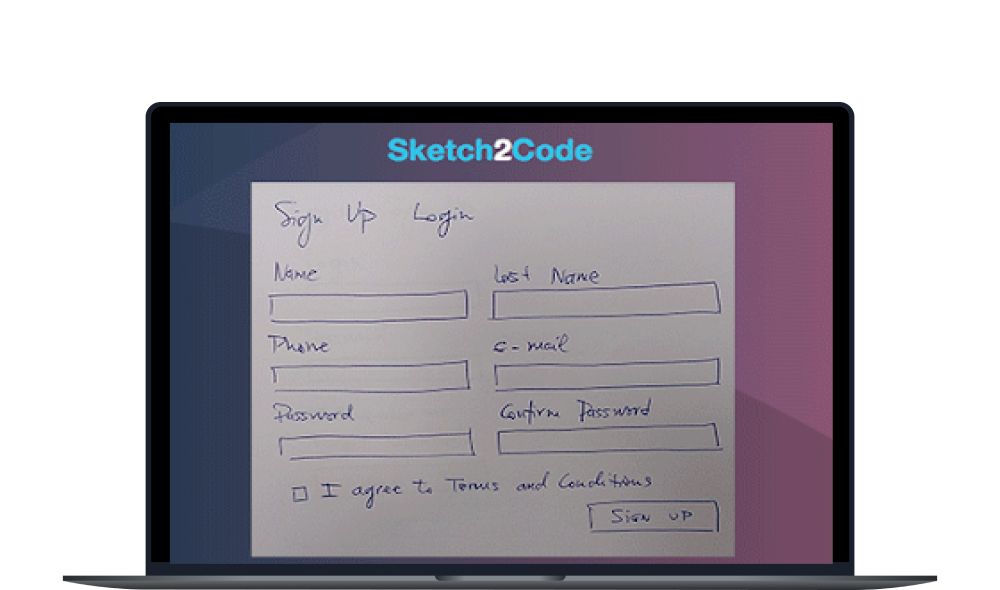
Sketch2Code

First up is Sketch2Code. Developed by Microsoft, this powerful tool uses AI to transform hand-drawn sketches into HTML code. This is a great option for designers who want to quickly create mockups and prototypes without having to write code from scratch. With Sketch2Code, you can easily turn your sketches into functional HTML code in no time.

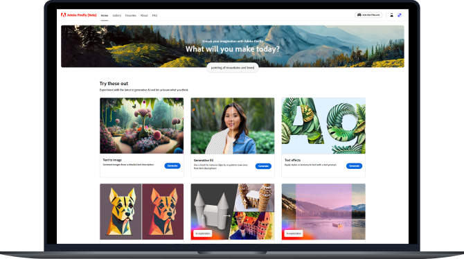
Adobe Firefly

Want to see the best use of Generative AI allow me to introduce you to Adobe Firefly, a state-of-the-art generative engine that’s now available on Adobe Photoshop. You’ll be amazed by how it transforms your creative process, making it effortless to produce exceptional designs.

https://www.adobe.com/in/sensei/generative-ai/firefly.html

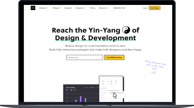
UXPin

If you’re looking for a tool that can help you create user flows and prototypes quickly and easily, then UXPin is an excellent option. This design platform uses AI to suggest design elements and layout options, making it much easier to create high-quality designs in a shorter amount of time. It also offers collaboration tools, making it a great choice for design teams.

https://www.uxpin.com/

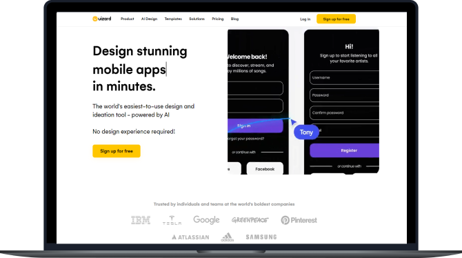
Uizard

Uizard.io is a powerful design tool that enables users to create top-notch designs with ease and speed. Providing the ability to transform sketches into high-quality, editable mockups in mere seconds, it uses cutting-edge algorithms to generate one-of-a-kind design concepts based on user input. This makes it an ideal option for designers looking to save time and maintain their creative spark.

https://uizard.io/

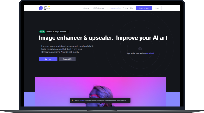
Let’s Enhance

Do you want to take your images to the next level? Let’s Enhance is a robust tool that employs advanced AI technology to enhance image resolution while maintaining its quality. It’s a fully automated process that is fast and efficient, allowing you to upscale your images up to 16x without any loss in quality. With Let’s Enhance, designers can now improve their images with ease and obtain high-resolution pictures like never before.

https://letsenhance.io/

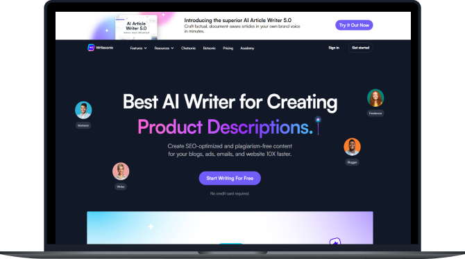
Writesonic

If you’ve had the opportunity to explore CharGPT or Grammarly and you’re in the market for another AI copywriting tool, it’s definitely worth considering WriteSonic. One of the key benefits of utilizing WriteSonic for your content creation needs is that the blogs it generates are specifically designed to be more SEO-friendly when compared to other AI tools. This can ultimately help you to improve your online visibility and drive more traffic to your website.

https://letsenhance.io/

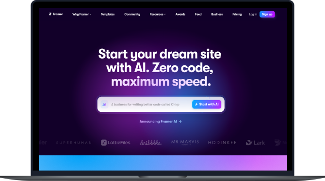
Framer AI

If you are a UI/UX designer, it would be beneficial for you to explore Faramer AI. This tool can create website and app designs based on the given prompt, which can then be published on the desired domain.

https://www.framer.com/ai

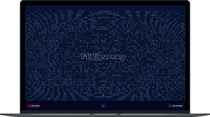
Midjourney

Out of all the image generators available, Midjourney consistently produces the best results according to my preferences. The images it generates exhibit a higher level of coherence, with superior textures and colors. Overall, the output is simply more captivating and visually appealing.

https://www.midjourney.com/home/?callbackUrl=%2Fapp%2F

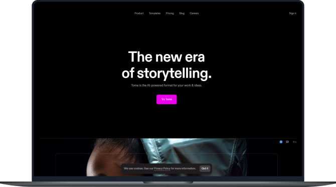
Tome

In case you find yourself pressed for time and in need of producing a compelling presentation, allow me to recommend Tome. This platform harnesses the power of storytelling AI to craft presentations that are tailored to your specific topic, ensuring that your message resonates with your audience.

https://tome.app/

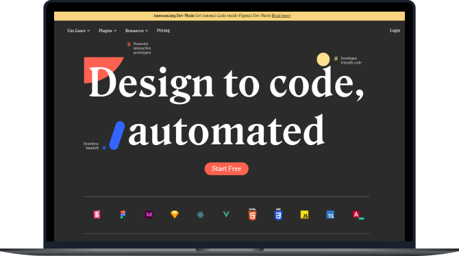
Anima

Anima is a plugin that enables the conversion of websites into Figma designs and Figma designs into HTML/CSS. Although it may not be perfect, with time it is expected to improve.

https://www.animaapp.com/


There are additional tools that you may consider, which I have not mentioned because they are well-known and require no introduction. Here are a few listed below:

Chat GPT: for content creation and research

Grammarly: for content polishing

Kevil AI: for image generation

Hemingway App: for writing blogs

Copy AI: for writing professional emails

Blackbox AI: for writing code in a selected language.

In conclusion, AI tools can be incredibly helpful for UI UX designers looking to streamline their workflow and create high-quality designs quickly and efficiently. Whether you’re looking for a tool to help with coding, design suggestions, or collaboration, there’s an AI-powered tool out there that can help you achieve your goals. So why not give one of these tools a try and see how much easier your design process can become.

Discovery in User Experience (UX) Design- Why & How (Part II)

Steps to conduct research at different level to make informed decisions

This article is continuation of series and first part of this article can be found here

In the first part of this article, we addressed the need of a requirement gathering, analysis in the discovery phase. This article will focus on different steps involved in discovery and how they impact on the UX projects.

As a part of Discovery Phase, a typical UX UI Project involves the following steps.

1. Talking with stakeholders & gathering information

Any design exercise (rather any project) should start with talking to the people who are responsible & involved in different areas of the product. Primary stakeholders are C level executives who are responsible for the business side, the product manager, marketing managers, support team lead/manager, developers, client servicing manager etc.

Photo by Nik MacMillan on Unsplash

A quick introduction & project requirement brief is a good start for this step. In my practice, I always believe in knowing the stakeholders personally i.e. understanding from where they are coming in the context of project need. Your understanding of the business requirement, knowing the stakeholder little on a personal level & synergy with them, sets a comfortable environment. A typical set of primary questions helps us to understand the multifaceted structure of a requirement or problem. It’s a very important step and your first chance to understand the business side, their problems, expectations & goals from their perspective.

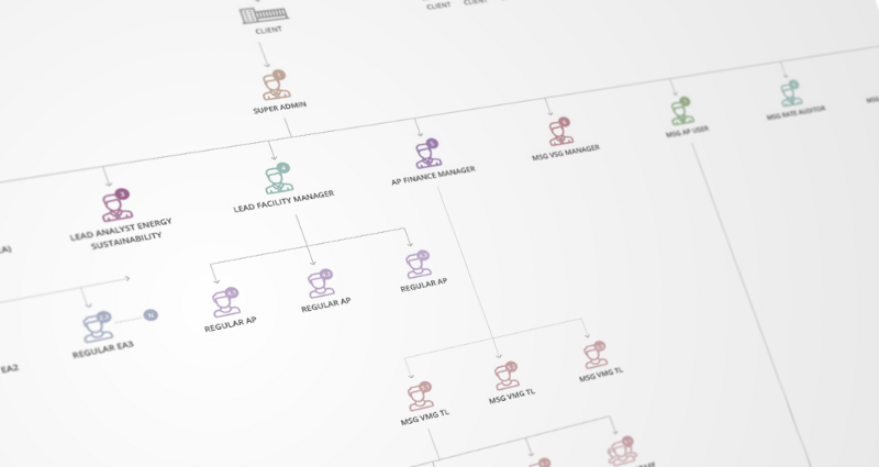
2. Understanding the organization structure

In every product, there is an involvement of employees in production & in servicing areas. Businesses have their own hierarchies, roles & responsibility assigned to each with the relevance of the product. Knowing the organization structure and how the tasks (in the context of product development or usage) are distributed in different roles, reveals the operational challenges, pain points & missing connecting dots.

Organisation Structure Map
Organization Structure Map

Form design perspective, the design team should know how a business is linked to the product or application. If design team is designing administrator side (like member management), they must understand the support department structure & challenges. Sometimes, in my experience, I noticed that businesses found some basic issues in their structure and how its linked to the products. Like few roles are missing, few roles combined irrespective of their context of use etc.

3. Business & competitive analysis

Business has some very critical challenges & limitations those needs consideration before planning for solution and strategy. Knowing the client’s business helps design team to get the business vision and empathize all the challenges with its limitation.

Competitors research and study gives design team fast forward approach. To know, understand what others (in the same line of business) are doing & how they are doing. It’s always good to learn from examples those are readily available. It also helps the team to identify and figure out what & how we can differentiate our experience from competitors. Depending on the need and time available, one can dive deeper in this analysis & research method as identified.

4. User research: identifying user types, personas & profile

“Empathy” you will hear this word frequently from designers or design school students. User Research is very important part of the discovery phase. It provides a right perspective designer with precise context.

The design team can only design better if they really know who is going to use it, how and when. Identifying the real users & their types, narrow down the focus of designing activity. The outcome of this step is we know the priority of users & their types. Also, we can easily allocate the functions & task between them.

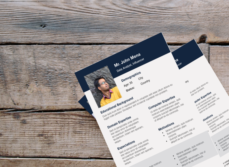
Persona Document (Sample) Created in User Research

Personas with the profile details add further clarity. Like understanding their Geography, Background, Culture, Profession, Goals, Environment, his/her typical daily routine activity etc. Once we identify different personas it helps us to draft user stories, document & use cases to bring more contextual clarity to the project.

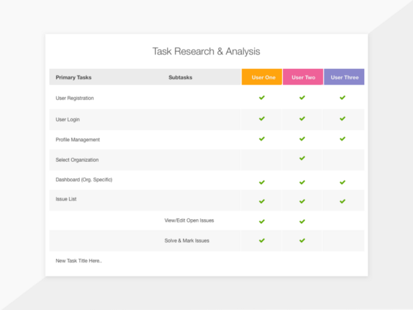
5. Task analysis

This step could be fairly time taking depending on the complexity & depth of usage of the product or application. Task analysis is a step where project team gets to know all the touch points where the user interacts with the product/application. It’s basically users needs & expectation which are converted into functions. Understanding the importance & priority of every function from a different user point of view is crucial. It acts a foundational activity in laying out the information architecture and navigation system.

User Based Task Exploration & Allocation by Prismic Reflections®

Task analysis not only helps designing team but also the product owners to get the deep insight into the reality of usage of functional features & their importance. At the end of the task analysis, both design team and businesses can see somewhat blur picture of project scope, approximate volume of work and there by an approximate timeline. The assumptions in this phase what one can make are more accurate than one who does it without performing this. The drawback of avoiding this step can lead to spending more time on the less important part of the product or not paying enough attention to important things for its users.

The drawback of avoiding this step can lead to spending more time on the less important part of the product or not paying enough attention to important things for its users.

6. UX audit & heuristic evaluation: reviewing the existing application

In many cases, design team often perform this step much earlier, before analysis of business competition, user & tasks. However, based on my experience, without getting into real context and empathy, audit or heuristic evaluation can not be effective. In some general or common applications, it’s ok to do it earlier. However complex enterprise applications which have its own breadth &

In some general or common applications, it’s ok to do it earlier. However complex enterprise applications which have its own breadth & depth can be only audited precisely when an auditor has the fair knowledge of the domain, application, different users and use case scenarios. For e.g. Energy management, internal applications of banks, share market, medical research, Security & Defense (government) etc.

Complete UX Audit could be a lengthy process depending on how one needs to perform it. Heuristic evaluation is the step where an expert in user experience quickly evaluates the usability & other issues in the application. In the same step, UX expert may prepare a list of seen problems & possible solutions or enhancements.

Heuristic evaluation is a fast, quick and comparatively less expensive method as compared to the detailed discovery phase. (charges of UX experts are high as they are seniors in most cases)

Note: UX Audit or heuristic evaluation could be a part of detailed discovery process or can be performed as a stand alone activity. Again it’s a business call how to identify the need of the situation & selection of appropriate choice. UX expert can contribute in making decision making about

7. Brainstorming: UX team & different departments in the organization

Brainstorm for more questions & more ideas

Brainstorm should not be a noise, it’s an opportunity to think through the findings team got so far. It also helps entire team to absorb the important information to gain further clarity. Different issues & options are inspected by different people from a different angle. And then gather to figure common point before they move ahead. Finalizing the strategy and approach for the design project need solid inputs. How we are planning the activities, what we are prioritizing and why we are doing it — these are all which forms the Strategy document. Sometimes strategy prepared separately or can be part of other master documents. In some cases requirement analysis, strategy & solution documents are more time to consume & expensive than the project execution itself.

Sometimes strategy prepared separately or can be part of other master documents. In some cases requirement analysis, strategy & solution documents are more time to consume & expensive than the project execution itself.

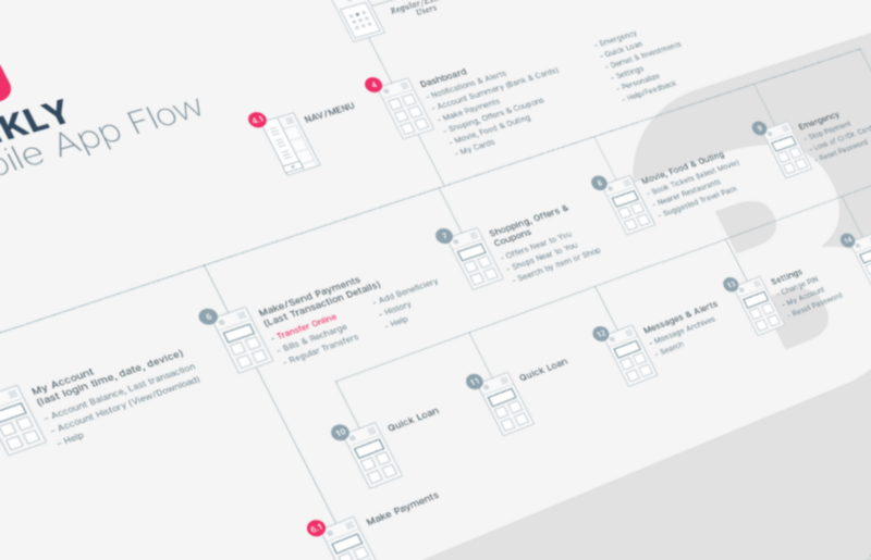
8. Information architecture & navigation system

Organizing & structuring the content in an effective way, labeling to make them easily findable. Information architecture matters and its one of the primary strength (or could be a weakness) of any product or website.

Screen & Information Flow Diagram by by Prismic Reflections®

Once the context is set with business information, priorities, users, profiles, tasks etc. Its the time to think about IA (Information Architecture)

Good information architecture not only enable user to find the appropriate information quickly
but also make them feel empowered while performing a particular task in the application in a much smoother way.

9. Strategy

If you notice, by following the above steps, the big picture is already getting in shape. A product design team can now figure out the strategy if they understand the business goals, users persona’s & stories, technological constraint, critical success factors, competition, priorities etc.

A method or plan to achieve the desired result by performing a specific action at a particular time is what we can define as a strategy.

The strategy consists of all these points which are especially focused on “What” we are going to do and “How” should it be approached & measured.

10. Document finalizing & sign off

Photo by Helloquence on Unsplash

Any meeting or exercise is complete if we do not have a solid action plan. And a solid action plan should not get into execution unless it is agreed by decision makers. Getting an agreement on what and how the further execution will be handled with a delivery schedule is important to avoid future conflicts. In this steps along with the project scope, strategy, solutions, timelines, deliverables, commercials & other terms to be documented and agreed in black and white. It is always best to face any type of conflicts or gaps earlier than the later stage.

Note: In depth research & analysis in discovery phase are the right fit for mid size, big & complex applications. Here the challenges are critical & expectations are very high. Expecting high & accurate results without in depth discovery is not a realistic expectation. The shallow approach in discovery has its pitfalls. However simpler and smaller products may adapt it depending on the time constraint.
In the above article, I have tried to mention all those points what I have experienced and remember in my design career. Of course, there is no specific step or method that is fit for every project. As we know it’s an iterative exercise.

More we DO, more we LEARN. More we are AWARE while doing, there we achieve the balance!

I would love to hear your experiences, feedback & comments. If you have any question or think we need a quick talk about your ideas, I am eager to get connected. You can contact me via Twitter or LinkedIn or through our company website Prismic Reflections®

Discovery in User Experience (UX) Design - Why & How? (Part I)

Finding small details in the big picture: analysis & research in UX design projects

In the first part of this article, we will address the need of a requirement gathering, analysis, and discovery phase in UX projects. This article will more focus on different steps in the discovery and how they impact on the UX activities.

A couple of weeks before I went to a mobile shop with my friend for buying a new smart phone for him. Well, yes, we didn’t choose to do it online. My friend wanted to actually feel & experience the phone before he actually takes the decision.

To summarise this story, we tried two shops one after another. And the biggest difference between two different shops was the shopping experience. The 1st shop was having more varieties & staff to attend us, whereas 2nd shop was having very few people but with the right approach. One of them (from the 2nd shop) started with asking right questions to us. Which actually helped us to know our own requirement & expectations clearly. He also helped us to weigh appropriately in between (smart phone) features, configuration & prices. Finally, the quick talk with smart sales person led us to get the product which was much closer to our needs, expectations & demand.

No doubt, sales person in the 2nd shop was smart, however, a quick process he followed was important. He did a quick a Discovery before he actually starts offering or selling.

Life is too short to build that nobody wants!

We can easily map the above very common & simple experience to the world of User Experience (UX) Design. Lack of discovery there are greater chances of reaching the conclusion or point where project team realizes that they have built something that is either “Not Enough” or “Too Much” for the users.

“Achieving a perfect balance between what user needs what business intending to provide with their goals aligned, is an Art!”

This article will quickly address the need of Requirement Gathering & Analysis, which is typically part of our discovery phase. The next series of this article will be focusing on different steps involved in the discovery.

What is requirement analysis, research & why it’s needed?

Discovery phase includes requirement gathering, analysis & research.

As the term itself explains, RA (Requirement Analysis) includes various type of information collection, research, analysis and streamlining it by different methods.

Analysis means breaking down complex structure of information into smaller pieces those are easy to understand.

It becomes an essential part of UX project for the following reasons,

Goals

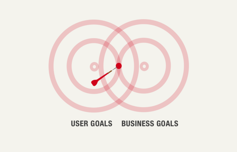
Identifying definite goal in UX project is really crucial and project without a definite goal can go into an infinite loop of iterations & revisions. Analysis & Research can be used to identify & define the definite goal of the project. Goals can be of two types i.e. User Goals and Business Goals. Defining some measurable metrics to both the goals can add great clarity to them.

Scope of work

Though user experience can be continuously evolving, one must draw the boundaries to the efforts, team involvement and finally timeline & commercials. Research helps to bring some important facts into the light so we can prioritize the goals to execute them as per the management agreement. It gives a clear idea about the efforts & timeline upfront before we begin the activity.

Strategy

This information not only helps us to identify & scope but also gives solid and logical reason to adopt a particular approach or strategy for the design process.

Photo by Michał Parzuchowski on Unsplash

Knowing the basics

Information & Research data answers very basic and important questions to the UX team, like Why are we doing it? Whom are we doing for? What supposes to be done and at what point in time?

The success of any UX project depends on solid understanding & identification of the right “Wh” questions. We may find multiple questions under each category, picking up the most appropriate & important question is important here.

Documentation

All the documents & files produced in RA process helps entire team across the lifecycle of the project to stay aligned & focused with an ultimate goal of the project.

Photo by Glenn Carstens-Peters on Unsplash

It really saves the time, cost and effort since team knows what are the findings from the user, business, and competitive research. Having a goal, work scope & strategy in place helps the team to work on the precise set of deliverables that is going to really matter in the project success.

As a part of Discovery Phase, a typical UX UI Project involves the number of steps. We will look into them in the next part (II) of this article which will be released soon.

I would love to hear your experiences, feedback & comments. If you have any question or think we need a quick talk about your ideas, I am eager to get connected. You can contact me via Twitter or LinkedIn or through our company website Prismic Reflections®